
BioTuring Ecosystem Tutorials
Products:
- Talk2Data: A system to run cross-study analyses of multi-omics data.
- BBrowser X: a modern single-cell browser
- Lens: Analyzing spatial transcriptomics data
- BioVinci: Scientific data visualization platform
- BioColab: A platform for Bioinformaticians
Talk2Data: A system to run cross-study analyses of multi-omics data.
1. DATA PREPROCESSING
Talk2data is a computational interface that allows scientists to “talk” with all of their individual single-cell datasets as a whole. While building the system, we have to tackle the following challenges:
- Batch effect: Different datasets come from different platforms and with different expression units. We attack the problem by two-step transformation as described below [ (See 1.1. Data transformation).
- Inconsistent annotation: In different studies, one condition (cell type/disease/stage …) can be annotated differently, according to the interest of the authors. To facilitate accurate combination of cells for queries, we apply sets of control vocabularies across the database [1.2. BioTuring annotation].
- Heavy computation: The current BioTuring database contains more than 16 million cells, making up billions of records. This number is growing exponentially, posing challenges for data storage, computational time and resources. To tackle this, we build a proper data structure for effective storage and fast extraction of information, while pre-indexing the data to save computational time and resources.
- Real-time calculation: One important characteristic of the Talk2data system is the flexibility, which allows scientists to ask questions on a subset of data that meets their interest (Ex: Epithelial cells in the tumor of smoked patients / Immune cells in the lymph node of lung …). The number of combinations is too huge to be pre-indexed, so we also optimize the system for efficient real-time querying and calculation.
1.1. Data transformation
To deal with the batch effect problem when combining data from different platforms, we transform the data in two steps:
1.1.1. Data ranking
For each cell in each single-cell dataset, we rank all of its genes by the expression level. The underlying rationale is that: If gene A is expressed higher than gene B in one cell, gene A should be ranked higher than gene B, no matter which technology is used to measure their expression level. As there can be multiple genes with the same absolute expression value, their ranks are then assigned by the average of their original ranks (SciPy, 2021). Given the assumption that a cell cannot express more than 5000 genes (in the current technology detection limit), we then convert the rank into 5000 - rank (Zhang, Ntranos, & Tse, 2020). In this setting, the gene with the highest expression value will have rank 5000.
1.1.2. Boolean transformation
Although the ranking system helps to overcome the differences between different units, the perturbation is still too large. A slight change in the original expression values can lead to significant differences in rank values. Therefore, we further transform the data into zero and one - one means this gene is expressed in the cell and vice versa. A gene is considered as expressed in a cell if it has a positive expression value and ranks among the top 5000 genes of the cell. From now, when we say gene A is expressed in cell B, it means gene A has the rank value smaller or equal to 5000 in cell B.
1.2. BioTuring annotation
Cell annotation plays an important role in the analytic process and it should be consistent across all datasets, which allows accurate combination of cells with the same condition. Therefore, we spent enormous effort building up sets of controlled vocabularies. We now have our own cell type ontology for making authors’ cell type annotations consistent across the database. Other annotations such as anatomy, disease, diagnosis, treatment, gender, etc are specifically curated depending on the tissue.
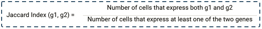
1.3. Co-expression
Talk2Data uses the Jaccard index to find co-expressed genes.
The Jaccard Index between two genes g1 and g2 is calculated as follow:
2. DATABASE
Talk2Data allows you to study one or multiple gene expression across 5 databases, covering single-cell transcriptomics, spatial, and tissue-specific studies:
- The BioTuring Single-cell gene expression database.
- The 10X Visium database
- NanoString SMI database
- The Genome-Tissue Expression project (GTEx v8)
- The Cancer Genome Atlas database (TCGA)
3. TALK2DATA INTERFACE
The Talk2data main page consists of the Talk2Data Toolbar and the Search bar.
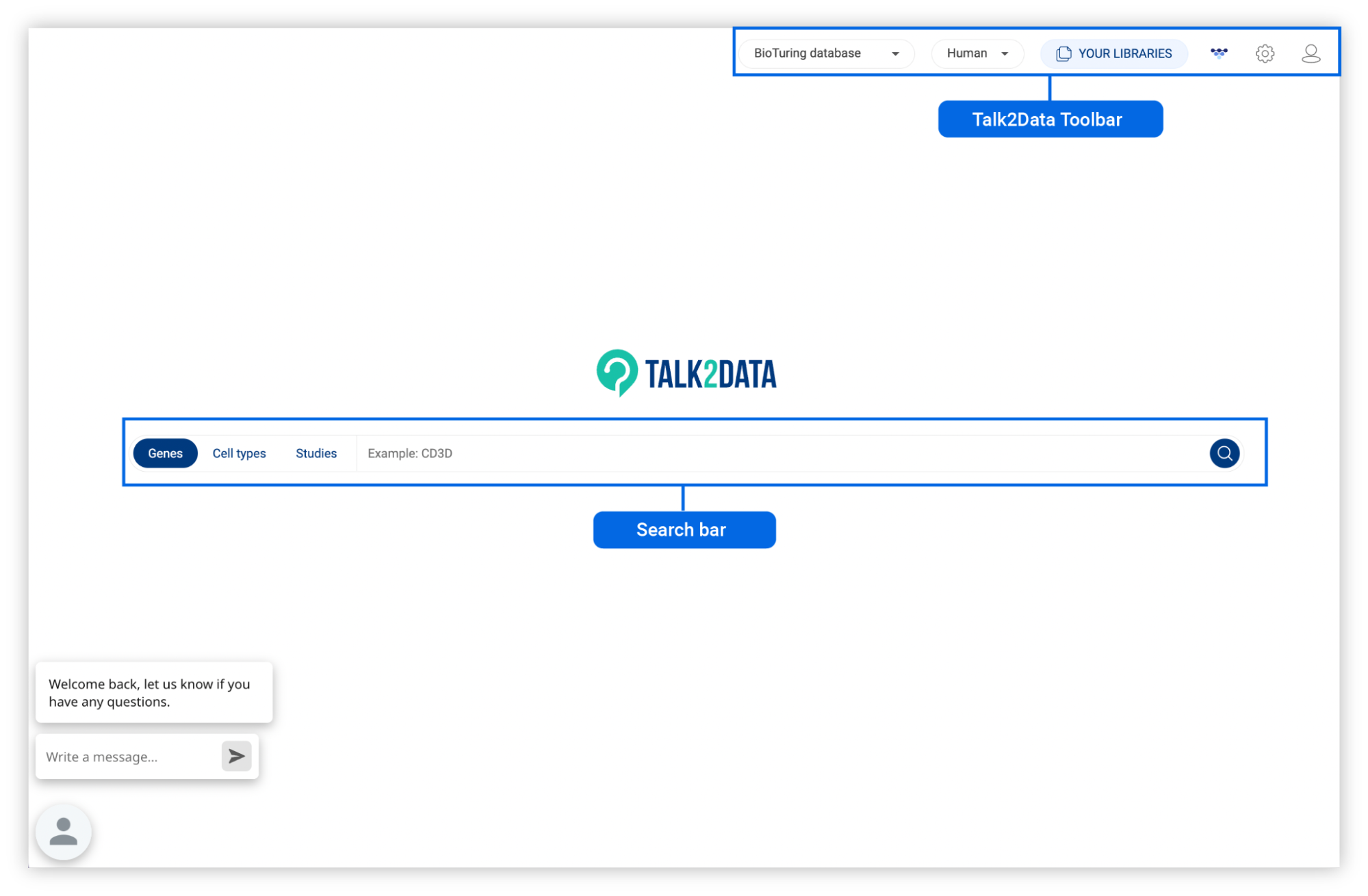
3.1. Search bar
There are three types of searches in Talk2data: Genes, Cell types and Studies.
- Genes: Explore the expression of genes across the whole BioTuring database. (See 4. EXPLORING GENE EXPRESSION ACROSS MULTIPLE DATABASES)
- Cell types: Explore the marker genes of different cell types and subtypes in the BioTuring database (See 5. FINDING MARKERS OF CELL TYPES).
- Studies: Explore the comprehensive single-cell database. You can analyze each study in depth with BBrowserX or combine different studies of interest into a custom atlas (See 6. SEARCHING FOR STUDIES IN BIOTURING DATABASE).
3.2. Talk2Data Toolbar
The Talk2Data Toolbar provides important tools to control the database you are working on and your account information.
- Database: Switch from the BioTuring database to other databases that you or your organization have access to in the drop-down list.
- Species: Select one of the three species that are supported on Talk2Data:
- Human
- Mouse
- Primate
- YOUR LIBRARIES: All of your works on Talk2Data including combined datasets, annotated studies, differential gene expression analysis, charts, heatmaps, and gene sets will be saved here (See 8. MANAGING YOUR PROJECTS IN “MY LIBRARIES”).
- BioVinci: Click the icon to go to BioVinci.
- Database settings: Click the icon to see the detailed information about the database you are working on as below. You can also change the species and database version here.


- Account information: Click the icon to show your account information.


4. EXPLORING GENE EXPRESSION ACROSS MULTIPLE DATABASES
To study one or multiple gene expression across studies, click “Genes”, then input the gene(s) of interest (e.g CD3D). Once the result is ready, you can switch between 5 databases to explore the single-cell expression profile, co-expression, spatial, and tissue-specific expression.

4.1. Gene expression level across the BioTuring Single-cell database
4.1.1. Gene expression profile across the BioTuring Single-cell database
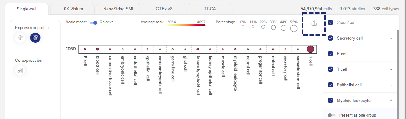
In “Expression profile”, information is presented in two ways: Cell Ontology and Heatmap.
The Cell Ontology graph shows the expression of all queried gene(s) across all cell types and subtypes. Each dot is a cell type or subtype. The expression level is Average rank (See 1.1. Data transformation).
- When one gene is queried, the colors of the dots reflect the queried gene’s expression level (rank), while the sizes of the dots reflect the percentage of cells expressing the queried gene. When multiple genes are queried, only the percentage of the cells expressing all genes are shown.
- Hover your mouse over a particular cell type/subtype to see details about gene expression level and percentage of expression
- Click on each major cell type to view gene expression across its cell subtypes (e.g. T cell). On the right panel, you can click the Back button (next to the cell types’ name) to get back to the major cell types, or click the “Browser studies” icons to find all related studies.
- You can also find a particular cell type/subtype by typing on the Search box in the top left corner of the plot.

The Heatmap presents similar information as the Cell Ontology graph. The advantages of heatmap include:
- you can include or exclude any cell types you want. To do this, go to the right panel and uncheck cell types to hide them on the plot. If you want to show the subtypes of a cell type, click on the drop-down button next to it and switch the slider to “Present as individuals”.

- The heatmap can be exported and further customized in BioVinci. To do this, click on the export icon in the top right corner.

- Finally, you also have a Scale mode option to scale the sizes of the dots. If you stay with Absolute, the sizes of the dots are scaled from 0 to 100%. If you switch to Relative, Talk2Data will size the dots by the largest percentage values, so that you can easily compare across cell types.
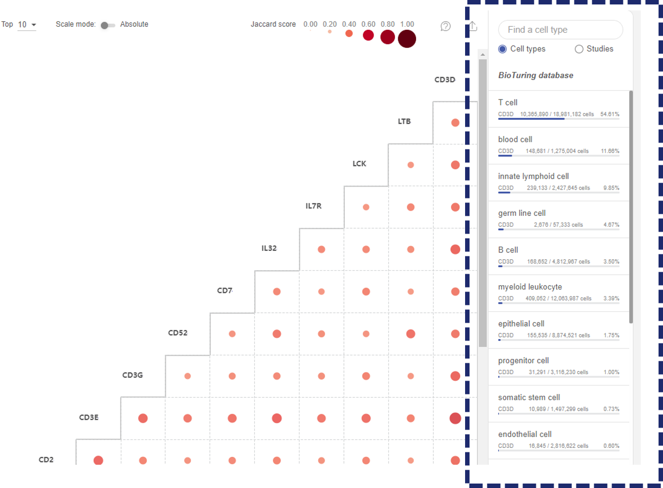
4.1.2. Co-expressed gene(s) from the BioTuring Single-cell database
The Co-expression function displays the level of co-expression between pairs of genes across BioTuring’s database based on the Jardcard score (See 1.3 Co-expression).
- When you query a list of genes, the co-expression matrix will show the co-expression level of all the combinations of two genes from the list.
- When you query for one gene, the co-expression matrix will show up to 50 genes with the highest co-expression levels across BioTuring’s database with the gene you query. By default, Talk2Data shows the top 10 co-expressed genes. You can choose to show more genes (up to 50 genes).
The co-expression level of each pair is represented by a dot. The sizes and colors of the dots reflect the Jaccard scores.
- Click on the “Scale mode” toggle button to switch between “Absolute” and “Relative”:
- Absolute: The sizes and colors of the dots are scaled from 0 to 1.
- Relative: The sizes and colors of the dots are scaled from the smallest value to the largest value. This mode amplifies the difference between two values.
- On the main plot, hover your mouse over a dot to see details about the Jaccard score and the number of cells co-expressing this pair.
- Click on the dot to see more details about the cell types and studies involved.
- Click the cell types tab in the pop-up window to study the co-expression across cell types in BioTuring public database. For each cell type, the tab shows the number of cells co-expressing 2 genes, and on what subtypes the co-expression happens, along with a Venn diagram describing the co-expression.
- Click the studies tab in the pop-up window to study the co-expression across studies. For each study, the tab shows the number of cells co-expressing 2 genes, and on what cell types the co-expression happens. Click “EXPLORE” if you want to study a particular dataset on BBrowser X.

- On the panel on the right hand side, you can narrow down the co-expression analysis to one particular cell type or study:
- Click the “Cell type” button and select one cell type. The co-expression matrix within the selected cell type will be shown. The subtypes of the main cell type will be listed on the panel. Continue to select a subtype to generate the co-expression matrix within that subtype. Click theicon to go back to the cell type list. You can use the search box on the top of the panel to look for a cell type.
- Click the “Studies” button and select one study. The co-expression matrix within the study will be shown. Click the icon to go back to the study list. You can use the search box on the top of the panel to look for a study by its title.

Finally, you can export the co-expression matrix to BioVinci for further editing by clicking on the icon.

4.2. Gene expression level across the Spatial database
4.2.1. Study gene expression profile and Co-location in the 10X Visium database
The BioTuring 10X Visium database contains 139 studies with 383,727 spots (as of September 2022), covering a wide range of tissue samples. There are 2 ways to explore gene expression in this spatial database: Expression profile and Co-location.
In Expression profile, you can find all studies in which the queried gene is expressed. When you click “Explore” a particular study, you will arrive at BioTuring Lens - our AI-driven platform for spatial biology. For more information, refer to [Lens manual].

In Co-location, Talk2Data will find up to 50 genes that are co-located with the queried gene(s) in the database and present the results as a heatmap. The level of co-location is calculated similarly to the co-expression level (refer to 1.3 Co-expression methodology).
- Each dot represents the level of co-location of a pair of genes, with the size and color of the dots reflecting the Jaccard score (i.e the co-location level). The scale of the dots can be adjusted as Relative / Absolute.
- When you hover your mouse over a dot, details, such as the Jaccard score and number of spots co-expressing the genes, will appear.
- If you click on the dot, a pop-up window will appear to list all related studies. For each study, you get a Venn diagram describing the co-location. Click “Explore” to open the study in BioTuring Lens for further analysis.

The heatmap can be exported and further customized with BioVinci.
4.2.2. Study gene expression profile in the NanoString SMI database
The BioTuring NanoString SMI database contains 139 studies with 383,727 spots (as of September 2022), covering a wide range of tissue samples. Talk2Data provides you all NanoString SMI studies in which the queried gene is expressed. When you click “Explore” a particular study, you will arrive at BioTuring Lens - our AI-driven platform for spatial biology. For more information, refer to BioTuring Lens tutorials.

4.3. Gene expression level across Tissue-specific databases: GTEx and TCGA
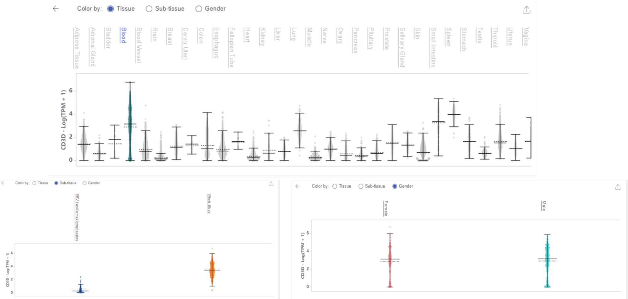
4.3.1. Study gene expression profile in Normal tissue (GTEx v8)
The GTEx database is a comprehensive public resource to study tissue-specific gene expression. Talk2Data uses GTEx v8, which contains 17,382 samples, covering 30 different human tissues (as of September 2022).
When you query one or multiple gene(s) in this database, Talk2Data presents the expression profile in 2 ways: Violin plot or Scatter plot.
Violin plot shows how a gene is distributed across tissues. In this plot, the y axis is the expression value. The unit of expression is the logarithm of transcript per million plus 1.

- The plot is interactive. Hover your mouse over the violin plot of a tissue and you’ll get more information about the statistics of tissue-specific gene expression value, such as the mean, median, quartile, and interquartile range.
- If you click on a tissue’s label along the x axis, you can highlight the violin plot of that tissue.
- Now, you can further analyze the gene expression in this particular tissue at either Sub-tissue level or compare between Genders.
- You can always go back to the main plot by clicking the Back arrow.
- The plot can be exported to Vinci for more customization.
Scatter plot shows 2 identical plots: the left one is colored by tissue, the right one is colored by gene expression level. The unit of expression is also the logarithm of transcript per million plus 1. Note that each dot in the scatter plots represents one sample from the GTEx database. The plot is also interactive:
- When you hover your mouse over a cluster, you will get the name of the tissue and the gene expression level.

- Click on a cluster on either plot or the tissue label on top to highlight it. Now you can further explore gene expression at Sub-tissue level or compare between Genders.

4.3.2. Study gene expression profile in Cancer tissue (TCGA)
The TCGA database sequenced 11,093 samples from primary cancers and matched normal samples, covering 26 tissue types and 33 cancer types.
When you query one or multiple gene(s) in this database, Talk2Data presents the expression profile in 2 ways: Violin plot or Scatter plot.
Similar to GTEx, TCGA Violin plot shows how a gene is distributed across cancer tissues. In this plot, the y axis is the expression value. The unit is the logarithm of Fragments Per Kilobase Million, plus 1.
- This plot is also interactive, which means you can hover your mouse over a tissue and find out more details about the statistics.
- If we click on a tissue’s label, we can choose to see tissue-specific gene expression profiles across cancer types or sample types.
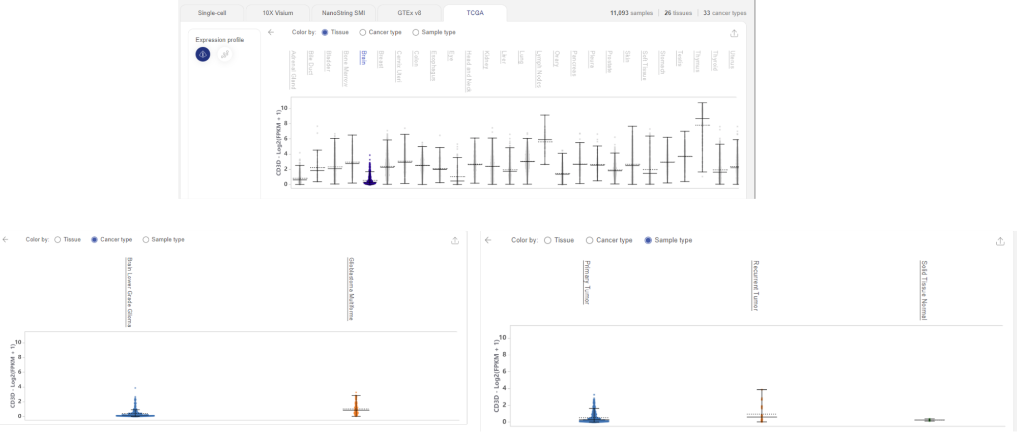
The Scatter plot option of TCGA is similar to that of the GTEx database. We have two similar dimensionality reduction plots, the left one visualizes tissue-specific clusters, the right one visualizes the queried gene expression level. Each dot represents one sample from the database.
Hover your mouse over a cluster to find out the tissue type and gene expression level. Highlight your tissue of interest by clicking on its name. You can now view tissue-specific gene expression across cancer types or sample types.

For all the plots we have seen, you can export and customize them as you wish in Vinci by clicking on the export icon .
5. FINDING MARKERS OF CELL TYPES
5.1. In cell types
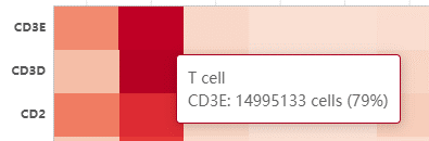
To query potential marker genes of a cell type based on the whole BioTuring’s single cell database, select the Cell types button in the Search box, then type or select a cell type of interest from Talk2Data’s suggestions (e.g. T cell).

The result is a heatmap showing genes specifically expressed in the queried cell type. The color intensity reflects the percentage of cells in a particular cell type expressing a certain gene.

Above the heatmap is the control panel, with which you can adjust three parameters:

- The first parameter is the threshold for the percentage of cells in the BioTuring database belonging to the selected cell type that express the genes. Genes that are expressed in more than that percentage of T cells will be kept. By default, Talk2Data shows the genes that are expressed in more than 30% of T cells.
- The second parameter is the threshold for the percentage of cells in the BioTuring database belonging to other cell types that express the genes. Genes that are expressed in less than that percentage of other cell types are kept. By default, the genes listed in the heatmap are expressed in less than 30% in other cell types.
- The third parameter controls how unique the genes are. By default, it allows one other cell type to exceed the threshold set by the second parameter (one exception). If you move it towards common, you allow more than 1 exception. You can allow up to 5 exceptions. If you select unique, Talk2Data will allow no exceptions.
In the example below, we adjust all thresholds to find more specific marker genes for T cells. The marker genes must express in more than 50% of T cells and less than 20% in other cell types, with only 1 exception allowed.

To explore the heatmap:
- Hover over the heatmap to view the percentage of cells expressing the genes (e.g CD3E in T cell).
- The color scale on the left corner, above the gene list, is interactive: you can slide the scale to hide genes expression outside of a particular range (e.g only show genes expressed in more than 50%)

- Switch from Normal heatmap to Size heatmap, in which gene expression level for each cell type is now represented by a dot. The size and color of the dot reflect the percentage of cells in a particular cell type expressing a gene.
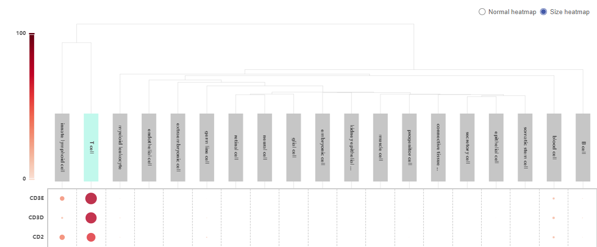
- Click on a cell type to see the expression of the marker genes across different subtypes of the cell type.

5.2. In cell subtypes
To query potential marker genes of a cell subtype, you can either select the desired cell subtypes from Talk2Data suggestion, or type its name to the Search bar (e.g. gamma-delta T cell). The result is a heatmap similar to the case of cell type.
In addition, you can use Search scope. This function allows you to compare the queried subtype with all other cell subtypes in the BioTuring database, or with its siblings (cell subtypes that belong to the same major cell type).
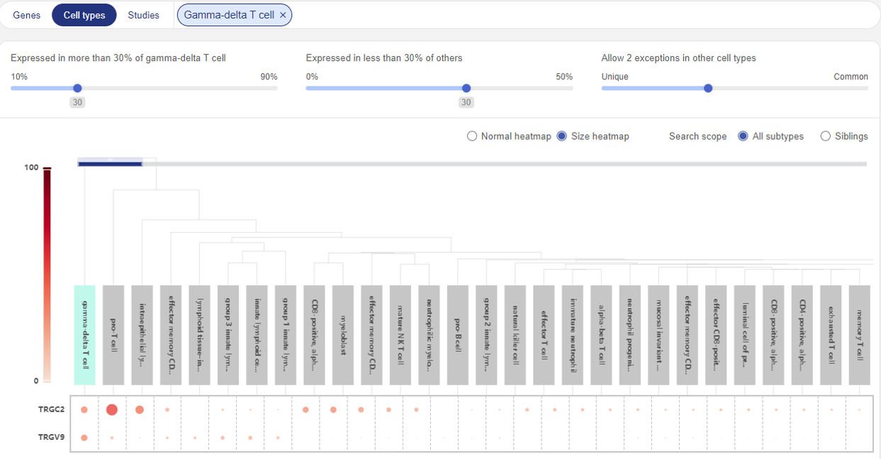
Compare marker genes for Gamma-delta T cell with all other subtypes

Compare marker genes for Gamma-delta T cell with other T cell subtypes
6. SEARCHING FOR STUDIES IN BIOTURING DATABASE
From the home page of Talk2Data, click “Studies” to go to the study page. The full list of datasets (studies) will be shown. Scroll down and click “More” to expand the list.
There are three methods to look for a study:
- Using the Search bar
- Using BioTuring’s standardized annotation
- Using Expression profile
Details of each method are described in the following subsections. Once you find a study of interest, click “EXPLORE” to go into the BBrowserX interface for single study analysis (See BBrowser X: A modern single-cell browser). You can also click “CREATE CUSTOM DATASET” to isolate cells from the search results into a custom dataset (See 7.1. Creating a custom dataset).
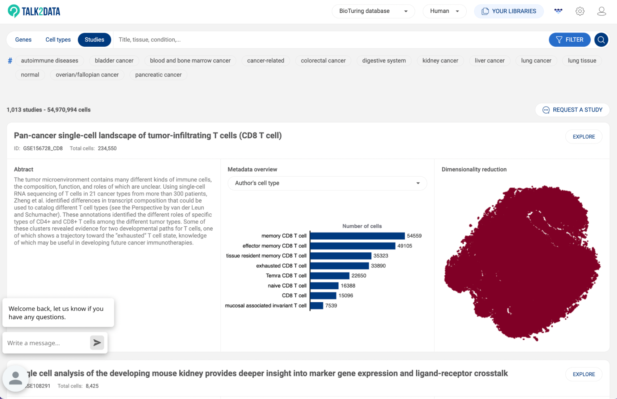
6.1 Searching with keywords
To use the search box, simply type a keyword. A keyword can be a GEO ID, a tissue name, a disease name, a study title, or an author name. If the keyword is found in the title/abstract/metadata of a study, the study will appear in the results.
6.2 Searching with BioTuring’s standardized annotation
BioTuring’s standardized annotation system covers 13 different categories of metadata. You can use the combination of different categories as a filter.
The 13 categories include:
- Tissue: type of tissue or organ from which a sample is collected.
- Condition: medical condition of a donor
- Sampling site: where a sample is collected from a subject
- Cell type: authors’ annotation about different cell types in a sample
- Cancer cell: malignant cells collected from a cancerous sample
- Treatment: type of therapy applied to a subject
- Response to treatment: how a subject response after a course of treatment
- Gender: sex of a donor
- Developmental stage: age period of a donor
- Sequencing platform: platform used for single-cell RNA sequencing
- Quantification: a program or package used for quantification of read counts
- Sampling technique: how a sample is collected
- Storage technique: how a sample is preserved before being processed.
To use this method, click on the button on the right of the search box. All 13 categories will be shown. Under each category are its main labels.


- Click on a category to see all of its labels on a pop-up window.
- In the column on the left, all main labels of the selected category are shown. Click on a main label to display its sub-labels.
- Check the box of a main label/sub-label to select. If you check the box of a main label, all of its sub-labels are automatically selected.
- You can use the search box to find a label.
- To switch to another category, use the drop-down menu in the top left corner of the pop-up window.
- Once you have chosen all of the labels for your studies of interest, click “SEARCH”.

- Some predefined tags under the search box are available for some common searches such as cancer, lung cancer, kidney cancer, autoimmune disease, ect. Click on a tag to perform a search.
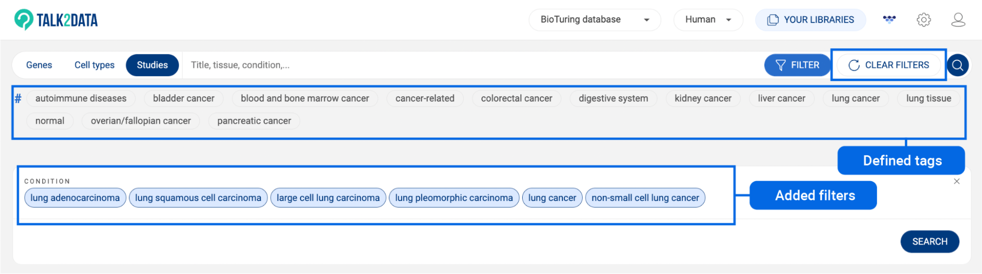
- To clear added filters, click “CLEAR ALL FILTERS” on the search bar. This button only appears when there is at least one filter applied.
6.3 Searching with expression profiles
With expression profiles, you can extract the studies on BioTuring’s database that express or do not express certain genes. This can be used in combination with Standardized annotation.
To use this method, click on the button on the right of the search box. Then, click on the “Expression profile” tab next to the “Standardized annotation'' tab. Then, you can start inputting genes to define an expression profile.
- When genes are put on separate lines, the search engine will look for studies that contain cells expressing all genes.
- When genes are put on the same line, the search engine will look for studies that contain cells expressing at least one of the genes.
- When you click on a gene, it will become a negative gene, meaning that the result will contain cells that do not express the gene.
- Click ‘SEARCH” to perform the search.

7. EXPLORING CUSTOM ATLASES
With our custom atlases, you can easily extract specific cell populations from different datasets in our database, enabling comprehensive and detailed analysis.
7.1. Creating a custom atlas
A custom atlas can be created from search results (See 6. SEARCHING FOR STUDIES IN BIOTURING DATABASE). You can also combine the result of the “Cell search” function on BBrowserX into an atlas or manually extract cells from a study into an atlas (See the BBrowserX tutorials). The expression unit in custom atlases is the ranking unit (See 1.1. Data transformation).
When you apply filters and get a list of studies, click “CREATE CUSTOM DATASET”. A pop-up window will appear:
- New dataset name: Give a title for your custom atlas.
- Include: When you search using filters, the result consists of studies that contain cells that fit your search criteria. If you choose “matched cells”, only cells that match your criteria will be extracted. If you choose “all cells” instead, all cells of each study on the result list are extracted.
- The whole study list is shown with a checkbox for each study. You can include/exclude a study by checking/uncheck its box.
- Click “CREATE” to save the atlas.

7.2. Analyzing a custom atlas
7.2.1. Summary
Standardized metadata across different studies incorporated into an atlas are summarized. Select a metadata field in the column on the right hand side to display it as a tree structure. This gives you an overview of the study IDs, conditions, cell types, ect. in a custom atlas.
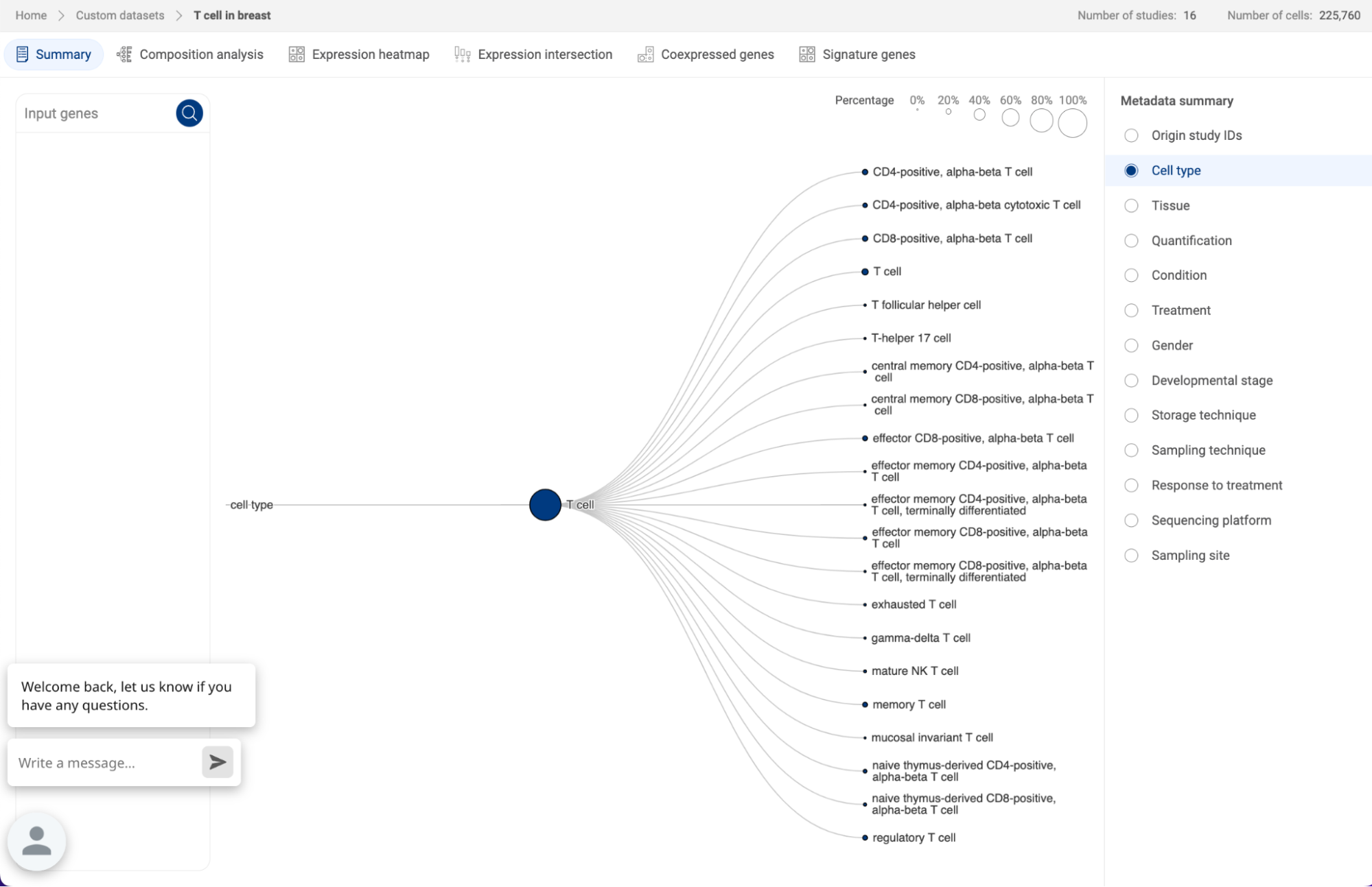
When you query for gene(s) in the query box on the left hand side, you will be directed to the Composition analysis page (See 7.2.2. Composition chart).
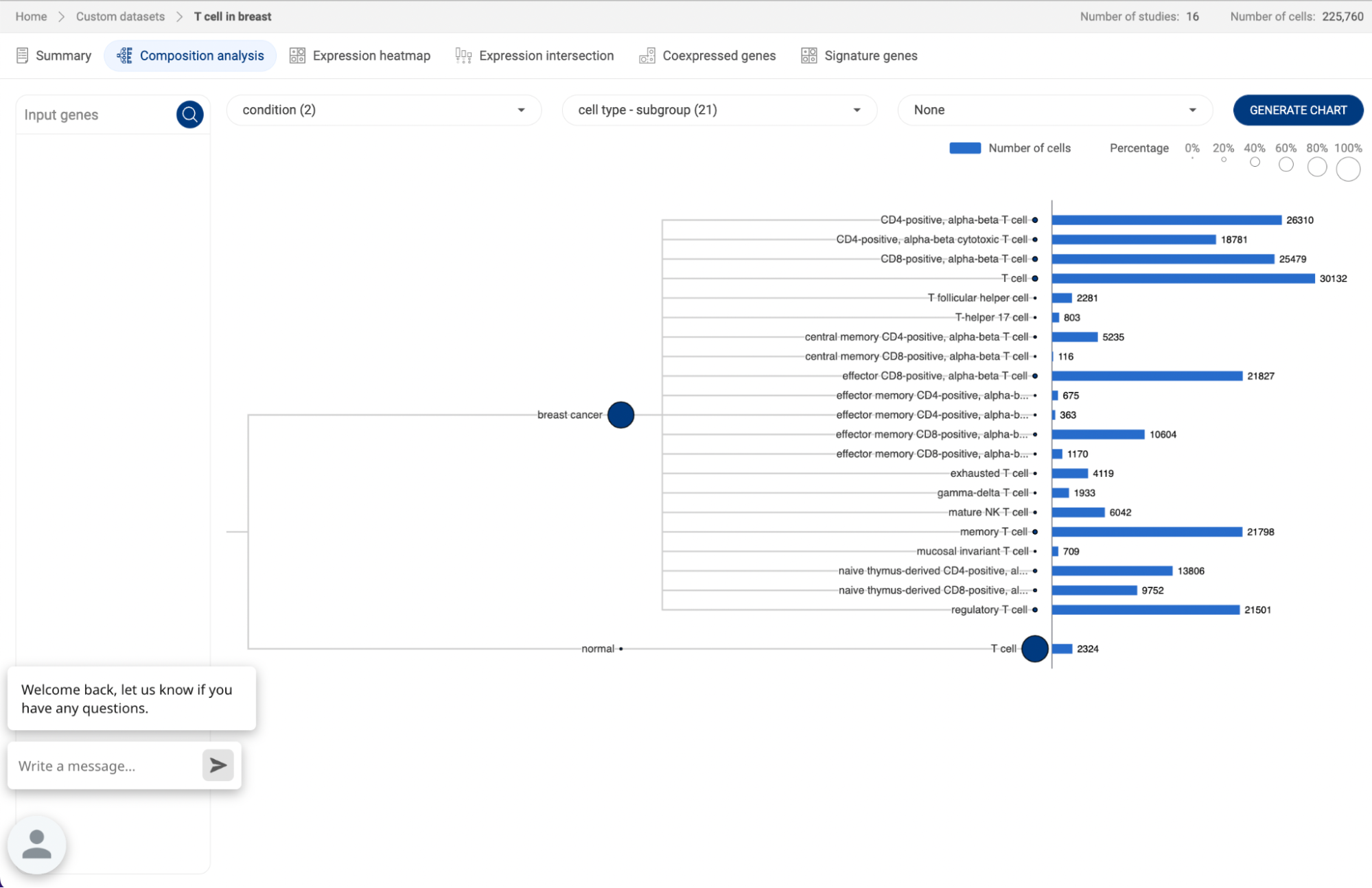
7.2.2. Composition analysis
Composition chart is an informative type of visualization when you want to have an overview of the proportions of different groups that form a dataset. For example, a composition chart can help you to visualize the cell type composition in different conditions. BBrowserX also allows you to look at the gene expression of each group directly on the chart.
- Exploring composition of a dataset
Click on the button to go to the Composition analysis page. For each dropdown menu, you can click on it and select one categorical metadata field. The number in brackets next to a metadata field is the number of groups within that field.

If you are choosing a categorical metadata field on the main page, a composition chart of that field will be created when you first enter the page.
In the example below, we want to look at the cell type composition in different conditions. Therefore, we assigned “Condition” and “Cell type” for the first two metadata fields. The third metadata field is not assigned and has a “None” value. Then, Click “GENERATE CHART”.
- A composition chart has a tree structure with each level according to each metadata field you assigned.
- The size of a node at each level represents its percentage in its parent.
- The bar chart on the right-hand side gives you information about the number of cells in each group and its percentage in the whole dataset.
- You can hover the mouse over a node, or a bar to see some more details.
- Creating a customized expression heatmap with composition chart

Once a composition chart has been created, you can look at the gene expression level within each group on the chart by type or past a gene or a list of genes into the query box on the left-hand side. An expression heatmap will replace the bar charts.
- The sizes of the circles represent the percentages of cells that express the gene, or the coverage.
- The color represents the level of expression of the gene in the datasets. The darker the color, the higher level of gene expression.
- Hover the mouse over a circle to see details about the mean expression of a gene and the number of cells expressing the gene.
7.2.3. Expression heatmap

- Click the button to go to the Expression heatmap page.
- The plots for the gene(s) added to the gene query box will be created. Change the input genes on the query box and click the button to create new plots.
- The sizes of the dots represent the percentages of cells that express the gene, or the coverage. The color represents the level of expression of a gene. The darker the color, the higher level of gene expression. Hover the mouse over a plot to see the detailed information about mean expression value, number and percentage of cells expressing the gene within the group.
- Click on the “Scale mode” toggle button to switch between “Absolute” and “Relative”:


- Absolute: The sizes of the circles are scaled from 1% to 100%.
- Relative: The sizes of the circles are scaled from the smallest value to the largest value. This mode amplifies the difference between two values.
- Select a metadata field on the right panel to generate plots for each group of the field. Check/uncheck a box next to a group label to show/hide the respective plot.
- Select a metadata field in the “Split by” section to split the plots by the different groups of the selected metadata fields.
- Click the button to export the plots to Vinci for further editing.

7.2.4. Expression intersection
- Click the button to go to the Expression intersection page.
- At least two genes are required to create an intersection plot. Input genes into the query box and click the button to create new plots.
- The matrix at the bottom shows different combinations of the input genes, and the bars represent the number of cells that express the respective combinations.
- Select a metadata field on the right panel to visualize the number of cells of each group of the field on a bar. Check/uncheck a box next to a group label to show/hide the respective plot. Hover the mouse over a bar to see the number of cells of the groups made up the bar.
- Select a metadata field in the “Split by” section to split the plots by the different groups of the selected metadata fields.
- Click the button to export the plots to Vinci for further editing.

7.2.5. Coexpressed genes
The Co-expression function on a custom atlas displays the level of co-expression between pairs of genes within the atlas based on the Jardcard score (See 1.3 Co-expression methodology).
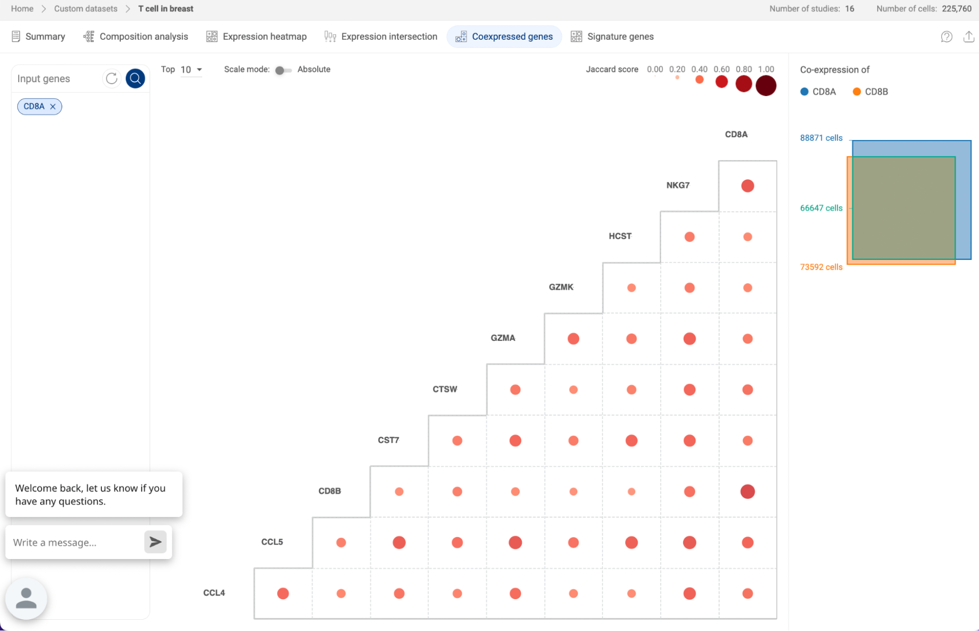
- When you query a list of genes, the co-expression matrix will show the co-expression level of all the combinations of two genes from the list.
- When you query for one gene, the co-expression matrix will show up to 50 genes with the highest co-expression levels in the atlas with the gene you query. By default, Talk2Data shows the top 10 co-expressed genes. You can choose to show more genes (up to 50 genes).
The co-expression level of each pair is represented by a dot. The sizes and colors of the dots reflect the Jaccard scores.
- Click on the “Scale mode” toggle button to switch between “Absolute” and “Relative”:
- Absolute: The sizes and colors of the dots are scaled from 0 to 1.
- Relative: The sizes and colors of the dots are scaled from the smallest value to the largest value. This mode amplifies the difference between two values.
- On the main plot, hover your mouse over a dot to see details about the Jaccard score and the number of cells co-expressing the two genes.
- Click on the dot to see a Venn diagram describing the co-expression of two genes on the panel on the right-hand side.
Finally, you can export the co-expression matrix to BioVinci for further editing by clicking on the icon.
7.2.6 Signature genes
- Click on the button to find signatures genes that help distinguish between different groups in a custom atlas or between cells from different atlas.
- In the panel on the right hand side, click on the toggle button to switch the Comparison scope:

- Within this dataset: Select one metadata field from the drop-down menu under the toggle button to find signature genes for each group of the field.
- Across datasets: Check the boxes of at least two custom atlas to find the signature genes for cells in each atlas.

- There are four parameters that you can adjust:
- In group: This is the threshold for the percentage of cells in a particular group/dataset that express a signature gene. Genes that are expressed in more than that percentage of cells in the group/dataset will be considered signature genes of that group/dataset. The default value of this parameter is 30%.
- Out group: This is the threshold for the percentage of cells outside a particular group/dataset that express a signature gene. Genes that are expressed in less than that percentage of cells outside the group/dataset will be considered signature genes of that group/dataset. The default value of this parameter is 30%.
- Exception: This parameter controls how unique the genes are. By default, it allows no other group/dataset to exceed the threshold set by the second parameter (no exception). You can allow up to 5 exceptions. If you select unique, Talk2Data will allow no exceptions. The number of exceptions should be smaller than the number of groups/datasets.
- Top: The number of signature genes for each group.
- Once you have set the groups of interest and the parameters, click “FIND SIGNATURE GENES” to create a bubble heatmap that displays the signature genes for each group.
- Click the button to export the plots to Vinci for further editing.
8. MANAGING YOUR PROJECTS IN “MY LIBRARIES”
All of your analyses performed on Talk2Data including custom atlases, annotation, differential gene expression, visualizations and gene sets will be saved to “ MY LIBRARIES”.
To access your libraries, click on the “MY LIBRARIES” button on the Talk2Data Toolbar.
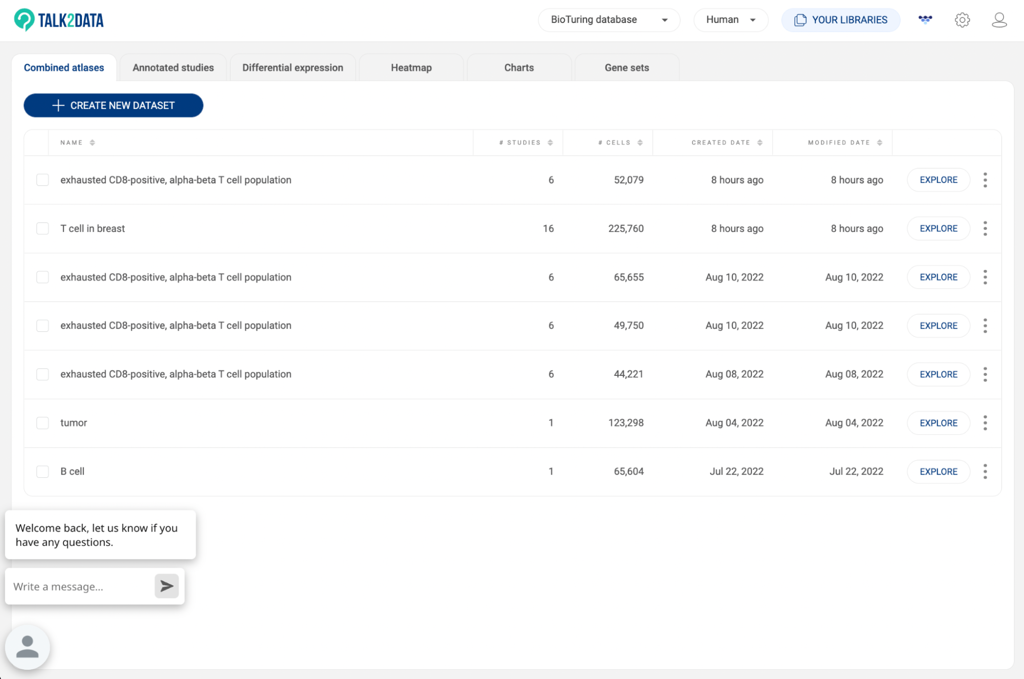
8.1. Combined atlas
All of your custom atlases are listed here. The information about title, number of studies, number of cells, created date, and modified date are also displayed.
- Click “EXPLORE” to analyze an atlas (See 7.2. Analyzing a custom atlas).
- Click the icon to edit, rename or delete an atlas:

- Edit: The selected cells from each study incorporated into the atlas will be shown. Click the icon to remove cells of a study from the custom atlas. Click the icon to go to the study. In the single study interface, select a cell population again and click the to add them to the atlas.
- Rename: A pop-up window will appear allowing you to change the title of the atlas.
- Delete: Delete a single analysis.


- To merge multiple atlases into one, check the boxes next to the titles. The “MERGE DATASET” button will appear at the top of the panel.
- To create a new atlas, click on the “CREATE NEW DATASET” button. You will be directed to the study search page (See 6. SEARCHING FOR STUDIES IN BIOTURING DATABASE)
8.2. Annotated studies
Besides Author's metadata and BioTuring’s standardized metadata, you can manually create new annotations or import a metadata file (See 3.2.4. Annotating a group of cells and 3.2.6. Importing metadata in BBrowserX tutorials). The results of AUCell enrichment analysis and Cell type prediction are also saved as new metadata fields. All of your annotations in each study will be listed here. Click “EXPLORE'' to go to a study on the list and continue your work.

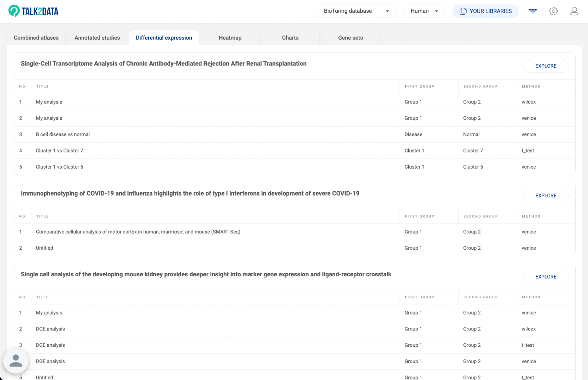
8.3. Differential expression
All differential gene expression analyses you perform within each study are listed here (14. DIFFERENTIAL GENE EXPRESSION (DGE) ANALYSIS in BBrowserX tutorials). The information about the analysis title, the two groups, and the method are shown. Click “EXPLORE'' to go to a study on the list and continue your work.
8.4. Heatmap
All heatmaps you created within each study are listed here (17. HEATMAP in BBrowserX tutorials). The information about heatmap title, number of cells, number of genes, and heatmap type are shown. Click “EXPLORE'' to go to a study on the list and continue your work.

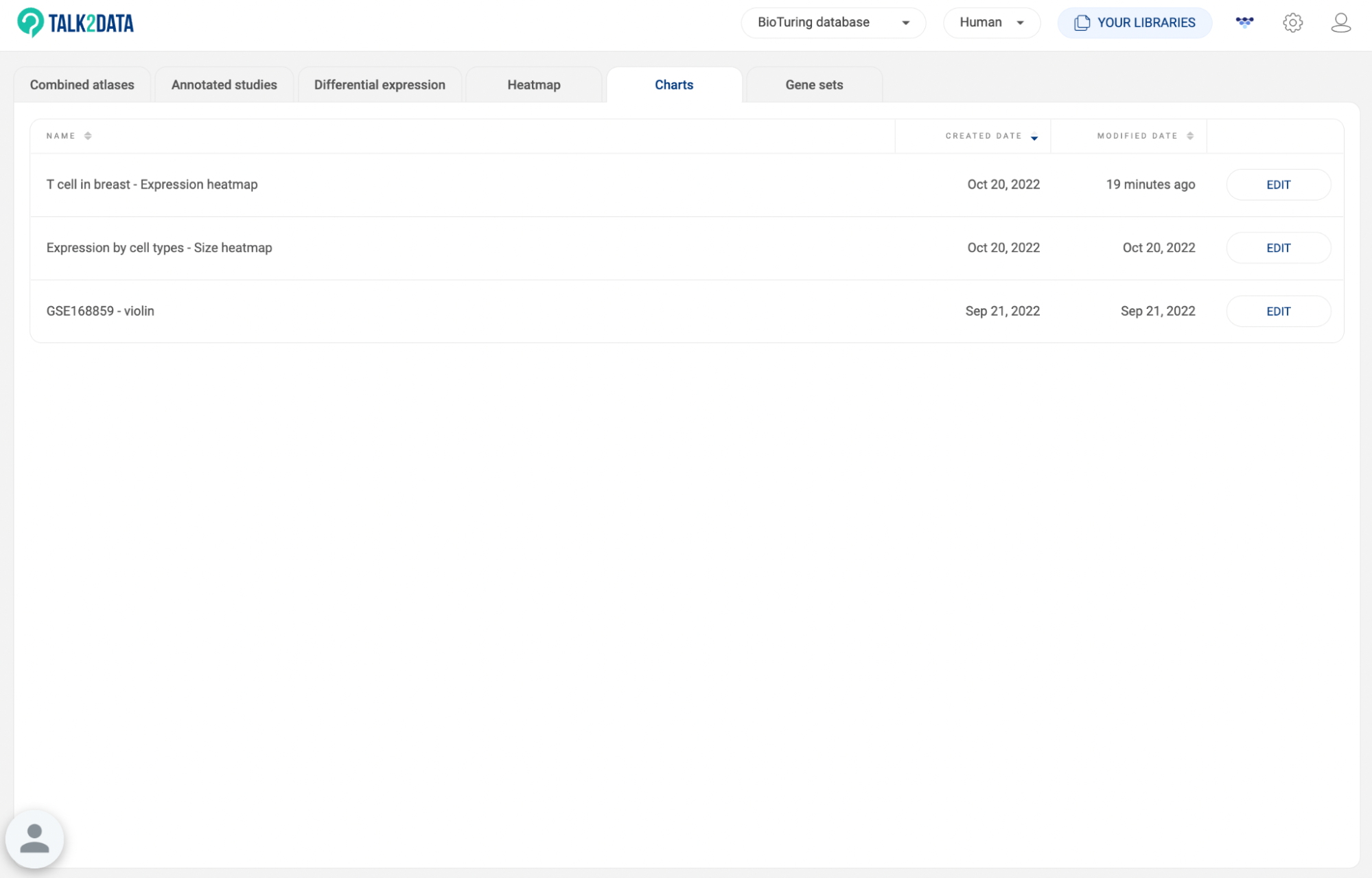
8.5. Charts
All charts you exported to Vinci are listed here (See BioVinci tutorials). The information about the chart title, created date, and modified date are shown. Click “EXPLORE'' to edit a chart in Vinci.
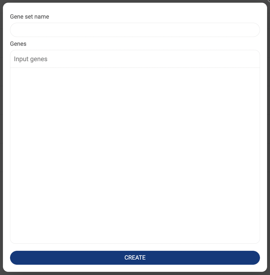
8.6. Gene sets
All gene sets you created are listed here (3.3.2. Saving a gene set in BBrowserX Tutorials). The information about the gene set title and created date are shown.
- Click “CREATE A NEW GENE SET” to add a new gene set. A popup window that allows you to set a name and add genes will appear. Click “CREATE” to save.
- Click the icon to edit a gene set.
- Click the icon to delete a gene set.


BBrowser X: A modern single-cell browser
1. IDENTITY AND ACCESS MANAGEMENT
The Identity and Access Management (IAM) page is where you can control access to specific data and manage permissions for the private version of BBrowserX that is installed on your organization's server. This page is only accessible by administrators who can determine who has access to certain data and what actions they are permitted to perform on the data.

1.1. Permissions
There are 12 built-in permissions (privileges) that define what a user can do with certain data. Click “Permissions” to see all the permissions.
# | Permission | Description |
1 | CREATE_NEW_STUDY | Upload data to a workplace. |
2 | DELETE_STUDY | Remove data from a study list in a workplace. |
3 | SHARE_STUDY_WITH_ANOTHER_GROUP | Share data within a workplace with other user groups. |
4 | MODIFY_METADATA | Change metadata field names and group names. |
5 | STANDARDIZE_METADATA | Map labels in the metadata of a dataset with terms on the ontology trees. |
6 | CREATE_NEW_DATABASE | Create a new database |
7 | DELETE_DATABASE | Remove a database |
8 | MODIFY_ONTOLOGIES | Create, edit and remove ontology trees within a workplace. |
9 | ADD_OR_REMOVE_USERS_IN_GROUP | Add and remove users to a group. |
10 | ADD_NEW_METADATA | Upload metadata files or use the annotation tool to create new metadata fields. |
11 | MODIFY_STUDY | Change Study name, Authors, and Abstract. |
12 | DELETE_METADATA | Remove metadata fields in a dataset. |
1.2. Define a role
Users are assigned a role when they are added to a user group. A role is defined by a combination of permissions.
- Click “Roles” to show the list of roles and their permissions.
- Click “ADD ROLE” to add a new role. A pop-up window will appear as shown below.
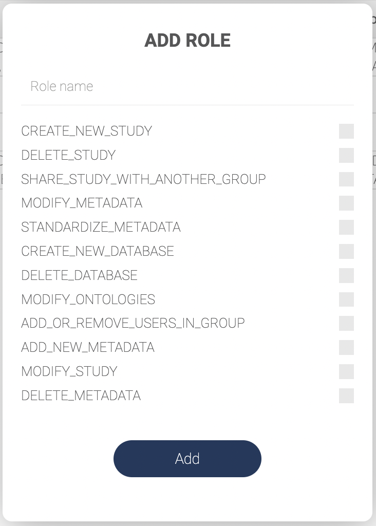
- Input a role name and check the permissions to decide which actions the roles are allowed.
- Click “ADD” to save.
1.3. Managing user groups
A user group shares a workplace. All users in a group can access the data within the workplace. Depending on their roles, each user can either view the data or make changes to it.
- Click “User groups” to see the list of groups.
- Click “ADD GROUP” to create a new user group. Fill in the group name in the pop-up window and click “Add”.

- On the user group list, click the icon to add a new user to the group.

- Fill in the user’s email address.
- Select a role from the drop-down menu.
- Click “Add”.

- Click the icon to see the list of users in a group and their roles. On the user list window, click the icon to remove a user from the group.
- Click the icon on the user group list to remove a group.


2. MANAGING YOUR PRIVATE DATA ON BBROWSER X
2.1 Navigating the data management page
- Group: Choose your workplace from the dropdown menu.
- The data in your "Personal workplace" can only be accessed by you. All shared workspaces you're a member of can be accessed by all members of the group.
- If you have the permission to add or remove users in a workspace (have the permission ADD_OR_REMOVE_USERS_IN_GROUP), you can manage members by clicking on “MANAGE GROUP” under the group name. For more information on roles and permissions, see “1. IDENTITY AND ACCESS MANAGEMENT”.

- Species: Choose the type of organisms. BBrowserX supports three species:
- Human
- Mouse
- Non-human primate
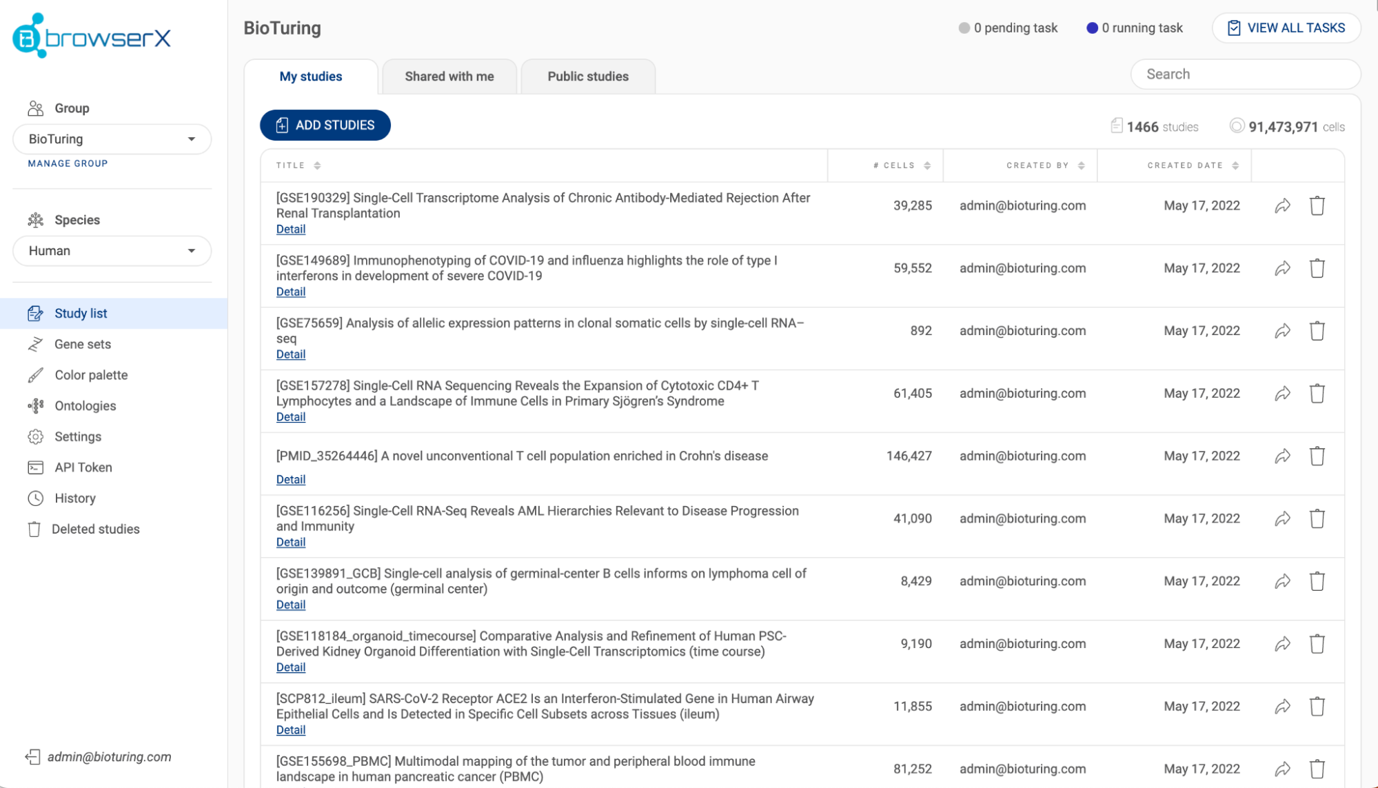
- Studies list: All datasets (studies) within a workplace are listed here.
- In the “My studies” tab Each study is shown with its title, species, number of batches, number of cells and created date. Click on the icon next to a header to change the sort settings. The number of studies and the number of cells are summarized at the top of the list. Use the search bar to search for a specific study using a keyword.
- If you have the necessary permissions, you can share a study to another group by clicking the button, or delete a study with the button.
- Click the “ADD STUDIES” button to submit a dataset (See “2.3. Submitting a dataset to BBrowser X”). The status bar in the top right corner shows the number of pending tasks and the number of running tasks that are related to submitting studies. Click “VIEW ALL TASKS'' for more details.
- The “Shared with me” tab shows studies that have been shared with you by colleagues (See “2.5. Sharing a dataset with a collaborator”), while the "Public studies" tab lists public studies on Talk2Data that you have bookmarked (See “3.4. Toolbar”).


- Gene sets: All custom gene sets are saved here.
- To add a gene set, click “CREATE A NEW GENE SET”, then provide the gene set names and all the gene names. You can also add a gene while exploring a dataset (See also “3.3 Gene expression panel”).
- Alternatively, you can add new gene sets by importing a .csv or .tsv file. The file should contain two columns: the first column are the gene set names and the second are lists of genes separated by semicolons.
- To export your gene sets, click the “EXPORT” button.
- Color palettes: These palettes can be used to customize different types of visualizations on BBrowser X.
- To add a color palette, provide a name, input the hexadecimal codes for the colors in the palette, select “discrete” or “sequence” mode, and click “ADD”.
- All of your custom palettes are listed. Click the button to delete a palette.
- Ontologies: This section is only available in shared groups. You can create and modify your ontology trees here. Ontologies are used for standardizing metadata across studies (See “2.4. Standardized annotations”).
- Settings: This is where you can configure your Amazon S3 settings (See “2.2. Configuring your Amazon buckets”).
- API Token: This is the place where you can generate tokens for submitting data via API calls. For more information, please refer to the “Usage guide” on the page.
- History: All actions regarding adding/removing/editing your studies, metadata and ontologies are tracked here.
- Deleted studies: All studies that are deleted within 30 days are listed here. Click the icon to restore a study. If you want to restore a study after the 30-day period, contact your server manager.
- Log-out: Click theicon next to your email in the bottom left of the page to log out of the platform.


2.2. Configuring your Amazon S3 bucket
- On the setting page, click the “ADD” button. The AWS S3 Bucket configuration will be shown as below.

- Fill in the required information and click “SAVE”.
- Added S3 buckets will be shown on the settings page. To edit or remove a bucket, click the “EDIT” button:
- To edit, adjust the configuration and click “SAVE”.
- To remove, click “DELETE”.
2.3. Submitting a dataset to BBrowser X
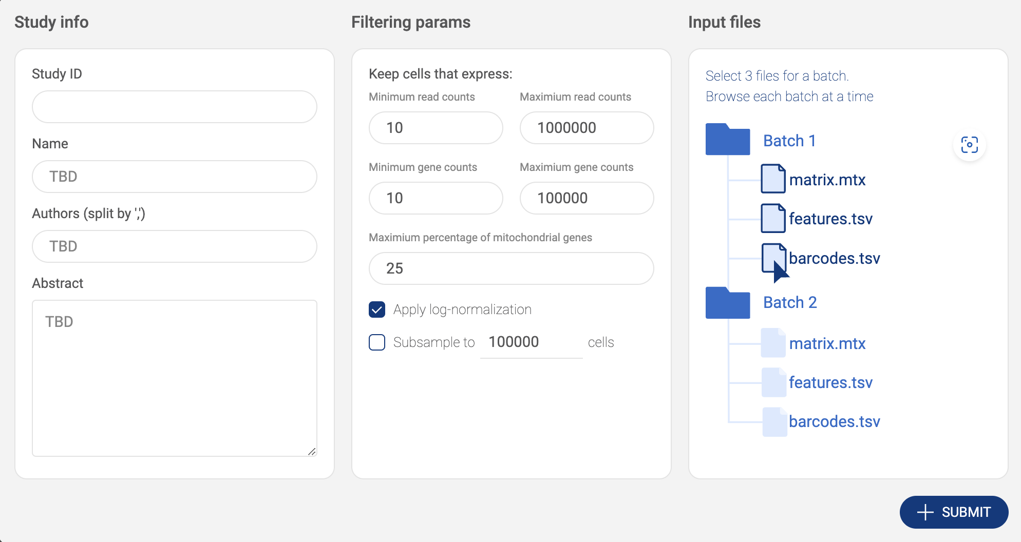
BBrowserX support four formats of single-cell data:
- CellRanger matrix output
- CellRanger .h5 output
- Scanpy object
- Seurat object
- TSV/CSV/TXT full matrix
The following sections show you how to submit your data via BBrowserX interface. If you want to submit your data via API calls, please learn how to generate tokens for API calls at “2.1 Navigating the data management page”.
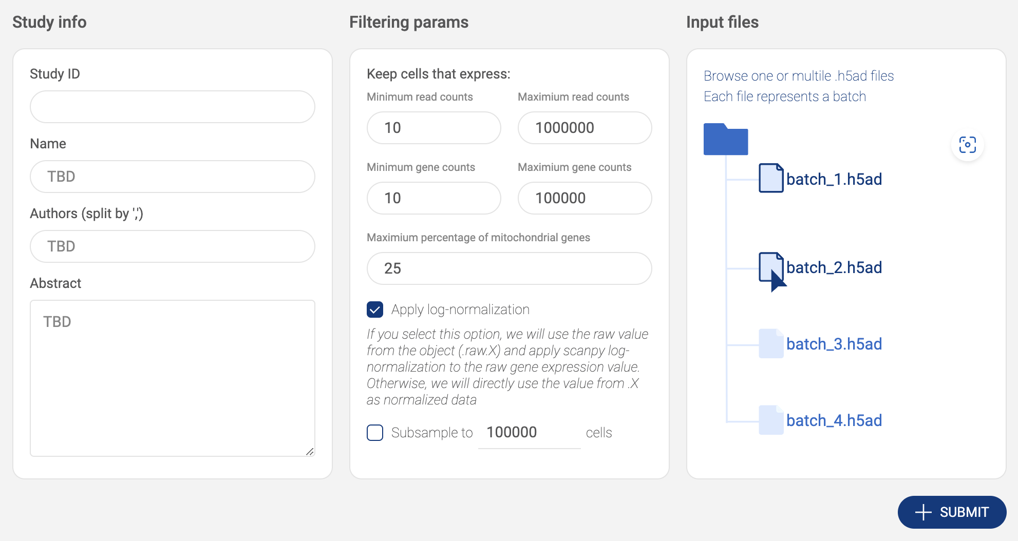
2.3.1. Submitting a CellRanger matrix
- Click the “ADD STUDIES” button to start submitting a dataset.
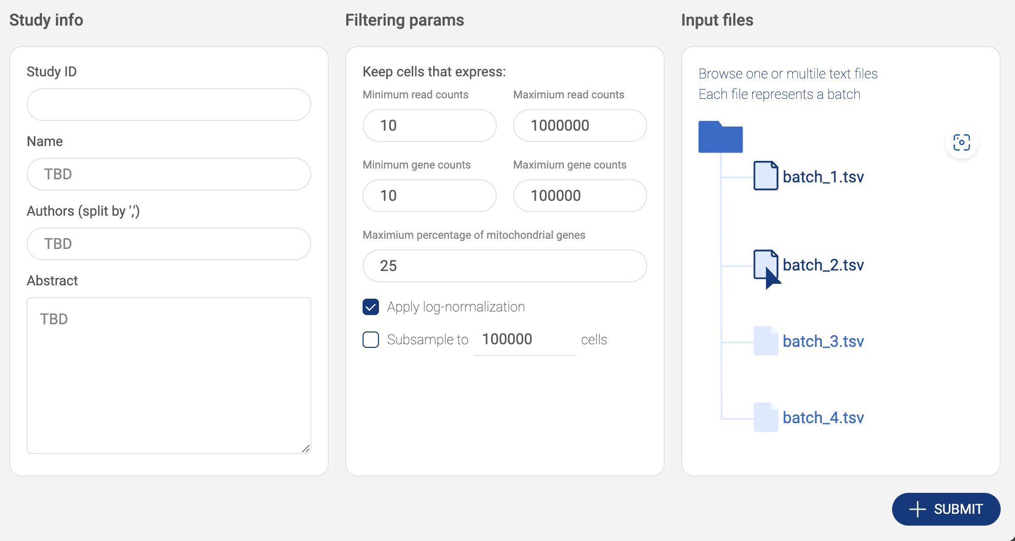
- Choose “CellRanger .mtx output”. Then, fill in the submit form.

- Study info: Basic information includes Study ID, Name, Authors and Abstract.
- Filtering parameters: Allow you to keep only high-quality cells.
- The parameters include the minimum and the maximum number of reads, the minimum and the maximum number of detected genes, and the maximum percentage of mitochondrial genes.
- Apply log-normalization: Check this option if your data is raw count data.
- Subsample: If you want to submit only a subset of your dataset, check this option and specify the number of cells. We support geometric sketching (Hie et al. 2019), an efficient method to sample a small representative subset of cells from massive datasets while preserving biological complexity.
- Input files: Click on the input file area to select the data file. The upload window will appear.
- Click the “UPLOAD” button to submit files from your local computer.
- Click the “AWS S3” button to submit files from Amazon S3. BBrowserXwill ask you to configure your S3 buckets in the settings page if you have not added any buckets (See “2.2. Configuring your Amazon S3 bucket”). On the AWS window, for each matrix, select 3 files - barcode.tsv, features.tsv and matrix.txt. Press down Ctrl/Cmd to select multiple files. Then click “SELECT”.
- The selected matrix is listed in the input file area. If your dataset contains more than one matrix, select one matrix at a time, then click the icon to select another matrix.

- After everything is set. Click the “SUBMIT” button. The data is processed and the newly added will be shown on the “Study list”.
2.3.2. Submitting a CellRanger .h5 file
- Click the “ADD STUDIES” button to start submitting a dataset.
- Choose “CellRanger .h5 output”. Then, fill in the submit form.


- Study info: Basic information includes Study ID, Name, Authors and Abstract.
- Filtering parameters: Allow you to keep only high-quality cells.
- The parameters include the minimum and the maximum number of reads, the minimum and the maximum number of detected genes, and the maximum percentage of mitochondrial genes.
- Apply log-normalization: If your data is raw count data, check this option.
- Subsample: If you want to submit only a subset of your dataset, check this option and specify the number of cells. We support geometric sketching (Hie et al. 2019), an efficient method to sample a small representative subset of cells from massive datasets while preserving biological complexity.
- Input files: Click on the input file area to select the data file. The upload window will appear.
- Click the “UPLOAD” button to submit files from your local computer.
- Click the “AWS S3” button to submit files from Amazon S3. BBrowserXwill ask you to configure your S3 buckets in the settings page if you have not added any buckets (See “2.2. Configuring your Amazon S3 bucket). On the AWS window, select one or multiple .h5/.hdf5 files. Press down Ctrl/Cmd to select multiple files. Then click “SELECT”.
- Selected files are listed in the input file area. Click the icon to select another file.
- After everything is set. Click the “SUBMIT” button. The data is processed and the newly added will be shown on the “Study list”.
2.3.3. Submitting a Scanpy object
- Click the “ADD STUDIES” button to start submitting a dataset.
- Choose “Scanpy object”. Then, fill in the submit form.
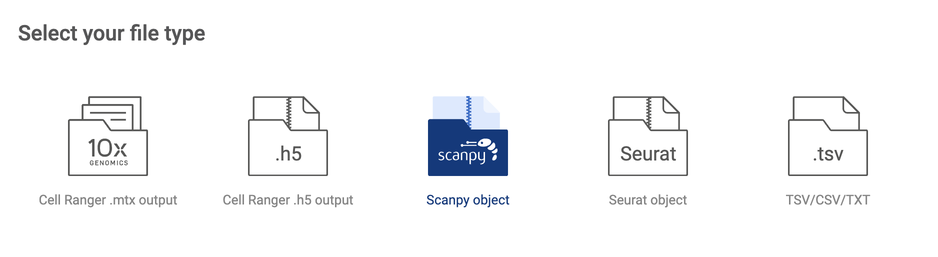
- Study info: Basic information includes Study ID, Name, Authors and Abstract.
- Filtering parameters: Allow you to keep only high-quality cells.
- The parameters include the minimum and the maximum number of reads, the minimum and the maximum number of detected genes, and the maximum percentage of mitochondrial genes.
- Apply log-normalization: If your data is raw count data, check this option.
- Subsample: If you want to submit only a subset of your dataset, check this option and specify the number of cells. We support geometric sketching (Hie et al. 2019), an efficient method to sample a small representative subset of cells from massive datasets while preserving biological complexity.
- Input files: Click on the input file area to select the data file. The upload window will appear.
- Click the “UPLOAD” button to submit files from your local computer.
- Click the “AWS S3” button to submit files from Amazon S3. BBrowserXwill ask you to configure your S3 buckets in the settings page if you have not added any buckets (See “2.2. Configuring your Amazon S3 bucket”). On the AWS window, select one or multiple .h5ad files. Press down Ctrl/Cmd to select multiple files. Then click “SELECT”.
- Selected files are listed in the input file area. Click the icon to select another file.
- After everything is set. Click the “SUBMIT” button. The data is processed and the newly added will be shown on the “Study list”.
2.3.4. Submitting a Seurat object
- Click the “ADD STUDIES” button to start submitting a dataset.
- Choose “Seurat object”. Then, fill in the submit form.


- Study info: Basic information includes Study ID, Name, Authors and Abstract.
- Filtering parameters: Allow you to keep only high-quality cells.
- The parameters include the minimum and the maximum number of reads, the minimum and the maximum number of detected genes, and the maximum percentage of mitochondrial genes.
- Apply log-normalization: If your data is raw count data, check this option.
- Subsample: If you want to submit only a subset of your dataset, check this option and specify the number of cells. We support geometric sketching (Hie et al. 2019), an efficient method to sample a small representative subset of cells from massive datasets while preserving biological complexity.
- Input files: Click on the input file area to select the data file. The upload window will appear.
- Click the “UPLOAD” button to submit files from your local computer.
- Click the “AWS S3” button to submit files from Amazon S3. BBrowserXwill ask you to configure your S3 buckets in the settings page if you have not added any buckets (See “2.2. Configuring your Amazon S3 bucket”). On the AWS window, select one or multiple .rds files. Press down Ctrl/Cmd to select multiple files. Then click “SELECT”.
- Selected files are listed in the input file area. Click the icon to select another file.
- After everything is set. Click the “SUBMIT” button. The data is processed and the newly added will be shown on the “Study list”.
2.3.5. Submitting a TSV/CSV/TXT full matrix
- Click the “ADD STUDIES” button to start submitting a dataset.
- Choose “Seurat object”. Then, fill in the submit form.

- Study info: Basic information includes Study ID, Name, Authors and Abstract.
- Filtering parameters: Allow you to keep only high-quality cells.
- The parameters include the minimum and the maximum number of reads, the minimum and the maximum number of detected genes, and the maximum percentage of mitochondrial genes.
- Apply log-normalization: If your data is raw count data, check this option.
- Subsample: If you want to submit only a subset of your dataset, check this option and specify the number of cells. We support geometric sketching (Hie et al. 2019), an efficient method to sample a small representative subset of cells from massive datasets while preserving biological complexity.
- Input files: Click on the input file area to select the data file. The upload window will appear.
- Click the “UPLOAD” button to submit files from your local computer.
- Click the “AWS S3” button to submit files from Amazon S3. BBrowserXwill ask you to configure your S3 buckets in the settings page if you have not added any buckets (See “2.2. Configuring your Amazon S3 bucket”). On the AWS window, select one or multiple .tsv/.csv/.txt files. Press down Ctrl/Cmd to select multiple files. Then click “SELECT”.
- Selected files are listed in the input file area. Click the icon to select another file.
- After everything is set. Click the “SUBMIT” button. The data is processed and the newly added will be shown on the “Study list”.
2.4. Creating a system of standardized annotation
BBrowserX allows you to build your own system of controlled vocabularies within a shared workplace. This system ensures that all members within a workplace use the same controlled terminology, which facilitates collaboration. The controlled vocabularies are structured into different ontology trees.
To manage your ontologies, click on “Ontologies” to see all the ontology trees.

By default, some ontology trees from BioTuring are added as references.
To create a new tree, click the “CREATE ROOT” button to create a root. The newly added root will be listed under the button along with the existing roots.
Click on a node and use the available tools on the top to build up your tree. Descriptions of the tools are available in the table below.
Add a node. A pop-up window will appear allowing you to fill in a name and a description for your new node. The new node will be a child of the selected node. | |
Remove the selected node. | |
Edit the selected node. | |
Move the selected node. A pop-up window will appear allowing you to select a new parent for the node. |


When a node is selected, the 'ASSIGNMENT OVERVIEW' section displays all the labels that are associated with that node.
2.5. Sharing a dataset with a collaborator
When you are analyzing a dataset, you can share it with a colleague. To do this, use the button on the Toolbar in the single-study interface (See “3.3 Toolbar”):

- If you share a dataset in your “Personal workspace”, you can add a colleague as either a viewer or an editor. All collaborators are listed, and you can review their access anytime. The shared dataset will appear in the “Shared with me” tab in their “Studies list” (See 2.1 Navigating the data management page).
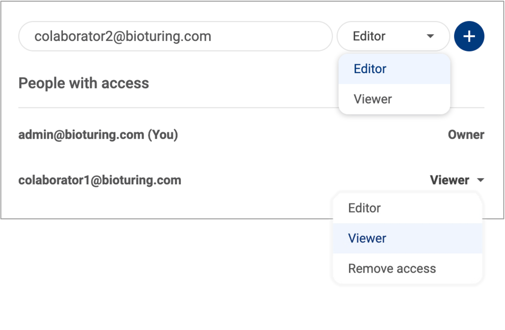
- If you share a dataset in a shared workspace, the link to the dataset will be copied to your clipboard. Only members of the shared group can access the dataset using the link.
- When you share a public dataset from the BioTuring database, the link to the dataset will be copied to your clipboard. Only users with an active license can access it.
3. BBrowserX SINGLE STUDY INTERFACE
The interface of BBrowserX consists of a scatter plot, the Metadata panel, the Gene query panel, the Toolbar, and the Sidebar. The following subsections explain how to navigate the interface.

3.1. Scatter plot
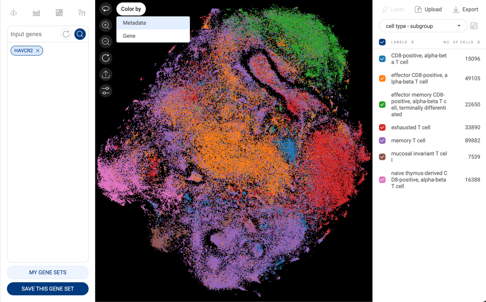
The scatter plot is in the center of the interface. It is either a t-SNE or UMAP of all the cells in the dataset. Each point represents one cell. The cells are colored by the different groups in the metadata panel on the right-hand side.
You can interact with the plot by using the tools in the top left corner. The description of the tools is presented in the table below.
Lasso | The lasso tool is used to draw closed paths on the scatter plot. Cells lying within the path are selected and shown in bigger-size dots. Press down the Ctrl/Cmd key to select multiple groups. When the lasso mode is not active, the default mode allows you to drag the plot around. |
Zoom in | Click on the button to zoom in, or scroll up with your mouse when the cursor is within the plot. |
Zoom out | Click on the button to zoom out, or scroll down with your mouse when the cursor is within the plot. |
Reset | Set the zoom level and position of the plot to the default setting. The selected cells are also reset. |
Point size | Change the size of each dot. The size range is from 1px to 10px. When there are selected cells, the point size is applied only to those cells. Unselected cells are shown with the smallest point size (1px). |
Export | Export the scatter with the currently selected metadata to BioVinci for further editing. |


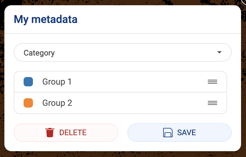
3.2. Metadata panel
The metadata panel is on the right-hand side of the interface. This section enables users to utilize all the available metadata from the authors and BioTuring, or add and edit your own metadata.
3.2.1. Visualizing a metadata field on the scatter plot
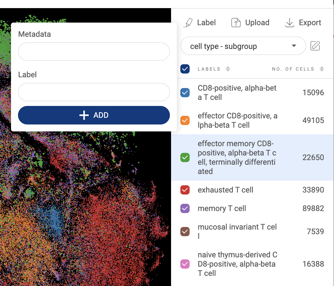
- Click on the dropdown menu to show all the available metadata: Authors’ metadata, BioTuring’s Standardized metadata, or User’s metadata.
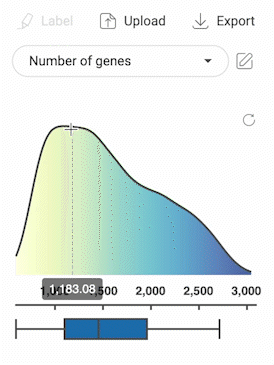
- Click on one metadata field to select. For categorical metadata, different groups of the metadata field and their respective number of cells are shown under the dropdown menu and are visualized with different colors on the scatter plot. For numerical metadata, a distribution plot and a box plot are shown.
- For categorical metadata, check/uncheck the box next to a group name to show/hide a particular group on the scatter plot.
- To change the color palette, click the button. In the pop-up window, switch to the “Color palette” tab. You can change the color palette for categorical metadata, numerical metadata and expression value. Click “SAVE” to save your changes.


3.2.2. Selecting cells with categorical metadata
- Besides the lasso tool, you can select a group of cells by clicking on the group name in the metadata panel. The dots on the scatter plot representing the cells from this group are enlarged.
- When a group is selected, clicking on another group will deselect the previously selected group(s).
- Similar to the lasso tool, press down Ctrl/Cmd to select multiple groups.
- The number of selected cells is shown on the top of the scatter plot.
3.2.3. Selecting cells with numerical metadata
- When a numerical metadata field is selected, you can select cells that have values belonging to a range by holding down the left mouse button, and then dragging the pointer on the distribution plot. The upper bound, lower bound, and position of the range can be changed as described in the image below.
- Selecting another range will not remove the previously selected range(s).
- Click the button in the top right corner of the distribution plot to remove all selections.
- The number of selected cells is shown on the top of the scatter plot.

3.2.4. Annotating a group of cells
- Select a group of cells using the lasso tool or group name(s) as described above.
- Click the button. A pop-up window will appear.

- The first input is the metadata field. When you type in a field name, a dropdown menu is shown below the input box. If you want to create a new metadata field, select “Create [field name]”. If you want to append the selected cells to an existing field, select “Append to [field name]”.
- The second input is the label, or group name, for the selected cells. Similar to metadata field input, you can either create a new group name or append selected cells to an existing group name.
- After filling in the metadata field and group name for the selected cells, click “ADD”.
- Other cells in the dataset which are not assigned any labels in a metadata field will appear as “Unassigned” as default. To remove a label, just select the label and append the cells to the “”Unassigned” label.
- New metadata added by users will be saved under “Your metadata” in the dropdown menu.
3.2.5. Editing or deleting a metadata field
- Click on the button. The edit pop-up window will appear. You can only edit or delete your metadata. Authors’ metadata and BioTuring’s metadata can’t be modified or removed.
- To edit the metadata, replace the metadata field and group names then click the “SAVE” button to save.
- To delete the selected metadata, click the “DELETE” button.

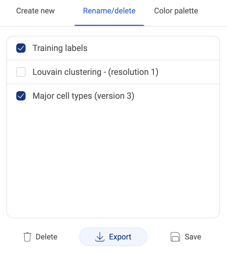
3.2.6. Editing or deleting multiple metadata fields
- To make changes to multiple metadata fields, click the button. In the pop-up window, switch to the “Rename/delete” tab.

- To edit a metadata field, replace the metadata field with a new name, then click the “SAVE” button.
- To delete metadata fields, check the boxes next to the field names, then click the “DELETE” button.
3.2.7. Combining existing metadata fields
- New metadata can be created by combining existing metadata fields. A new metadata field will contain all the combinations of the existing fields you select.
- To start combining metadata, click the button. In the pop-up window, under the “Create new” tab, file in the field name and select up to three metadata fields to combine.
- Finally, click “COMBINE”. The new metadata will be saved under “Your metadata”.
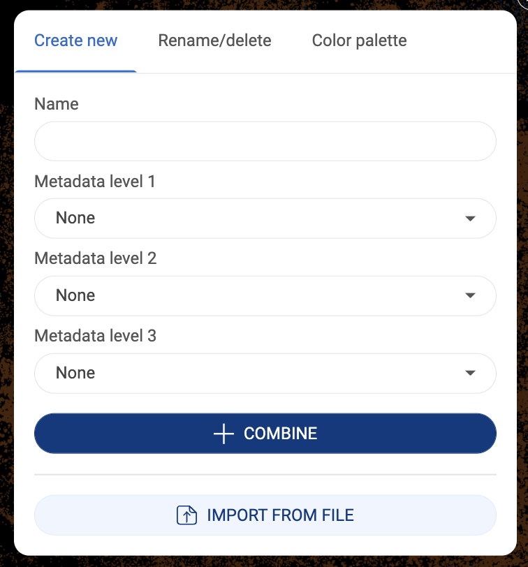
3.2.8. Importing metadata
- Instead of annually annotating each group, you can upload a metadata file under the format of .tsv or .csv.
- The first row of the file must contain headers including “barcodes” and metadata field(s). The first column must be the barcodes of all or a subset of the cells in the dataset. An example is shown below.

- To import a metadata file, click the button. In the pop-up window, under the “Create new” tab, click “IMPORT FROM FILE”.
- Uploaded metadata will be saved under “Your metadata”.
3.2.9. Exporting metadata
- Metadata that you imported or created can be exported into a .tsv file. To export all added metadata, click the button. Then, select “Metadata”. The file will be downloaded to your computer.

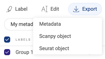
- To export specific metadata fields instead of all added metadata, click thebutton. In the pop-up window, switch to the “Rename/delete” tab. Then, check the boxes next to the field names you want to export and click the “EXPORT” button.
3.2.10. Exporting a dataset
To export a dataset, click the button. Then, select one of the two formats:
- Scanpy object: A .h5ad file will be downloaded to your computer.
- Seurat object: A .rds file will be downloaded to your computer.
3.3. Gene expression panel
The gene expression panel provides users with important tools to explore the gene expression level of any cell in a dataset and create different types of visualizations. This panel contains a gene query box and visualization tools at the top.

3.3.1. Querying genes with the query box
- Move the cursor to the box and type in a gene name or a list of genes.
- While you are typing a gene, genes that match your input will be listed below the input. Click on a suggestion to add the gene to the search list.
- Another method of adding genes is to copy and paste. When you copy more than one gene, they should be separated by commas, spaces, or line breaks.
- Added gene(s) will be shown on the box in individual tags.
- Click on the icon in a gene tag to remove a gene. Click on the icon to remove all the added genes.
- Click on the icon, or press “Enter”, to see the expression profile of the added gene(s) on the scatter plot. When there is more than one gene added to the box, click on a gene name tag to show only its expression on the scatter plot.


3.3.2. Saving a gene set
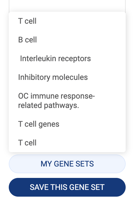
- When a list of genes is added to the search box, you can save them as a gene set for later use.
- Make sure the gene set is added to the query box and click the “SAVE THIS GENE SET” button. A popup window that allows you to set a name and modify the gene set will appear.
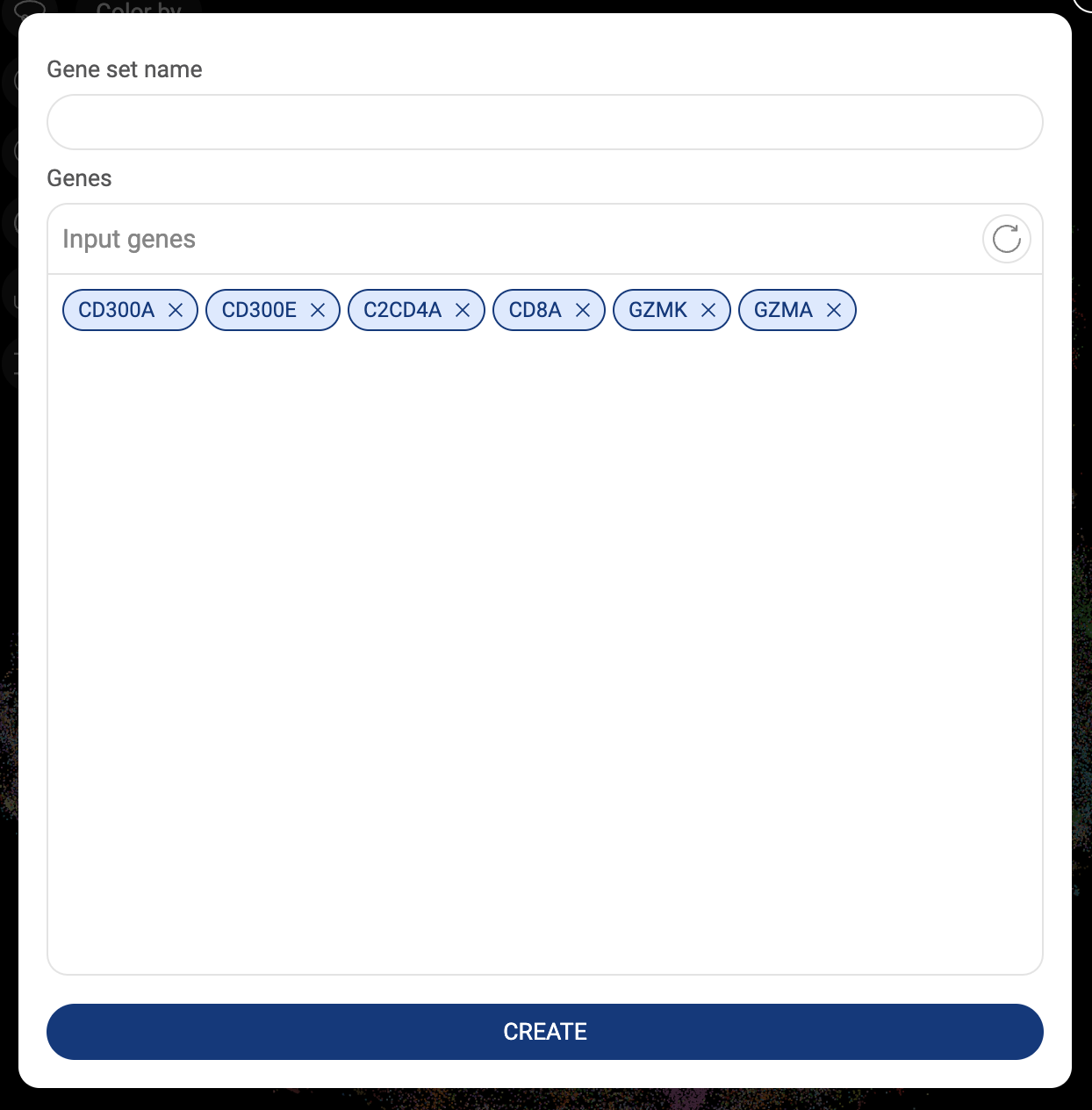
- Click the “CREATE” button to save the gene set.
- Click the “MY GENE SETS'' button to show all of your saved gene sets. Click on a gene set name to add it to the query box. Your gene sets can also be accessed in your library (See the Talk2Data tutorials).
Five icons at top of the gene expression panel are five different types of visualizations you can create on BBrowser X. Description of the tools is in the table below.
Violin plot consists of a kernel density plot and a box plot. Violin plots are useful to display the distribution of the gene expression level. | |
Bar chart displays the mean expression value of a gene in a particular group. | |
Bubble heatmap shows the expression level and the percentage of cells expressing the queried gene(s). | |
Circos plot visualizes the gene expression in relation to different groups of a metadata field. | |
Intersection plot, or upset plot, visualizes the number of cells expressing different combinations of the queried genes. | |
Co-expression plot displays the level of co-expression between pairs of genes within the dataset based on the Jardcard score. |


Details about gene expression units and how to create different types of visualization are presented in “5. EXPLORING GENE EXPRESSION”.
3.4. Toolbar
The toolbar is at the top of the interface. It contains several important features. Each button on the toolbar is described below. Details about each function are discussed in separate sections.
Isolate selected cells to analyze. The subset is treated like a dataset, all the available features on BBrowserX can be applied to this isolated group. The button is active only when there are selected cells. Details about this feature are presented in section 6. ADVANCED FILTER WITH SUB-CLUSTERING. | |
Perform the Louvain clustering algorithm on the dataset to divide cells into different clusters. Details about this feature are presented in section 7. LOUVAIN CLUSTERING. | |
Perform either t-distributed stochastic neighbor embedding (t-SNE) or Uniform Manifold Approximation and Projection (UMAP) for visualization. Details about this feature are presented in section 8. t-SNE/UMAP. | |
Create and customize the embeddings from Principal Component Analysis (PCA). This feature is only available on the Private version of BBrowser X. Details about this feature are presented in section 9. EMBEDDINGS. | |
Perform BioTuring’s Cell Type Prediction algorithm on the dataset. Details about this feature are presented in section 10. CELL TYPE PREDICTION. | |
Perform AUCell Enrichment analysis on the dataset. Details about this feature are presented in section 11. AUCELL ENRICHMENT ANALYSIS. | |
Search for cells from BioTuring’s database that are biologically similar to selected cells. The button is active only when there are selected cells. Details about this feature are presented in section 12. CELL SEARCH. | |
Save selected cells to a custom dataset. The button is only active when there are selected cells. This feature is only available on the Public version of BBrowser X. | |
Bookmark a dataset. The dataset will appear on the “Public studies” tab in your studies list (See “2.1 Navigating the data management page”). This feature is only available on the Public version of BBrowser X. | |
Map a selected group to a term on an ontology tree. This feature is only available on the Private version of BBrowser X. Details about this feature are presented in section 4. STANDARDIZING ANNOTATIONS ACROSS STUDIES. | |
Share the current analysis via an URL, or invite other users to collaborate. Details about this feature are presented in section 2.5. Sharing a dataset with a collaborator. |


3.5. Sidebar
The Sidebar is located on the right side, containing the following functions. Details about each function are discussed in separate sections.
Create composition charts and customized heatmaps. Details about this feature are presented in section 13. COMPOSITION CHART . | |
Perform differential gene expression to find significant genes that help distinguish between two groups of cells. Details about this feature are presented in section 14. DIFFERENTIAL GENE EXPRESSION (DGE) ANALYSIS. | |
Find marker genes for selected cells. To use this feature, select a group of cells first. Details about this feature are presented in section 15. FINDING MARKER GENES. | |
Perform clonotype analysis with the output from CellRanger. Details about this feature are presented in section 16. ANALYZING TCR AND BCR DATA WITH CLONOTYPE ANALYSIS. | |
Create expressions heatmap for a list of genes. Details about this feature are presented in section 17. HEATMAP. | |
Perform trajectory inference with Monocle 2. Details about this feature are presented in section 18. PSEUDOTIME. | |
Find potential pathways that are enriched in a cell group. Details about this feature are presented in section 19. PATHWAY ANALYSIS. |


4. STANDARDIZING ANNOTATIONS ACROSS STUDIES
When you are working on a study, you can map labels of the “Original metadata” - the metadata you imported or created, to the terms on the ontology trees (See “2.4. Creating a system of standardized annotation”).
- First, click on the icon on the Toolbar. The standardized annotation window will appear.
- On the right panel, select a metadata field.
- On the first dropdown menu on top of the window, select an ontology tree. The name of an ontology tree is its root. The selected ontology will be shown.
- To map a label of the metadata field to a node on the ontology tree:

- Click on a label on the metadata panel.
- Click on a node on the ontology tree. You can scroll up/down your mouse to zoom in/zoom out and drag the tree around to find the node. Another way is to select a term on the second dropdown menu.
- Click on the icon.

- The assignment status of a label is shown on the left panel.
- On the metadata panel of the main page, the standardized annotations are available on the “Standardized metadata” tab.

5. EXPLORING GENE EXPRESSION
5.1. Expression of one single gene
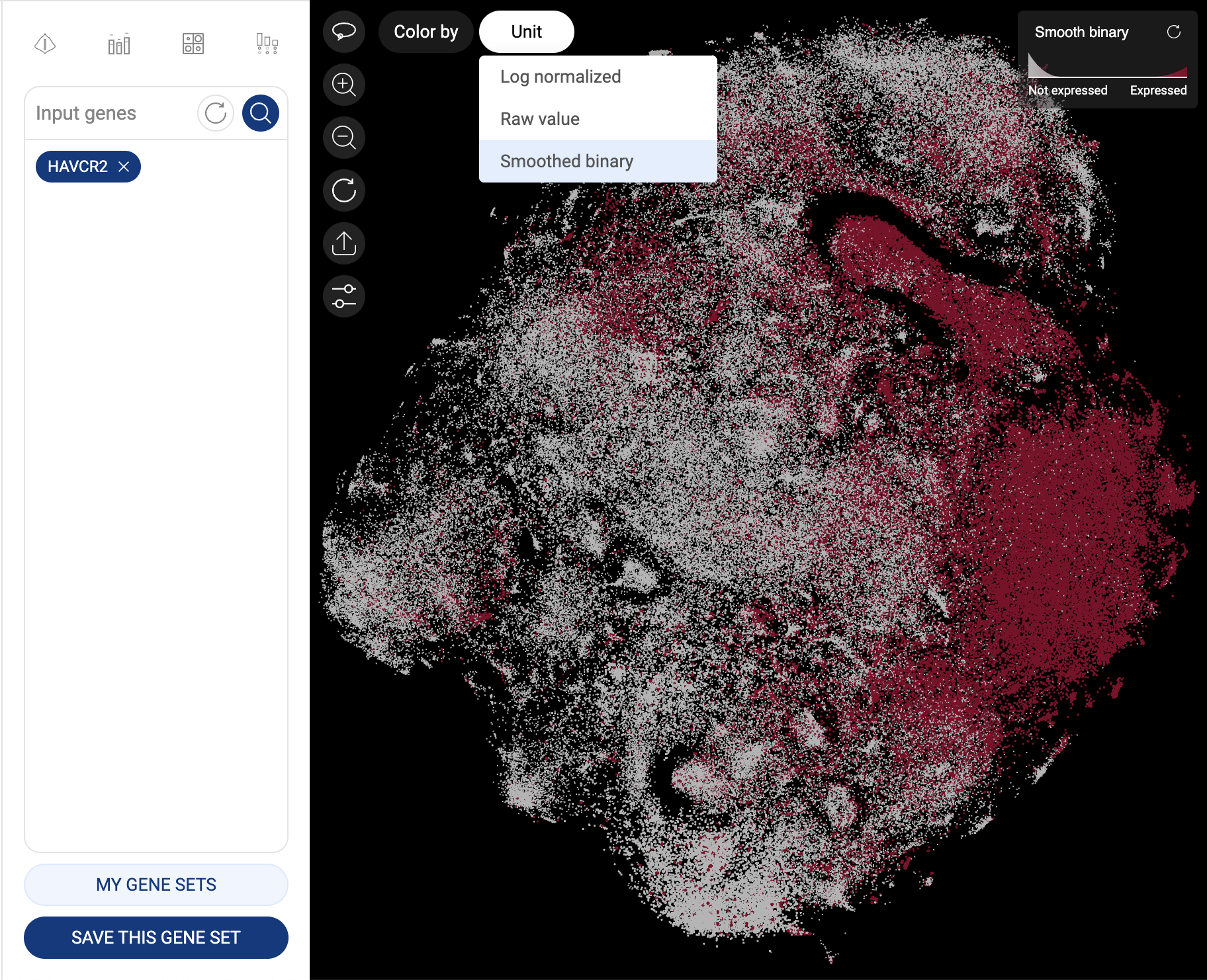
When one gene is queried, the scatter plot is automatically colored by the expression level, and the “Unit” button is shown at the top left corner of the scatter plot, allowing you to change the unit of expression. There are three types of units used on BBrowser X to show the expression level of a gene: raw count, log-normalized unit, and smoothed-binary unit. The default unit of expression is log-normalized value.
5.1.1. Raw value
Raw expression value of a gene is the UMI counts or the number of sequence reads mapped to the transcript of that gene.
5.1.2. Log-normalized
Log-normalized value are calculated as: loge(reads per million + 1)
5.1.3. Smoothed-binary
Smoothed-binary unit (Vuong et al. 2022) represents the gene expression level in a cluster as boolean values: either “expressed” or “not expressed”.
We use an entropy approach for choosing a gene expression cutoff that minimizes the clustering information loss.
This approach, when combined with the k-nearest neighbor smoothing algorithm, can help remove the background noise without overlooking drop-outs.
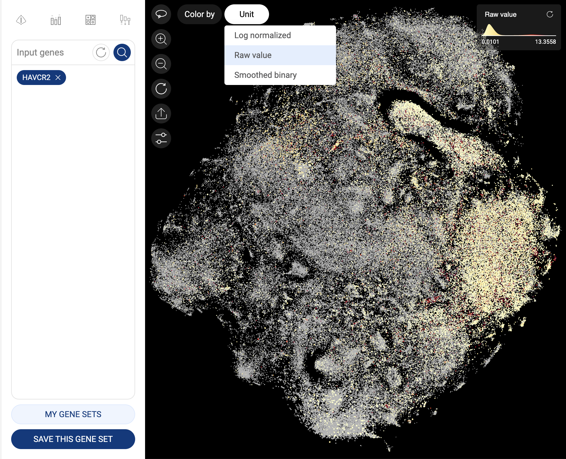
Gene expression in raw value
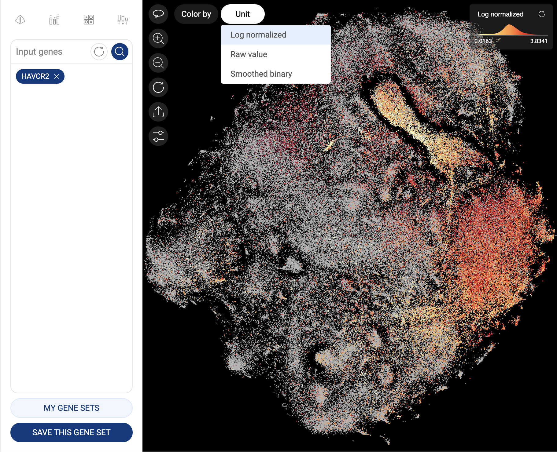
Gene expression in log-normalized unit
Gene expression in smooth-binary unit
Users can click on the “Color by” button in the top left corner of the scatter and select “Metadata” to switch back to color the scatter plot by Metadata as follows.
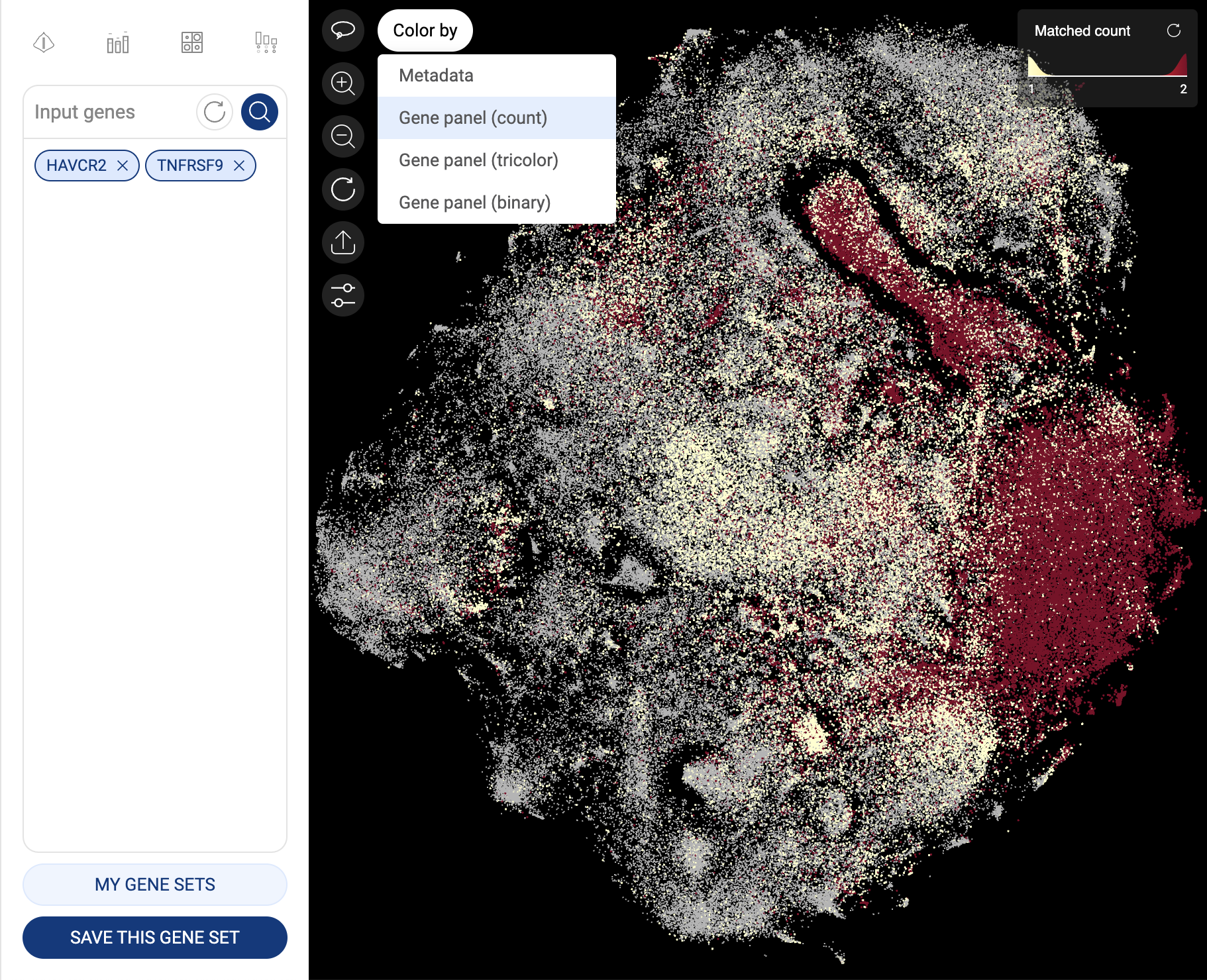
5.2. Expression of two or more genes
When you query for two or more genes (a gene panel), the expression of a gene in a cell is based on whether at least one transcript of that gene is detected in the cell. In other words, a cell is identified as expressing a gene when the raw count and log-normalized expression of that gene in the cell are larger than zero.
To change the color mode, click on the “Color by” button. Four available color modes are:
- Gene panel (count): each cell is colored based on the number of genes in the panel that express in that cell. This is the default mode when three or more genes are queried.
- Gene panel (tricolor): This mode is only available and is the default mode for a panel of two genes. Cells are colored in three colors: cells expressing the first gene (in the query order) are colored red, those expressing the second gene are colored blue, and those expressing both genes are colored yellow.
- Gene panel (binary): cells are colored based on whether they express all genes in the panel (“All expressed”), or not.
- Metadata: Cells are colored based on the metadata.
Cells are colored based on gene count

Cells are colored in the tricolor mode
5.3. Gene expression visualization
5.3.1. Violin plot
- Click the icon on top of the gene query box. You will be directed to the Violin plot page.
- The plots for the gene(s) added to the gene query box will be created. Change the input genes on the query box and click the button to create new plots.
- The white dots represent the means. Hover the mouse over a plot to see the detailed information about Mean, Q1, Q3, Q1 - 1.5IQR, Q3 + 1.5IQR.
- Select a metadata field on the right panel to generate plots for each group of the field. Check/uncheck a box next to a group label to show/hide the respective plot.
- Select a metadata field in the “Split by” section to split the plots by the different groups of the selected metadata fields.
- Click the button to export the plots to Vinci for further editing.
- You can switch between different plots with the tools at the top of the page.


5.3.2. Bar chart
- Click the icon on top of the gene query box. You will be directed to the Bar chart page.
- The plots for the gene(s) added to the gene query box will be created. Change the input genes on the query box and click the button to create new plots.
- The error bars represent the 95% confidence intervals. Hover the mouse over a plot to see the detailed information about mean expression value, number and percentage of cells expressing the gene within the group.
- Select a metadata field on the right panel to generate plots for each group of the field. Check/uncheck a box next to a group label to show/hide the respective plot.
- Select a metadata field in the “Split by” section to split the plots by the different groups of the selected metadata fields.
- Click the button to export the plots to Vinci for further editing.
- You can switch between different plots with the tools at the top of the page.

5.3.3. Bubble heatmap
- Click the icon on top of the gene query box. You will be directed to the Bubble heatmap page.
- The plots for the gene(s) added to the gene query box will be created. Change the input genes on the query box and click the button to create new plots.
- The sizes of the dots represent the percentages of cells that express the gene, or the coverage. The color represents the level of expression of a gene. The darker the color, the higher level of gene expression. Hover the mouse over a plot to see the detailed information about mean expression value, number and percentage of cells expressing the gene within the group.
- Click on the “Scale mode” toggle button to switch between “Absolute” and “Relative”:

- Absolute: The sizes of the circles are scaled from 1% to 100%.
- Relative: The sizes of the circles are scaled from the smallest value to the largest value. This mode amplifies the difference between two values.
- Select a metadata field on the right panel to generate plots for each group of the field. Check/uncheck a box next to a group label to show/hide the respective plot.
- Select a metadata field in the “Split by” section to split the plots by the different groups of the selected metadata fields.
- Click the button to export the plots to Vinci for further editing.
- You can switch between different plots with the tools at the top of the page.
5.3.4. Circos plot
- Click the icon on top of the gene query box. You will be directed to the Circos plot page.
- The plots for the gene(s) added to the gene query box will be created. Change the input genes on the query box and click the button to create new plots.
- A flow represents the expression level of a gene in a group.
- Select a metadata field on the right panel to generate plots for each group of the field. Check/uncheck a box next to a group label to show/hide the respective plot.
- Select a metadata field in the “Split by” section to split the plots by the different groups of the selected metadata fields.
- Click the button to export the plots to Vinci for further editing.
- You can switch between different plots with the tools at the top of the page.

5.3.5. Intersection plot
- Click the icon on top of the gene query box. You will be directed to the Intersection plot page.
- At least two genes are required to create an intersection plot. Input genes into the query box and click the button to create new plots.
- The matrix at the bottom shows different combinations of the input genes, and the bars represent the number of cells that express the respective combinations.
- Select a metadata field on the right panel to visualize the number of cells of each group of the field on a bar. Check/uncheck a box next to a group label to show/hide the respective plot. Hover the mouse over a bar to see the number of cells of the groups made up the bar.
- Select a metadata field in the “Split by” section to split the plots by the different groups of the selected metadata fields.
- Click the button to export the plots to Vinci for further editing.
- You can switch between different plots with the tools at the top of the page.

5.3.6. Coexpressed genes plot
- Click the icon on top of the gene query box. You will be directed to the Coexpressed genes page.
- The Co-expression function displays the level of co-expression between pairs of genes within the atlas based on the Jardcard score:

- When you query a list of genes, the co-expression matrix will show the co-expression level of all the combinations of two genes from the list.
- When you query for one gene, the co-expression matrix will show up to 50 genes with the highest co-expression levels in the atlas with the gene you query. By default, BBrowserX shows the top 10 co-expressed genes. You can choose to show more genes (up to 50 genes).
- The co-expression level of each pair is represented by a dot. The sizes and colors of the dots reflect the Jaccard scores.
- Click on the “Scale mode” toggle button to switch between “Absolute” and “Relative”:
- Absolute: The sizes and colors of the dots are scaled from 0 to 1.
- Relative: The sizes and colors of the dots are scaled from the smallest value to the largest value. This mode amplifies the difference between two values.
- On the main plot, hover your mouse over a dot to see details about the Jaccard score and the number of cells co-expressing the two genes.
- Click on the dot to see a Venn diagram describing the co-expression of two genes and the correlation plot on the panel and on the right-hand side.
- Finally, you can export the co-expression matrix to BioVinci for further editing by clicking on the icon.
6. ADVANCED FILTER WITH SUB-CLUSTERING
Sub-clustering allows you to isolate selected cells from the whole dataset into a separate scatter plot. Despite its simplicity, this feature can be utilized to extract any cell clusters for further analysis. You can perform sub-clustering as many times as you want until only your group of interest is present on the screen.
In the example below, we want to extract exhausted CD8 T cells in Breast Cancer from a dataset containing multiple subsets of T cells in various cancer types.
The first step is to select the “Breast Cancer” group in the metadata field “Cancer type”. When you click the “Sub-clustering” button, cells belonging to “Breast Cancer” are extracted and shown on the scatter plot.
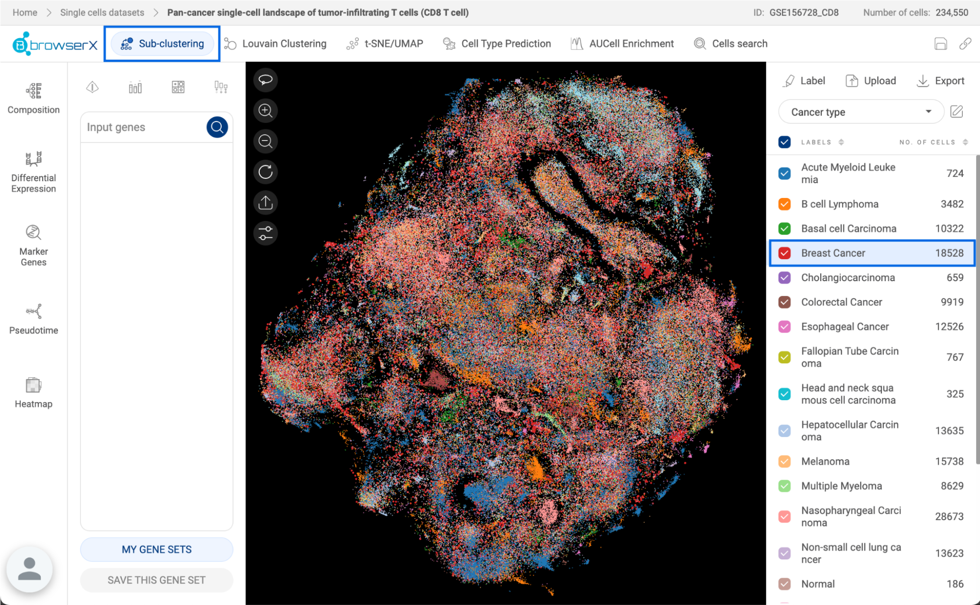
Select the “Breast Cancer” group and click the “Sub-clustering” button.
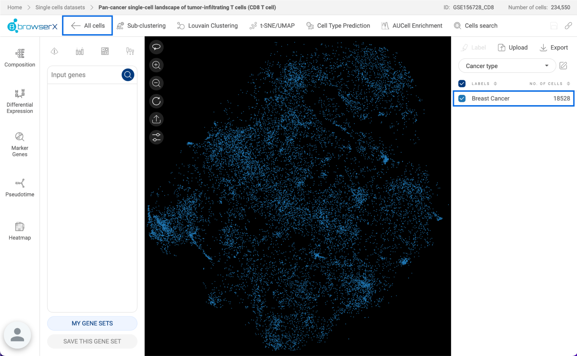
The cells belonging to “Breast Cancer” are extracted.
When you switch the metadata to “Author’s cell type”, all subtypes of T cells in “Breast Cancer” are shown. Similar to the first step, you can select “exhausted CD8 T cell” from the metadata and perform Sub-clustering a second time.

Different T cell subtypes in “Breast Cancer”
The cells of interest - exhausted CD8 T cells in Breast Cancer are extracted. You can select the cells and create a label for the extracted cells under a new metadata field.

The “Sub-clustering” feature only separates selected cells from the rest, you can perform Louvain Clustering, t-SNE, UMAP, or any other advanced features on this subset of cells.
When you are done with your analysis on the subset, click the “All cells” button to go back to the whole dataset.
7. LOUVAIN CLUSTERING
This algorithm uses 50 principal components that are identified by Principal Component Analysis, or PCA, to group cells into different groups based on their similarities.
7.1. On the Private version of BBrowser X
To perform Louvain Clustering on a dataset, click the “Louvain Clustering” button on the Toolbar. A popup window will appear, allowing you to adjust two parameters:
- Input embedding: Choose one of the embeddings available for the dataset. To generate a new PCA embedding, see “9. EMBEDDINGS”.
- Resolution: The higher the resolution, the higher the number of clusters. The default resolution is 1.
After setting the parameters, click the “Run” button. The clustering result will be saved as a new metadata field under “Your Metadata” and displayed on the scatter plot.
7.1. On the Public version of BBrowser X
To perform Louvain Clustering on a dataset, click the “Louvain Clustering” button on the Toolbar. A popup window will appear, allowing you to adjust two parameters:
- Batch correction - Harmony: Choose the input embeddings.
- In this public version, we provide two default PCA embeddings, one is applied Harmony batch correction and the other is not.
- Select “Default” to use the default PCA embedding which is applied the Harmony method (Korsunsky, I., Millard, N., Fan, J. et al., 2019) to remove batch effects between different groups of the metadata “Sample ID”, as input.
- Select “None” to perform clustering on the PCA embedding without batch correction.
- Resolution: The higher the resolution, the higher the number of clusters. The default resolution is 1.
After setting the parameters, click the “Run” button. The clustering result will be saved as a new metadata field under “Your Metadata” and displayed on the scatter plot.
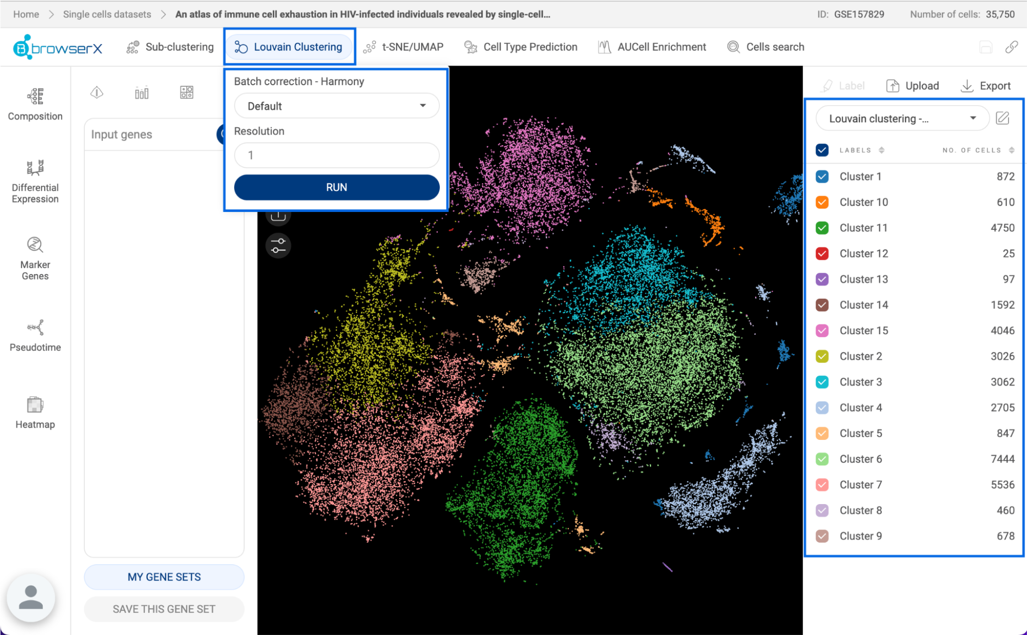
8. t-SNE/UMAP
BBrowserX supports two methods: t–Stochastic Neighbor Embedding (Van der Maaten and Hinton, 2008) or t-SNE, and Uniform Manifold Approximation and Projection (McInnes et al., 2018) or UMAP. From the PCA embeddings with 50 principal components, t-SNE/UMAP will continue to reduce to 2 dimensions to achieve a 2D visualization.
8.1. On the Private version of BBrowser X
Click on the “tSNE/UMAP” button on the Toolbar to open the tSNE/UMAP window:
- Input embedding: Choose one of the embeddings available for the dataset. To generate a new PCA embedding, see “9. EMBEDDINGS”.
- Method: Choose between t-SNE or UMAP.
- For t-SNE, you need to set the perplexity, which is a guess about the number of close neighbors of each cell. The default perplexity is 30.
- For UMAP, you need to set the number of neighbors. The default number of neighbors is 30.
- You can also import a .tsv file containing the coordinate of each cell. The first row of the file must contain headers. The first column must be the barcodes of all or a subset of the cells in the dataset, the next columns must be the x-coordinates and y-coordinates. An example is shown below.

Generated t-SNE and UMAP are listed in the “Previous results” section. The PCA embeddings are also included in this list. When a PCA embedding is selected, the first two principal components will be used.

8.2. On the Public version of BBrowser X
To run t-SNE or UMAP on a dataset, click the “t-SNE/UMAP” button on the Toolbar. A popup window will appear, allowing you to adjust the following parameters:
- Batch correction - Harmony: Choose the input embeddings.
- In this public version, we provide two default PCA embeddings, one is applied Harmony batch correction and the other is not.
- Select “Default” to use the default PCA embedding which is applied the Harmony method (Korsunsky, I., Millard, N., Fan, J. et al., 2019) to remove batch effects between different groups of the metadata “Sample ID”, as input.
- Select “None” to perform clustering on the PCA embedding without batch correction.
- Method: Choose between t-SNE or UMAP.
- For t-SNE, you need to set the perplexity, which is a guess about the number of close neighbors of each cell. The default perplexity is 30.
- For UMAP, you need to set the number of neighbors. The default number of neighbors is 30.
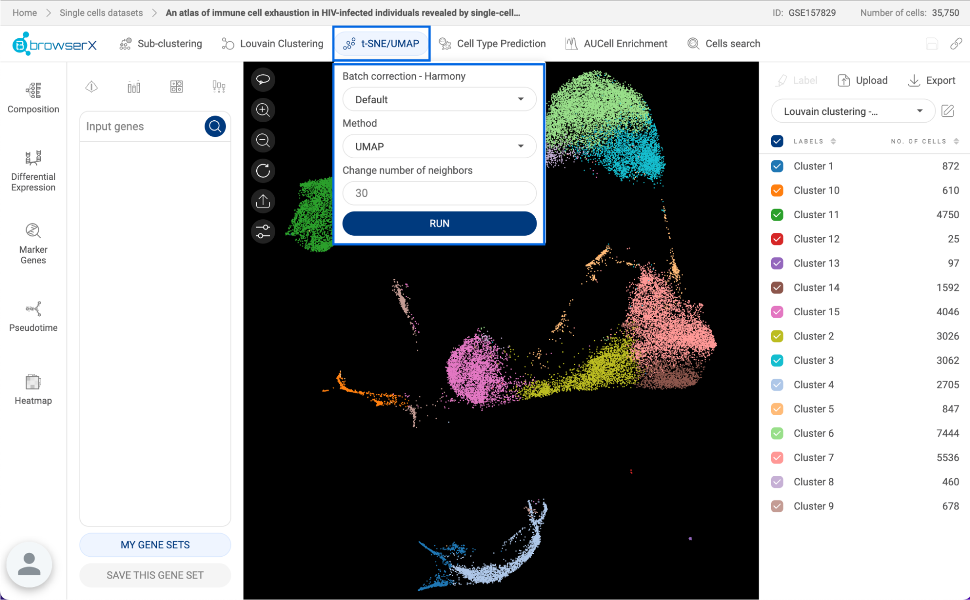
9. EMBEDDINGS
This feature is only available on the private version of BBrowserX, which allows you to customize the embeddings used for Louvain clustering, t-SNE, and UMAP. On the Public version of BBrowserX, two types of PCA embeddings are provided and can be selected when setting the configuration for Louvain clustering, t-SNE, and UMAP.
Click on the “Embeddings” button on the Toolbar to open the embedding window.
- All embeddings are listed in the “Previous results” section. “PCA (no batch corrected)” is the raw PCA embedding without batch correction. “Harmony (Sample ID)” is the PCA embedding that goes through the Harmony batch correction algorithm.
- When you select a PCA embedding, a t-SNE plot with the default perplexity equal to 30 is automatically generated from the PCA embedding and shown on the scatter plot. If the dataset contains more than 200,000 cells, an UMAP will be created.
- To create a new embedding that applies Harmony batch correction between groups of another metadata field other than “Sample ID”, select one metadata field in the dropdown menu in the “Create new” section and click “RUN”.
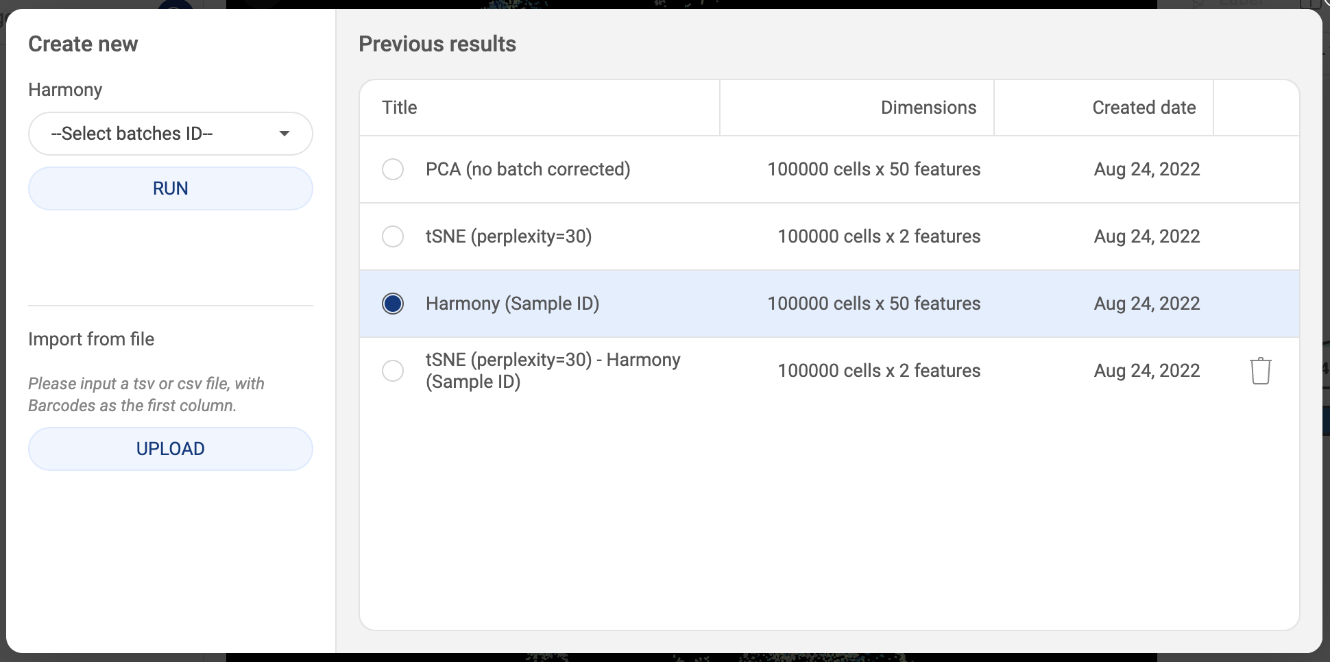
- You can also import a .tsv or .csv file containing the coordinate of each cell. The first row of the file must contain headers. The first column must be the barcodes of the cells in the dataset, the next columns must contain the principal components. An example is shown below.
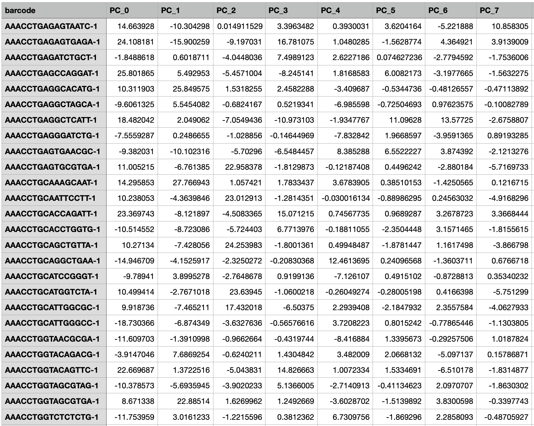
10. CELL TYPE PREDICTION
This feature allows you to automatically label cells in your dataset using a machine learning model from BioTuring, your own training labels, or custom gene sets.
10.1. Predicting using BioTuring Cell Type Prediction model
This function is a supervised classification-based tool to annotate cell types and subtypes. The algorithm is trained with the BioTuring curated database containing millions of cells. The function allows the classification of 54 major cell types and 183 subtypes and cancer cells of different origins. A list of predictable cell types can be found here.
The function allows the prediction of cell types at the major cell types level or cell subtypes level. For each domain, there are three versions for the human data and two versions for mouse data. The versions used different training data.

To run the BioTuring Cell Type Prediction algorithm on a dataset, click the “Cell Type Prediction” button. Then, on the “BioTuring” tab, choose one of the prediction models.
The prediction result will be saved as a new metadata field under “Your metadata” and displayed on the scatter plot.
10.2. Predicting using training labels
This function allows you to use one metadata field annotating part of the dataset as training labels for the algorithm to learn and annotate the whole dataset.
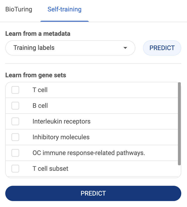
To predict using training labels, click the “Cell Type Prediction” button. Then, switch to the “Self-training” tab, select the metadata field containing the training labels in the “Learn from a metadata” section, then click the “PREDICT” button next to the metadata field.
The prediction result will be saved as a new metadata field named “Predicted from [selected metadata field]” under “Your metadata”.
10.3. Predicting using gene sets
This function allows you to use gene sets as reference to annotate a dataset.
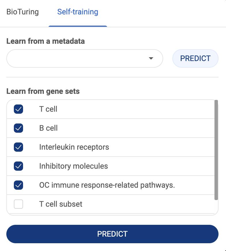
To predict using training labels, click the “Cell Type Prediction” button. Then, switch to the “Self-training” tab, select the gene sets in the “Learn from gene sets” section, then click the “PREDICT” button. See “3.3.2. Saving a gene set” on how to add a custom gene set.
The prediction result will be saved as a new metadata field named “Predicted from gene sets” under “Your metadata”.
11. AUCELL ENRICHMENT ANALYSIS
AUCell (Aibar et al., 2017) is an algorithm to identify cells in a single-cell dataset with an active gene set. For an input gene set, AUCell evaluates the activity of the gene set in each cell based on the ranking of all genes and returns a score. A high AUCell score means that the gene set is highly enriched in a cell.
To perform enrichment analysis on a dataset, click the “AUCell Enrichment” button. The AUCell popup window will appear as shown below:
- Save as: A name for your enrichment analysis. This will be part of the metadata name created to save your enrichment analysis.
- Gene set: Select a gene set that you saved. See how to save a gene set at “3.3. Gene expression panel”.
- Input genes: Instead of using a saved gene set, you can type or paste your genes into this box. If you have added genes to the query box on the main page, these genes will be automatically added to this box. Click on the icon in a gene tag to remove a gene. Click on the icon to remove all the added genes.
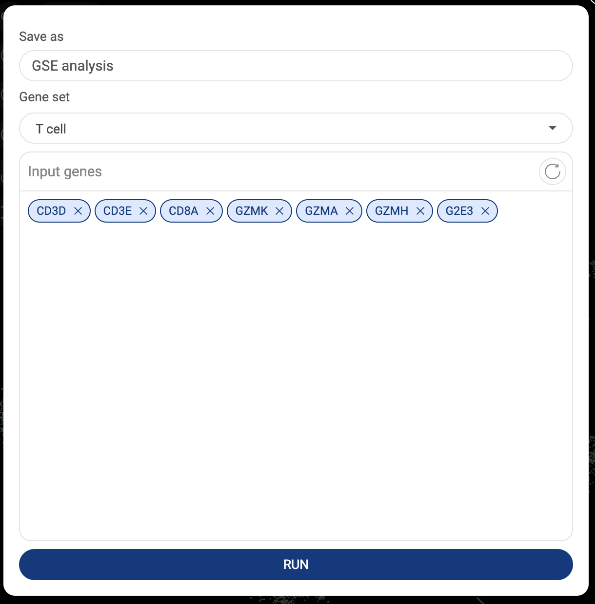
Finally, click the “RUN” button. The AUCell scores for each cell are saved as a new numerical metadata field named [Enrichment analysis name] - AUCell score] under “Your metadata”.

12. CELL SEARCH
Cell search is an advanced algorithm to search for similar cell populations in BioTuring’s single-cell database. The algorithms are not based on annotations from the authors, but on the expression profile of each cell in the context of millions of cells, to identify populations that share similar characteristics with your selected cells.
To search for similar cells in the database, first, select your cells of interest. Next, click the “Cell search” button on the Toolbar. The search result will be shown on a new page as shown below.
Depending on the level of heterogeneity of the selected population, your selected cells will be analyzed and divided into different groups based on their gene expression. All cell populations that have similar biological signatures to each group will be retrieved and classified into different cell types.
In this example, we select a population labeled as “exhausted CD8 T cell” by the authors. The “Cell search” algorithm returns similar cells belonging to four cell types: exhausted CD8 -positive alpha-beta T cell, effector CD8-positive alpha-beta T cell, T follicular helper cell, and central memory CD8-positive alpha-beta T cell.
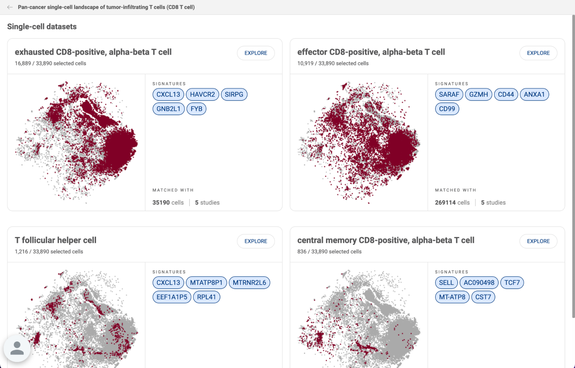
In each result box, under the cell type, the number of cells from the selected population that are identified as the respective cell type is presented. The cells are also highlighted on the scatter plot. The signatures that help the algorithm to find similar cells, the number of matched cells, and the number of studies containing matched cells are given on the right side of the scatter plot.
When you click the “EXPLORE” button next to a cell type, you will be directed to a new page to analyze the matched populations.
- The scatter plot in the center of the page displays the matched populations.
- The metadata panel shows the Study ID of the datasets containing the cell populations. Click on the icon to jump directly to a study. You can switch to “Authors’ cell types” to look at the original cell type annotations.
- The gene query box allows you to see the expression of any genes across the populations. Since the cells are from different datasets, we use the smoothed-binary unit. See “5. EXPLORE GENE EXPRESSION” for more information about expression units.
- Click the “Important genes” button in the top left corner to see the list of signatures representing the biological similarity between these cells. All the gene signatures will be added to the gene query box.
- Click the “Create custom datasets'' button in the top right corner to extract all the cells into a custom dataset. See the Talk2Data tutorial on how to analyze custom datasets.


Our video tutorial on Cell Search is available at https://www.youtube.com/watch?v=tQsbkjgf6wY
13. COMPOSITION CHART
Composition chart is an informative type of visualization when you want to have an overview of the proportions of different groups that form a dataset. For example, a composition chart can help you to visualize the cell type composition in different conditions. BBrowserX also allows you to look at the gene expression of each group directly on the chart.
13.1. Exploring the composition of a dataset
To create a composition chart for a dataset, click the “Composition” button on the Sidebar. The composition chart window will open with three dropdown menus at the top of the page. For each dropdown menu, you can click on it and select one categorical metadata field. The number in brackets next to a metadata field is the number of groups within that field.
If you are choosing a categorical metadata field on the main page, a composition chart of that field will be created when you first enter the page.
In the example below, we want to look at the cell type composition in different conditions. Therefore, we assigned “Condition” and “Cell type” for the first two metadata fields. The third metadata field is not assigned and has a “None” value. Then, Click “GENERATE CHART”.
- A composition chart has a tree structure with each level according to each metadata field you assigned.
- The size of a node at each level represents its percentage in its parent.
- The bar chart on the right-hand side gives you information about the number of cells in each group and its percentage in the whole dataset.
- You can hover the mouse over a node, or a bar to see some more details.
- For numerical metadata, you can look at the average value of each group by selecting a field from the drop-down menu of “Numerical metadata” in the top left corner.
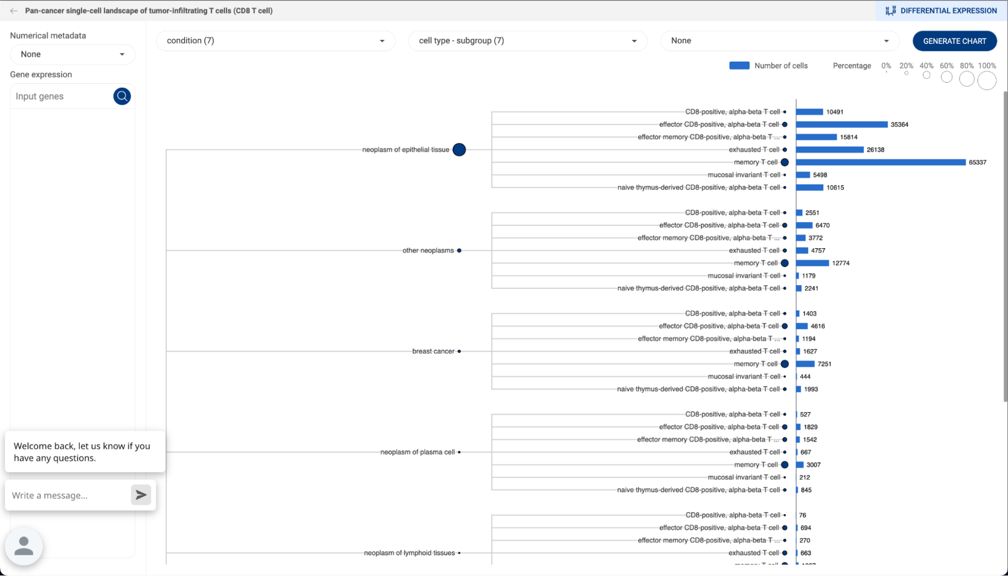
13.2. Creating a customized expression heatmap with composition chart
Once a composition chart has been created, you can look at the gene expression level within each group on the chart by type or past a gene or a list of genes into the query box on the left-hand side. An expression heatmap will replace the bar charts.
- The sizes of the circles represent the percentages of cells that express the gene, or the coverage.
- The color represents the level of expression of the gene in the datasets. The darker the color, the higher level of gene expression.
- Hover the mouse over a circle to see details about the mean expression of a gene and the number of cells expressing the gene.

You can perform differential gene expression between two groups from a composition chart by clicking on the “DIFFERENTIAL EXPRESSION” button in the top right corner. See “14. DIFFERENTIAL GENE EXPRESSION (DGE) ANALYSIS” on how to use this feature on BBrowser X.
14. DIFFERENTIAL GENE EXPRESSION (DGE) ANALYSIS
Differential gene expression (DGE) analysis helps you to explore the differences in the abundance of gene transcripts between any two groups of cells in a dataset using statistical tests.
14.1. Creating a new DGE analysis
To perform DGE, click on the “Differential expression” button on the Sidebar. You will be directed to the DGE settings page. The panel on the right-hand side allows you to :
- Title: Set a title for your analysis. This will help you access your analysis on the history page.
- First group/Second group: This toggle button is for switching between the two groups. After selecting cells for a group, switch to the other group.
- Group name: Set a name for the current group. A name helps you to distinguish between the two groups. If you leave this field empty, the two groups will be referred to as “Group 1” and “Group 2”.
- Three methods for assigning cells to a group:
- Metadata: First, select a categorical metadata field, then select one of the groups in the field.
- Lasso: Use the lasso tool to select cell clusters on the scatter plot on the left. Press the Ctrl/Cmd key to select multiple clusters.
- Composition: Generate a composition chart and select a group by clicking on a node on the chart. You can select multiple groups. See “13.COMPOSITION CHART” on how to create a composition chart.
- Method: select one of the three available DGE methods:
- Venice: This is a non-parametric statistical test for single-cell data developed by BioTuring (Vuong et al. 2020). Venice divides the probability distribution of the gene expression level of a group into multiple intervals instead of looking at only the mean expression values. Therefore, this algorithm performs well even in cases where the mean expression values may not be distinguishable. When benchmarked against 14 other methods, Venice showed great accuracy, in short running time.
- T-test: Student’s t test.
- Wilcoxon: Wilcoxon rank sum test.
- After filling in, click the “RUN” button.
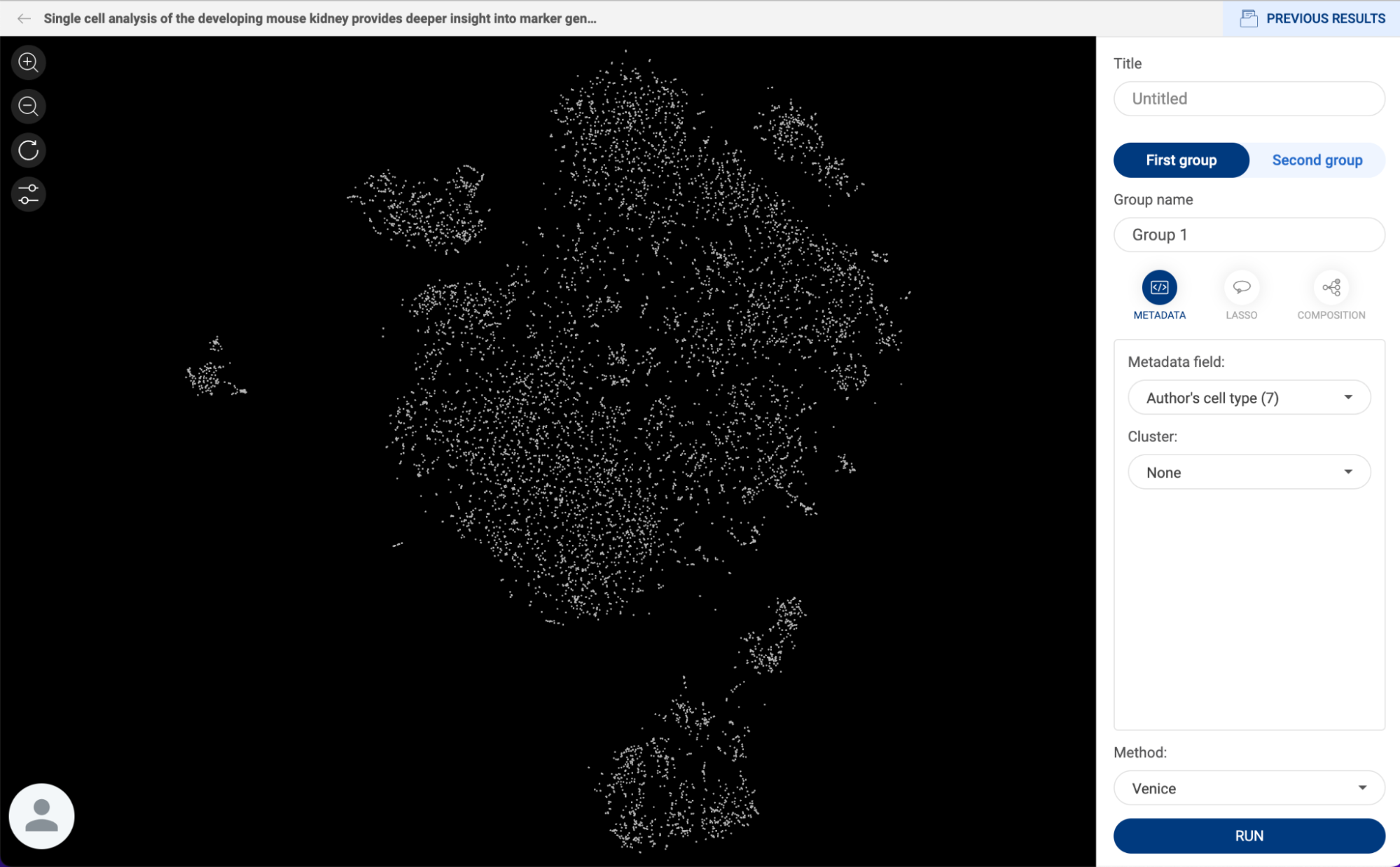
14.2. Navigating the DGE result page
The DGE result is shown on a summary table, a volcano plot, scatter plots, and a probability density plot as below.
- Summary table: The magnitude of change (Log2(FC)) and adjusted p-value (FDR) of each gene are shown. The default cut-off for adjusted p-value is 0.05. The table is sorted by FDR values by default, with the lowest values appearing first.
- You can filter the genes by changing the Log2(FC) or FDR cut-off.
- Click on the icon next to a header to change the sort settings.
- Click on a gene name to select a gene. By default, the gene with the highest adjusted p-value is selected.
- Check the box next to a gene name to display its label on the volcano plot.
- Click on the button to export the result for further analysis.


- Volcano plot: Each dot represents a gene. The magnitude of change is plotted on the x-axis, and the p-value is plotted on the y-axis. The genes which are checked on the summary table will be labeled on the volcano plot. Clicking on a dot will select the gene that the dot represents.
- Probability density plot: The probability density functions of the log-normalized expression values of the selected gene within each group along with the box plots are presented. The circles on the bottom left of the plot represent the coverage.
- Scatter plot: The expression of the selected gene within each group in log-normalized unit is presented.

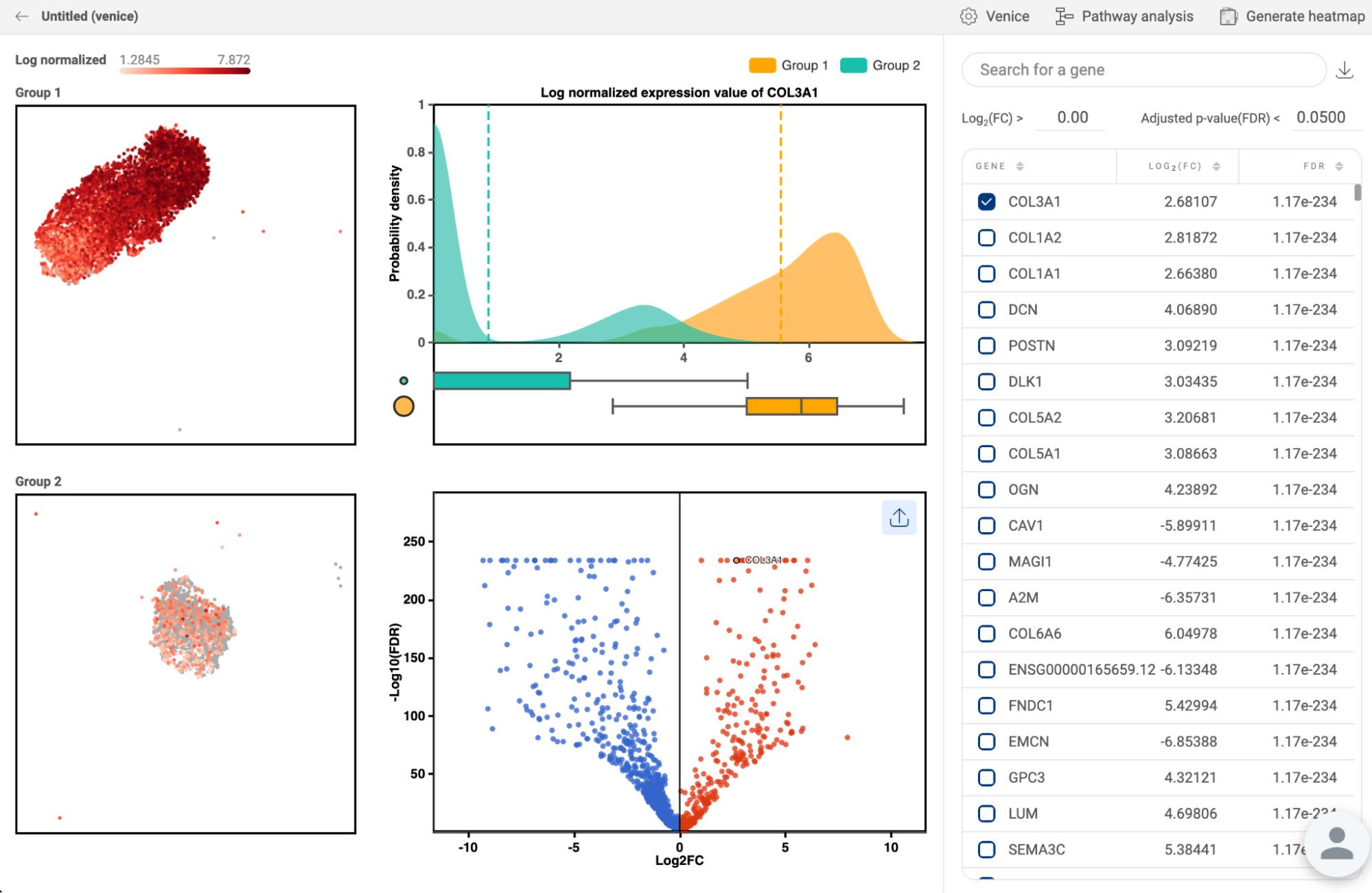
You can perform DGE on the same groups with a different method by clicking the icon in the top right corner. All analyses with different methods will be saved to your history.

There are shortcuts in the top right corner to generate a heatmap of 600 significant genes (See “17. HEATMAP”), or find potential pathways that are enriched in each group (See “19. PATHWAY ANALYSIS”).
14.3. Navigating the DGE history page
When you are on the DGE page, instead of creating a new analysis, you can click on the “PREVIOUS RESULTS'' button in the top right corner to see all DGE analyses you performed on a dataset. DGE history of all datasets can also be accessed via “My library” on Talk2Data (See “8. MANAGING YOUR PROJECTS IN “MY LIBRARIES” in the Talk2Data tutorials).
The information displayed for each analysis includes the title, the two groups being compared, the method used, and the creation date..

- Use the search box in the top right corner to search for analyses using keywords.
- Click the “EXPLORE” button to go to the result page of an analysis.
- Click the icon to rename or delete an analysis:
- Rename: A pop-up window will appear allowing you to change the title and name of each group.
- Delete: Delete a single analysis.
- To delete multiple items, check the boxes next to the titles. A delete button will appear at the top of the panel.
- To create a new DGE analysis, click on the “CREATE A NEW ANALYSIS” button.
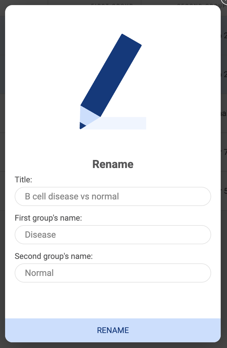
15. FINDING MARKER GENES
Marker genes is a feature that allows you to find a gene panel - a set of differentially expressed genes, that help distinguish a population of cells from others. In many cases, the expression of only one gene is not enough to tell a population apart, especially at the sub type level. Therefore, a combination of multiple genes is an effective solution to tackle this problem.
To find marker genes, select your cells of interest and click the “Marker genes” button on the Sidebar. The marker genes page contains a gene panel table, a scatter plot, a metadata panel, and a decision tree as shown below.
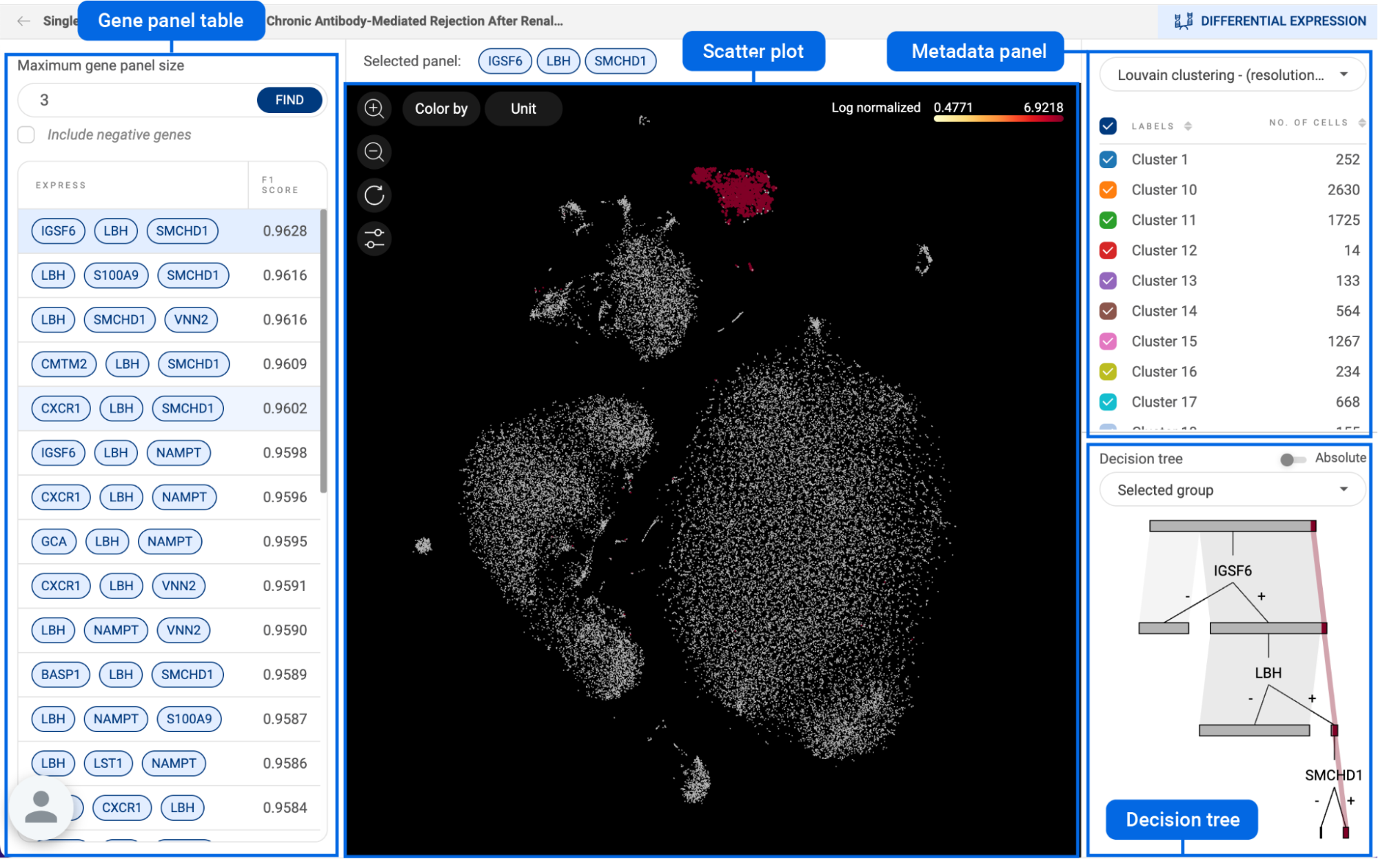
15.1. Configuring the gene panel table
- Each gene panel is shown with its F1 score in the table
- Maximum gene panel size: type in a number that defines the maximum number of genes in a panel and click the “FIND” button. The default value is 2.
- Include negative genes: When this option is unchecked, the panel only contains expressed genes. When this option is checked, the algorithm uses both expressed genes and not-expressed genes to define a panel. In this case, negative genes are listed as red tags in the “NOT EXPRESS” column.
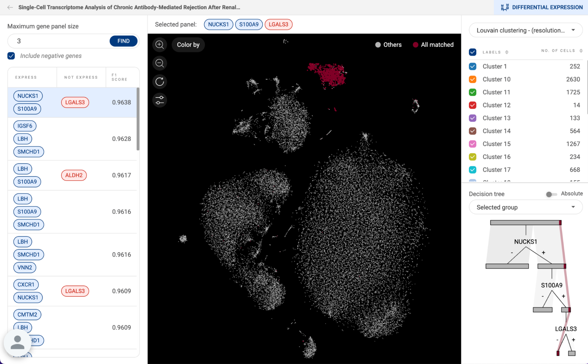
15.2. Exploring a gene panel
- Click on a gene panel to select. The selected panel is shown at the top of the scatter plot.
- On the scatter plot, by default, the expression of the gene panel across the dataset is presented. Click on a gene tag of the “Selected panel” to see the expression of an individual gene. See “4. EXPLORING GENE EXPRESSION” on how to use different expression units and color modes.
15.3. Decision tree
- The decision tree visualizes how the selected gene panel, can help distinguish the selected group from the rest. A flow represents a cell group.
- The default scale mode is “Absolute”, meaning that the sizes of different flows in the chart are proportional to the number of cells in each group. In case the number of cells in different groups varies considerably, you can change the scale mode to “Relative”.
- By default, only the flow representing the selected group has color, the rest is grey. You can change the color mode to “All metadata fields” to visualize all groups on the tree.
16. ANALYZING TCR AND BCR DATA WITH CLONOTYPE ANALYSIS
Analysis of the clonotype diversity under different conditions may provide fascinating insights into how our immune system works, and therefore open up opportunities for treatment.
BBrowserX supports the analysis of TCR and BCR data from 10X Chromium single-cell profiling. Make sure you have the “All contig annotations” file from Cell RangerV(D)J output.
16.1. Importing clonotype data
- Click the “Clonotype” button on the Sidebar.
- Select the type of data: TCR or BCR.
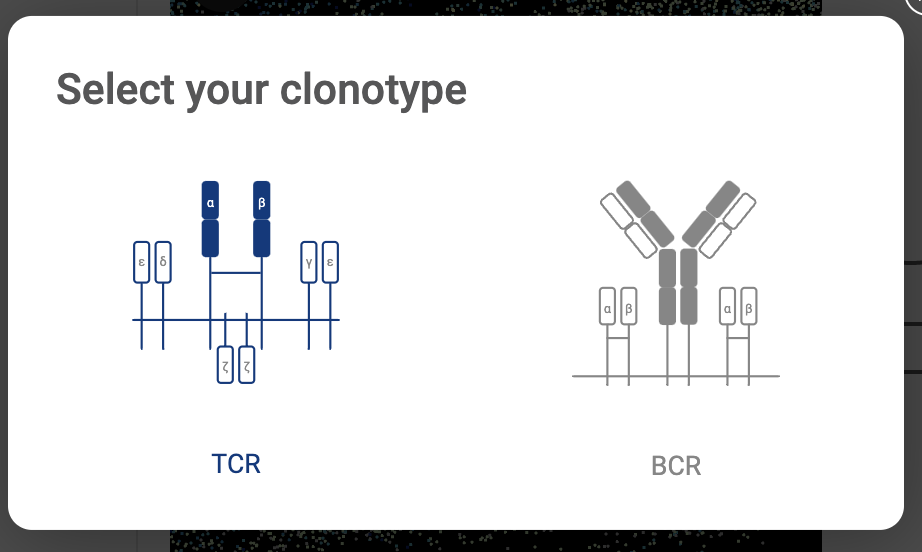
- In the pop-up window, click the “UPLOAD” button if you upload the file from your local computer. If you import a file from your Amazon S3, click the “AWS S3” button. See “2.2. Configuring your Amazon S3 bucket'' on how to add an Amazon S3 bucket.

- Once you have uploaded the data, you will be immediately directed to the clonotype page when clicking on the “Clonotype” button. You can always change the data file with the “Change file” button in the top right corner.
16.2. Getting an overview of your clonotype data
- On the “Summary” page, your clonotype data is saved as different metadata fields and the selected field is visualized on the scatter plot.
- You can set a cut-off value for the minimum number of cells for any metadata fields. The groups that contain fewer cells than the cut-off value will become “Unassigned”. Then, click the “SAVE TO METADATA” button to save the metadata you create by setting a cut-off value.
- On the sidebar, there are shortcuts for you to generate composition charts and perform differential gene expression. See “13. COMPOSITION CHART” and “14. DIFFERENTIAL GENE EXPRESSION (DGE) ANALYSIS” on how to use these features.
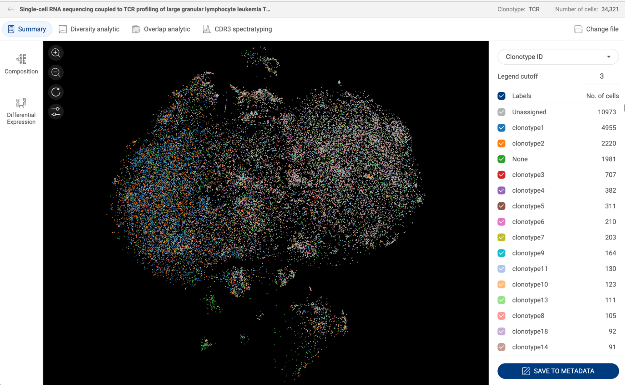
16.3. Diversity analysis
Diversity analysis of clonotypes is a challenging task. Since some clonotypes are very rare compared to others, and there’s a limitation on the sample size, the clonotypes captured in a sample may not represent the whole clonotype population.
On BBrowser X, we use hill numbers, a mathematically unified family of diversity indices that incorporate relative abundance and richness, as a framework for clonotype diversity analysis.
16.3.1. Hill numbers
Hill numbers are defined as:
(*)
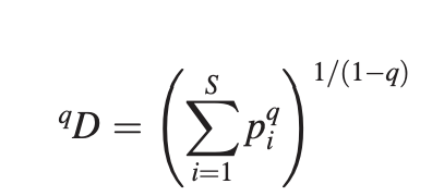
S is the number of clonotypes, pi is the relative abundance of the ith clonotype.
The parameter q (q  1) quantifies the sensibility of the measure to the relative abundance of each clonotype.
When q = 0, the difference in the proportion of each clonotype is completely disregarded, only the number of clonotypes, or clonotype richness, is counted.
0D = S
When q = 1, (*) is undefined, but the limit when q approaches 1 results in the exponential of the Shannon index. In this case, the measure weighs clonotypes in proportion to their frequency.
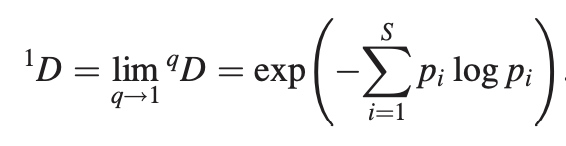
When q = 2, the clonotypes with the higher frequency in the population are weighted more than rare clonotypes. This is the inverse Simpson index.

16.3.2. Generating rarefaction curves with hill numbers
- In the Diversity analysis page, select a factor to estimate diversity on the dropdown menu in the top left corner.
- Hill numbers: You can change the order of diversity q.
- q = 0, richness.
- q = 1, exponential Shannon index.
- q = 2, inverse Simpson index.
- Chart types:
- Sample-size-based diversity accumulation curve
- Coverage-based diversity accumulation curve
- The solid part of the curve is the interpolated estimation and the dashed line is the extrapolated estimation, which is up to twice the sample size. The 95% confidence intervals are shown in lighter shades.

16.4. Overlap analysis
This feature analyzes the similarity of different groups, for example, how many CDR3 sequences are shared between different patients. The result is presented on a hierarchical cluster heatmap with similar groups sitting next to each other.
To use this analysis, set parameters at the top of the page:
- Overlapped factor: Select a factor from the dropdown menu.
- Group by: Select a metadata field. Different groups of the metadata field will be compared based on the similarity of the overlapped factor.
- Method: How the scores are calculated.
- Jaccard score: the score between two groups is calculated as below:

- Raw count: based on the raw numbers.

16.5. CDR3 spectratyping
This tool provides the probability density plots for the distribution of CDR3 lengths.
To draw this type of plots, select a factor on the dropdown menu in the top left corner.
On the metadata panel on the right-hand side, you can select a metadata field to split the plots by different groups of the field.

17. HEATMAP
Heatmap is an effective type of visualization to interpret gene expression data. BBrowserX supports creating heatmaps with your custom gene sets or automatically-detected marker genes. fastCluster (Müllner 2013) is the hierarchical clustering algorithm used to arrange cell groups into hierarchical order. To use this function, click on the Heatmap button on the Sidebar.
17.1. Navigating the heatmap history page
When you click on the Heatmap button on the Sidebar, you will be directed to the page showing the list of all created heatmaps. Heatmap of all datasets can also be accessed via “My library” on Talk2Data (See 8. MANAGING YOUR PROJECTS IN “MY LIBRARIES” in the Talk2Data tutorials).
The information about the title, number of cells, number of genes, type and created date of each heatmap is shown.

- Use the search box in the top right corner to search using keywords.
- Click the “EXPLORE” button to explore a heatmap.
- Click the icon to rename or delete a heatmap:
- Rename: A pop-up window will appear allowing you to change the name of the heatmap.
- Delete: Delete a heatmap.
- To delete multiple items, check the boxes next to the titles. A delete button will appear at the top of the panel.
17.2. Creating a new heatmap
On the Heatmap history page, click the “CREATE A NEW HEATMAP” button. A pop-up window will appear as shown below.
- Title: Set a title for your heatmap. This will help you access your heatmap on the history page.
- Metadata level 1: When you select a metadata field, cells are grouped by different groups of the selected fields which will be shown on the x-axis. The order of the groups are the result of the hierarchical clustering algorithm…
- Metadata level 2: When a second metadata field is selected, each group of the level 1 metadata field will be split by different groups of the level 2 metadata.
- Metadata level 3: When a third metadata field is selected, the groups are further split by this metadata. You can split a dataset into at most 400 groups.
- Use gene markers/Use gene sets: Select one of the methods for choosing genes. The genes will be shown on the y-axis.
- Use gene markers: Fill in a number for “Number of marker genes per group”. The algorithm will identify the marker genes for each group and create a heatmap of these markers.
- Use gene sets: Select one of your gene sets or type in a new gene list into the box.
- When all the parameters are set. Click “GENERATE HEATMAP”
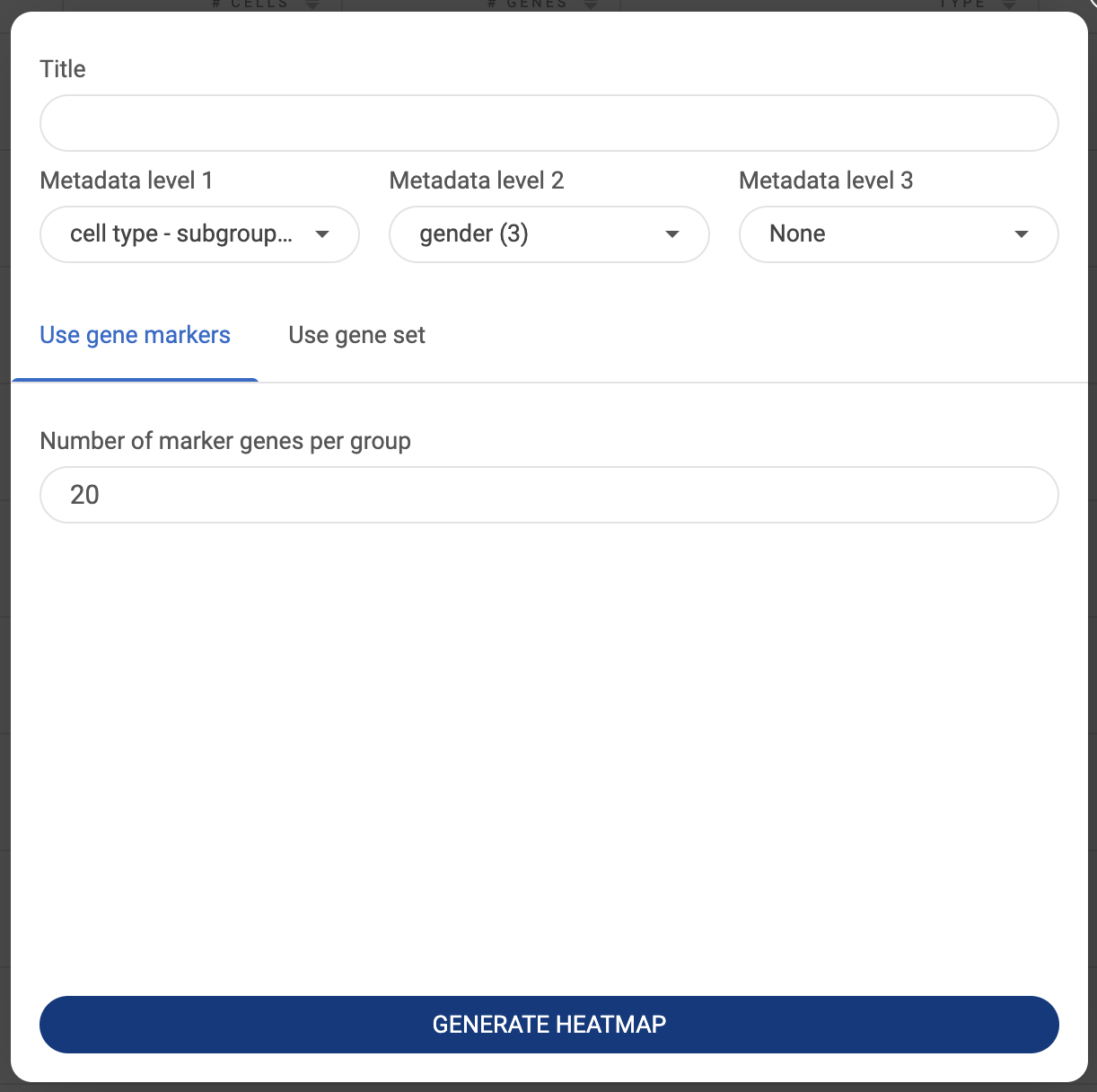
17.3. Navigating the heatmap result page
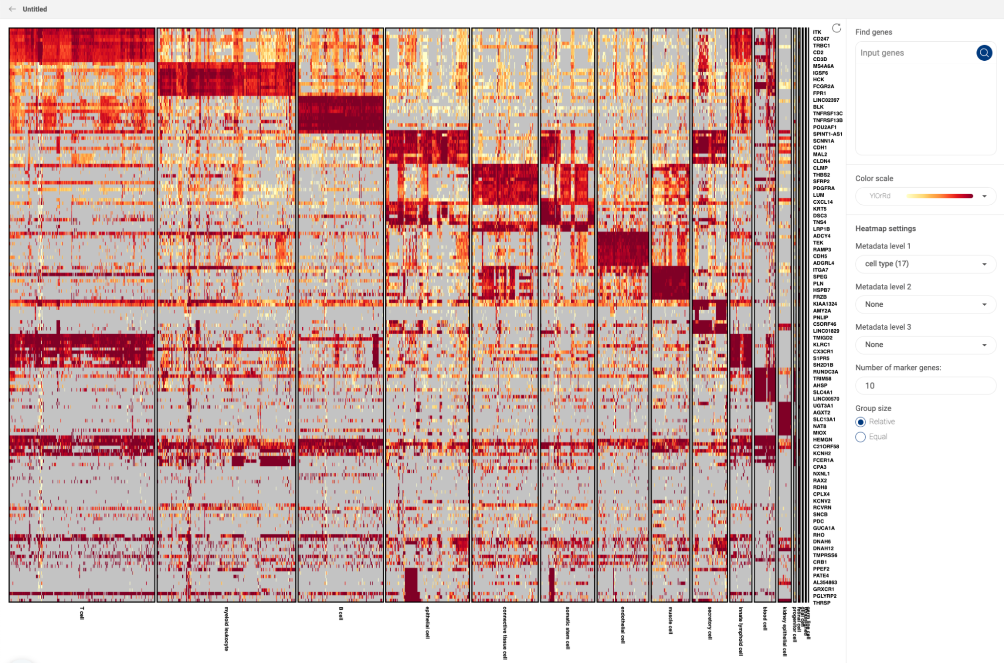
- The default heatmap is at the single-cell level. In this resolution, different groups of the level 1 metadata field are shown on the x-axis, and genes are shown on the y-axis of the heatmap.
- Drag your mouse vertically on the heatmap to zoom into a range on the y-axis. More genes within the range will be shown.
- Drag your mouse horizontally on the heatmap to zoom into certain groups on the x-axis.
- Click on the icon to exit the zoom mode.

- The heatmap setting panel on the right-hand side allows you to make changes to the current heatmap.
- Find genes: Input one or multiple gene(s) from the heatmap into the gene box and click the icon to show only the gene(s). Click the icon to remove the gene(s).
- Color scale: Select one of the color palettes from the drop-down menu.
- Metadata level 1, 2 & 3: change the groups on the x-axis.
- Number of marker genes: Change the number of marker genes used to create the heatmap. This option is only available when you use marker genes.
- Group size: By default, the group size option is “Relative”, which means the group sizes on the x-axis are proportional to their number of cells. Change this option to “Equal” to display different groups equally in size.
- Resolution: This option is only available for heatmaps with less than 100 genes. By default, the expression resolution is “Single-cell”, which means the expression value of each cell is shown on the heatmap. To display the mean expression of each group instead of the expression level of each cell, select “Cluster”. In the heatmaps at the cluster resolution, genes are shown on the x-axis and cell groups are shown on the y-axis. The sizes of the circles represent the percentages of cells that express the gene, or the coverage. The color represents the level of expression of the gene in the datasets. The darker the color, the higher level of gene expression.


18. PSEUDOTIME
Pseudotime analysis is a computational approach that reconstructs the developmental trajectories of cells by modeling the dynamic changes in their gene expression profiles. For this analysis, we support Monocle 2 (Qiu, Xiaojie, et al., 2017).
18.1. Creating a new pseudotime analysis
To perform pseudotime analysis, click on the “Pseudotime” button on the Sidebar. You will be directed to the pseudotime settings page. The panel on the right-hand side allows you to configure the settings:

- Title: Provide a title for your analysis. This will help you revisit your analysis on the history page.
- Three methods for selecting a cluster:
- Metadata: First, select a categorical metadata field, then select one of the groups in the field.
- Lasso: Use the lasso tool to select cell clusters on the scatter plot on the left. Press the Ctrl/Cmd key to select multiple clusters.
- Composition: Generate a composition chart and select a group by clicking on a node on the chart. You can select multiple groups. See “13.COMPOSITION CHART” on how to create a composition chart.
- Subsample: If the selected cluster contains too many cells, you can check the option to subsample the cluster and specify the number of cells. Geometric sketching (Hie et al. 2019) is the method being used to subsample.
- After filling in, click the “RUN” button.
18.2. Navigating the pseudotime result page
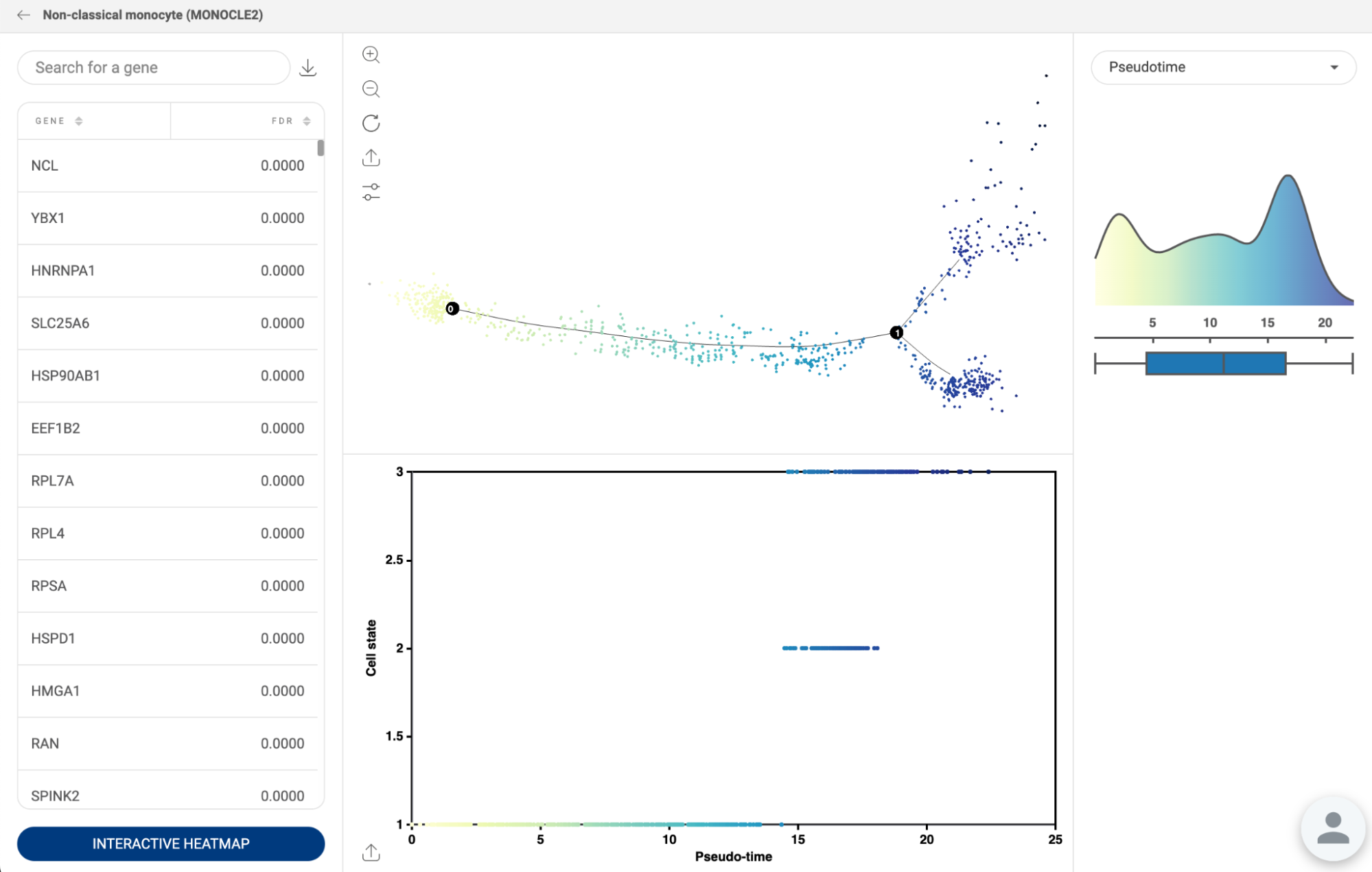
- The result of the trajectory inference is presented as a trajectory tree, where cells are colored according to their pseudotime values by default.
- A scatter plot located beneath the trajectory tree plots pseudotime on the x-axis and cell states on the y-axis.
- The coloring of cells on the scatter plots can be changed by selecting a different metadata field from the metadata panel on the right.
- The table on the left displays genes with the lowest false discovery rate (FDR) values, sorted in ascending order.
- By clicking on a gene name, its expression is shown on the trajectory tree and its expression values are plotted against pseudotime on the x-axis in the second scatter plot. The trend line indicates whether the gene is up-regulated or down-regulated throughout development.
- To view the genes on a heatmap, click "INTERACTIVE HEATMAP".
18.3. Navigating the pseudotime history page
When you are on the pseudotime page, instead of creating a new analysis, you can click on the “PREVIOUS RESULTS'' button in the top right corner to see all pseudotime analyses you performed on a dataset. pseudotime history of all datasets can also be accessed via “My library” on Talk2Data (See “8. MANAGING YOUR PROJECTS IN “MY LIBRARIES” in the Talk2Data tutorials).
The information displayed for each analysis includes the title, number of cells, the method used, and the created date.

19. PATHWAY ANALYSIS
Pathway analysis is a feature used to identify potential biological processes based on the AUCell enrichment score (Aibar et al., 2017). This function is supported by the biological pathway database WikiPathways (Martens et al. 2021) .
To calculate the AUCell enrichment scores, we first transform the gene expression values of all genes into rankings. Then, for each pathway, we calculate the AUCell score based on the gene list of that pathway. If most of the genes in a pathway are ranked at the top, the pathway will receive a high average enrichment score.
To use this feature, first select a group of cells, then click the 'Pathway Analysis' button on the Sidebar.
The table of enrichment results will display the pathways with the highest average AUCell scores. The enrichment score of a pathway is calculated as the average of AUCell scores for the pathway’s gene set within each individual cell.
By clicking on a pathway in the table, you can access all relevant information and diagrams from the WikiPathways database. Scroll down under the description to see the average expression and coverage for each gene in the pathway.
Hover the mouse on a gene name on the diagram to see its average expression and coverage in the selected group. Click on the gene name to see the scatter plot displaying its expression in each cell.

When pathway analysis is performed from a differential expression gene (DEG) analysis (See “14. DIFFERENTIAL GENE EXPRESSION (DGE) ANALYSIS”), the enrichment results for each group will be displayed.
To obtain the distribution of the enrichment score for each group, we calculate the AUCell score for each cell in the group. To determine if a pathway is differentially enriched between two groups, we use the statistical test Venice (Vuong et al. 2020). Pathways with a p-value less than 0.05 are considered statistically significant and are displayed.

BioTuring Lens: Analyzing spatial transcriptomics data
1. MANAGING YOUR PRIVATE DATA ON BIOTURING LENS
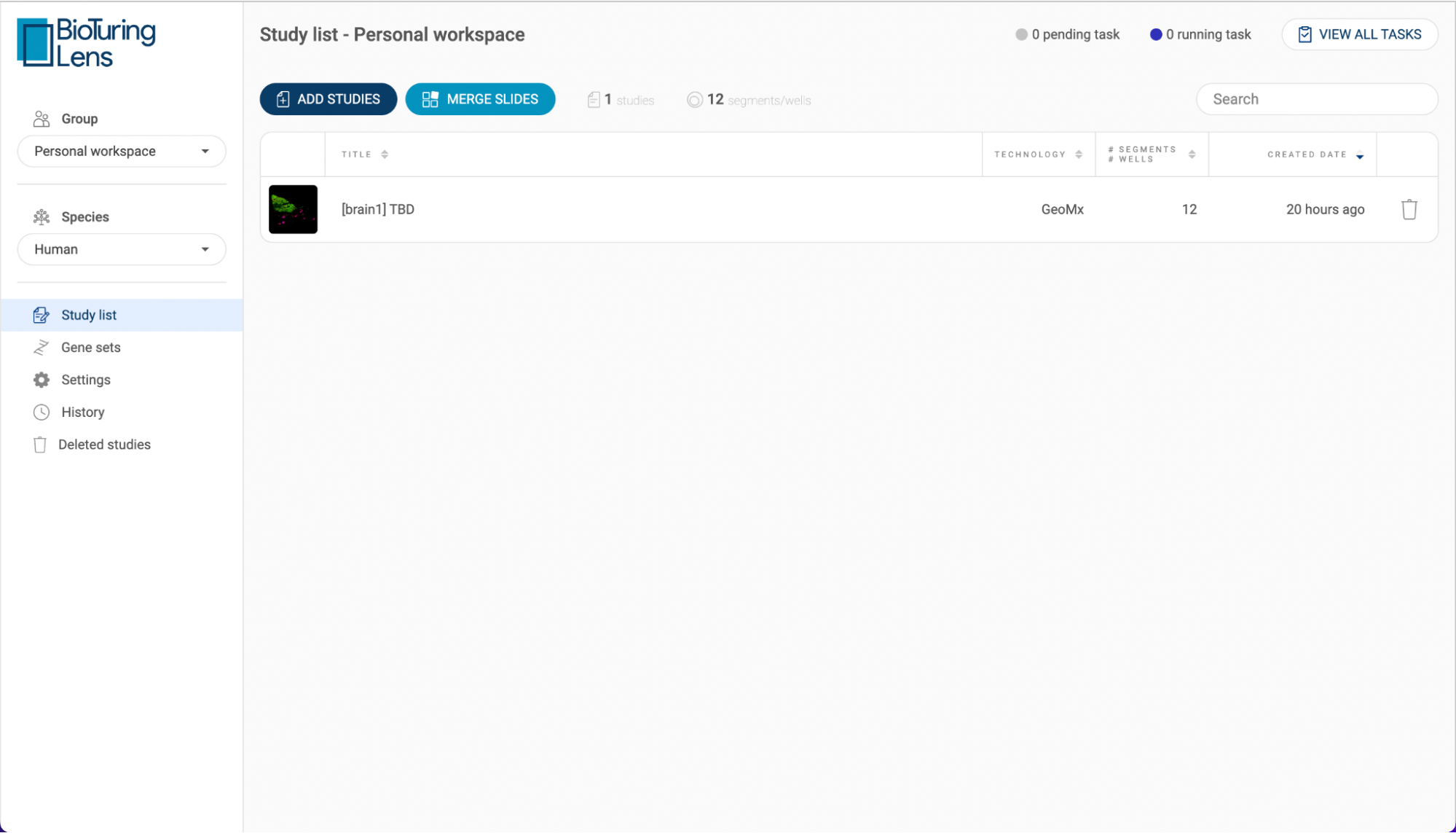
1.1 Navigating the data management page
- Group: Choose your workplace. The data in the “Personal workspace” can only be accessed by you. All shared workspaces that you’re a member of will appear on the dropdown menu. The data in a shared workspace can be accessed by all members of the share group.
- Species: Choose the type of organisms. BioTuring Lens supports two species:
- Human
- Mouse
- Studies list: All datasets (studies) within a workplace are listed here.
- Each study is shown with its title, technology, number of segments/wells, and created date. Click on the icon next to a header to change the sort settings.
- The number of studies and number of cells are summarized at the top of the list.
- Use the search bar to search for a study with a keyword.
- Click the “ADD STUDIES” button to submit a dataset.
- Click the button to delete a study.
- The status bar in the top right corner shows the number of pending tasks and the number of running tasks. Click “VIEW ALL TASKS” for more details.
- Gene sets: All gene sets will be saved here. See “2.3 Gene expression panel” on how to create and use a gene set.
- Settings: This is where you can configure your Amazon S3 settings (See “1.2. Configuring your Amazon buckets”).
- History: All actions regarding adding/removing/editing your studies, metadata and ontologies are tracked here.
- Deleted studies: All studies that are deleted within 30 days are listed here. Click the icon to restore a study. If you want to restore a study after the 30-day period, contact your server manager.
1.2. Configuring your Amazon S3 bucket
- In the setting page, click the “ADD” button. The AWS S3 Bucket configuration will be shown as below.
- Fill in the required information and click “SAVE”.
- Added S3 buckets will be shown on the settings page. To edit or remove a bucket, click the “EDIT” button:
- To edit, change the configuration and click “SAVE”.
- To remove, click “DELETE”.
1.3. Submitting a dataset to BioTuring Lens
BioTuring Lens supports two spatial technologies:
- Nanostring’s GeoMx DSP
- 10x Genomic’ Visium Spatial Gene Expressions
1.3.1. Submitting a GeoMx DSP dataset
- Click the “ADD STUDIES” button to start submitting a dataset.
- Choose “GeoMx DSP”. Then, fill in the submit form.
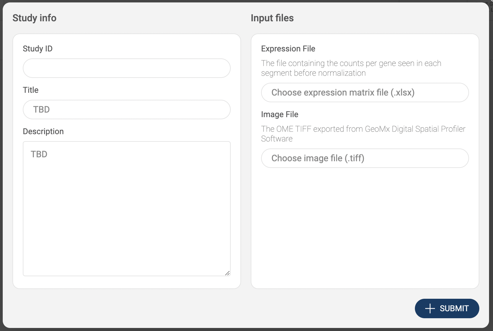
- Study info: Basic information includes Study ID, Title, and Description.
- Input files: This format requires two files: an .xlsx expression matrix file containing the raw counts of each gene in each segment (Expression File), and an OME TIFF image exported from GeoMx Digital Spatial Profiler (Image File). Click on “Choose expression matrix file (.xlsx)” and “Choose image file (.tiff)” to upload each file. The two methods for uploading are shown on the pop-up window:
- Click the “UPLOAD” button to submit files from your local computer.
- Click the “AWS S3” button to submit files from Amazon S3. BioTuring Lens will ask you to configure your S3 buckets in the settings page if you have not added any buckets (See “1.2. Configuring your Amazon S3 bucket”). On the AWS window, select a file, then, click “SELECT”.
- After everything is set. Click the “SUBMIT” button. The data is processed and the newly added will be shown on the “Study list”.
1.3.2. Submitting a Visium dataset
- Click the “ADD STUDIES” button to start submitting a dataset.
- Choose “Visum Spatial”. Then, fill in the submit form.
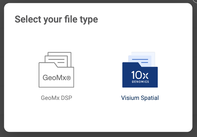

- Study info: Basic information includes Study ID, Title, and Description.
- Input files: This format requires four files: an .h5 expression matrix file containing the raw counts of each gene in each wells (Expression File), an TIFF image (Image File), a tissue_positions file outputted from Spaceranger (Tissue position file), and a scalefactors_json outputted from Spaceranger (Scale factor). When you upload a file, the two methods for uploading are shown on the pop-up window:
- Click the “UPLOAD” button to submit files from your local computer.
- Click the “AWS S3” button to submit files from Amazon S3. BioTuring Lens will ask you to configure your S3 buckets in the settings page if you have not added any buckets (See “1.2. Configuring your Amazon S3 bucket”). On the AWS window, select a file, then, click “SELECT”.
- After everything is set. Click the “SUBMIT” button. The data is processed and the newly added will be shown on the “Study list”.
1.4 Merging images with “BioTuring virtual slides”
In addition to analyzing one image at a time, BioTuring Lens provides BioTuring Virtual Slides, which allows you to merge multiple images and analyze them simultaneously.
- To create a BioTuring virtual slide, click “MERGE SLIDES”.
- On the pop-up window, choose the type of technology from the drop-down menu in the top left corner. All of your slides of the selected technology will be shown under the drop-down menu.
- Drag your images into the positions you want. Up to 32 images are supported.
- Fill in the information for the new slides, including Study ID, Title, and Description.
- Finally, click “SUBMIT”.
The images are merged into one single Virtual slide. Annotations are also unified if they’re matched. The new Virtual slide will be listed on the “Study list”.

2. BIOTURING LENS INTERFACE
The interface of BioTuring Lens consists of an Image viewer, the Metadata panel, the Gene query panel, the Toolbar, and the Sidebar. The following subsections explain how to navigate the interface.
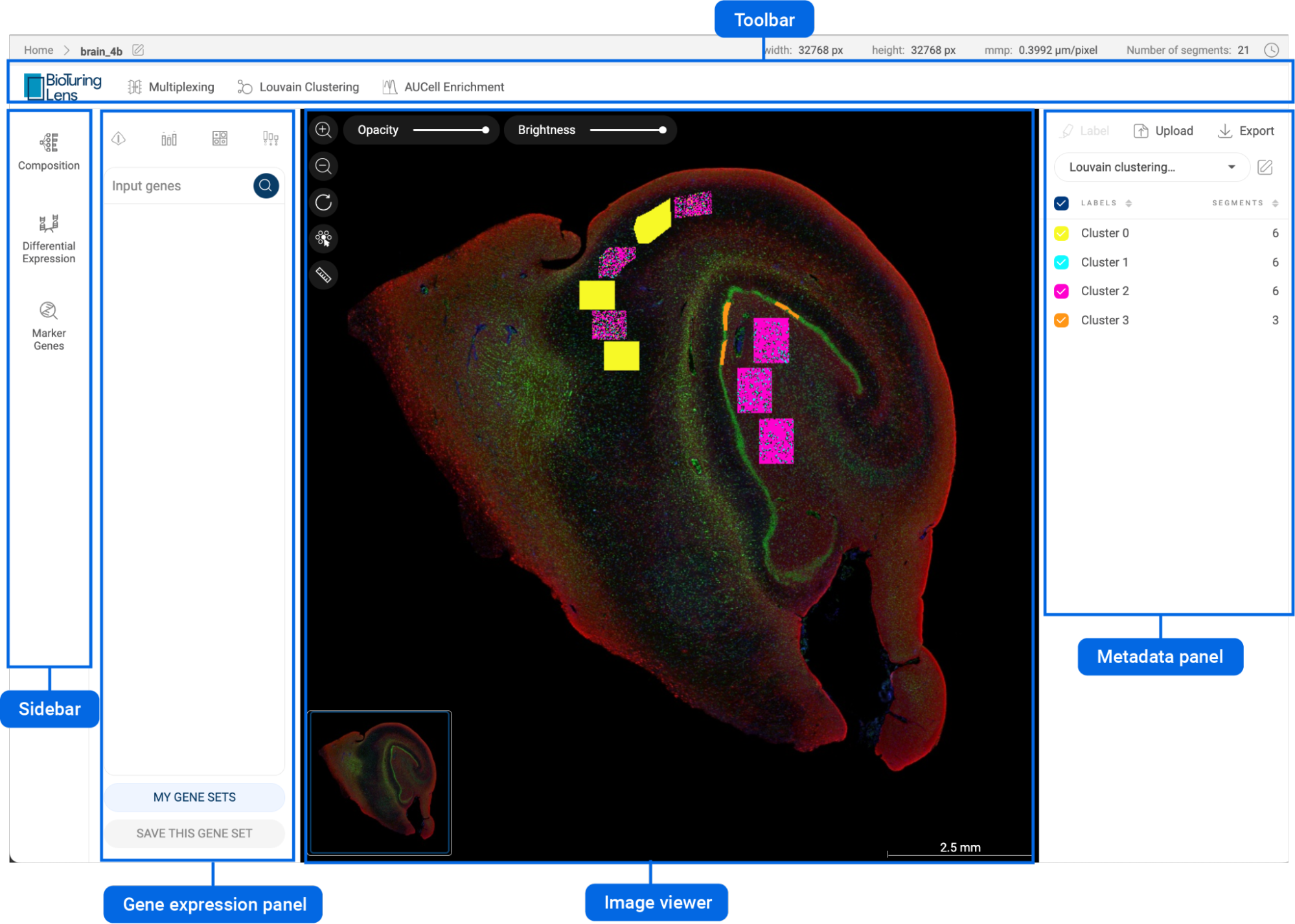
2.1. Image viewer
The image viewer is in the center of the interface. The image viewer shows the sample image and the Visium wells or GeoMx segments on top of the image. The wells/segments are colored by the different groups in the metadata panel on the right-hand side.
You can interact with the image by using the tools in the top left corner. The description of the tools is presented in the table below.
Zoom in | Click on the button to zoom in, or scroll up with your mouse when the cursor is within the plot. |
Zoom out | Click on the button to zoom out, or scroll down with your mouse when the cursor is within the plot. |
Reset | Set the zoom level and position of the plot to the default setting. The selected wells/segments are also reset. |
Point selector | Select each well/segment by mouse click. Selected wells/segments are highlighted with a white border. When the point selector is not active, the default mode allows you to drag the image around. |
Lasso | The lasso tool is used to draw closed paths on the image. This tool is only available on Visium images. Wells lying within the path are selected and highlighted with a white border. Press down Ctrl/Cmd to select multiple groups. When the lasso mode is not active, the default mode allows you to drag the plot around. |
Ruler | The ruler tool is used to measure distances on the image by pressing the left mouse button and dragging the mouse between two points. When the ruler is not active, the default mode allows you to drag the image around. |
Adjust the slider bar to change the opacity of the wells/segments on top of the image. | |
Adjust the slider bar to change the brightness of the image. |


2.2. Metadata panel
The metadata panel is on the right-hand side of the interface. This section enables users to interact with all the available metadata, or add and edit your own metadata.
2.2.1. Visualizing a metadata field on the image viewer
- Click on the dropdown menu to show all the available metadata.
- Click on one metadata field to select. For categorical metadata, different groups of the metadata field and their respective number of wells/segments are shown under the dropdown menu and are visualized with different colors on the image viewer. For numerical metadata, a distribution plot and a box plot are shown.
- For categorical metadata, check/uncheck the box next to a group name to show/hide a particular group on the image viewer.
2.2.2. Selecting wells/segments with categorical metadata
- Besides the lasso tool and the point selector, you can select wells/segments by clicking on the group name in the metadata panel. The wells/segments belonging to the group will be highlighted on the image viewer.
- When a group is selected, clicking on another group will deselect the previously selected group(s).
- Similar to the lasso tool, press down Ctrl/Cmd to select multiple groups.
2.2.3. Selecting wells/segments with numerical metadata
- When a numerical metadata field is selected, you can select cells that have values belonging to a range by holding down the left mouse button, and then dragging the pointer on the distribution plot. The upper bound, lower bound, and position of the range can be changed as described in the image below.
- Selecting another range will not remove the previously selected range(s).
- Click the button in the top right corner of the distribution plot to remove all selections.
2.2.4. Annotating wells/segments
- Select wells/segments using the lasso tool, point selector or group name(s) as described above.
- Click the button. A pop-up window will appear.
- The first input is the metadata field. When you type in a field name, a dropdown menu is shown below the input box. If you want to create a new metadata field, select “Create [field name]”. If you want to append the selected wells/segments to an existing field, select “Append to [field name]”.
- The second input is the label, or group name, for the selected sells/segments. Similar to metadata field input, you can either create a new group name or append selected wells/segments to an existing group name.
- After filling in the metadata field and group name for the selected wells/segments, click “ADD”.
- New metadata added by users will be saved under “Your metadata” in the dropdown menu.

2.2.5. Editing or deleting a metadata field
- Click on the button. The edit pop-up window will appear. You can only edit or delete your metadata.
- To edit the metadata, change the metadata field and group names then click the “SAVE” button to save.
- To delete the selected metadata, click the “DELETE” button.
2.2.6. Importing metadata
- Instead of annually annotating each group, you can upload a metadata file under the format of .tsv or .csv.
- The first row of the file must contain headers including “barcodes” and metadata field(s). The first column must be the barcodes of all or a subset of the wells/segments in the dataset. An example is shown below.
- To import a metadata file, click the button and choose a metadata file.

2.2.7. Exporting metadata
- Imported metadata can be exported into a .tsv file.
- To export your metadata, click the button. The file will be downloaded to your computer.
2.3. Gene expression panel
The gene expression panel provides users with important tools to explore the expression level of any gene and create different types of visualizations. This panel contains a gene query box and visualization tools at the top.
2.3.1. Querying genes with the query box
- Move the cursor to the box and type in a gene name or a list of genes.
- While you are typing a gene, genes that match your input will be listed below the input. Click on a suggestion to add the gene to the search list.
- Another method of adding genes is to copy and paste. When you copy more than one gene, they should be separated by commas, spaces, or line breaks.
- Added gene(s) will be shown on the box in individual tags.
- Click on the icon in a gene tag to remove a gene. Click on the icon to remove all the added genes.
- Click on the icon, or press “Enter”, to see the expression profile of the added gene(s) on the image viewer. When there is more than one gene added to the box, click on a gene name tag to show only its expression on the scatter plot.
2.3.2. Saving a gene set
- When a list of genes is added to the search box, you can save them as a gene set for later use.
- Make sure the gene set is added to the query box and click the “SAVE THIS GENE SET” button. A popup window that allows you to set a name and modify the gene set will appear.
- Click the “CREATE” button to save the gene set.
- Click the “MY GENE SETS” button to show all of your saved gene sets. Click on a gene set name to add it to the query box.
Five icons at top of the gene expression panel are five different types of visualizations you can create on BBrowser X. Description of the tools is in the table below.
Violin plot consists of a kernel density plot and a box plot. Violin plots are useful to display the distribution of the gene expression level. | |
Bar chart displays the mean expression value of a gene in a particular group. | |
Bubble heatmap shows the expression level and the percentage of wells/segments expressing the queried gene(s). | |
Intersection plot, or upset plot, visualizes the number of wells/segments expressing different combinations of the queried genes. |
Details about gene expression units and how to create different types of visualization are presented in “3. EXPLORING GENE EXPRESSION”.
2.4. Toolbar
The Toolbar is at the top of the interface. It contains several important features. Each button on the toolbar is described below. Details about each function are discussed in separate sections.
Adjust the fluorescent channels of a fluorescent image. This feature is only available for Nanostring DSP images. | |
Perform the Louvain clustering algorithm on the dataset to divide wells/segments into different clusters. | |
Perform AUCell Enrichment analysis on the dataset. |

2.5. Sidebar
The Sidebar is located on the right side, containing the following functions. Details about each function are discussed in separate sections.
Create composition charts and customized heatmaps. | |
Perform differential gene expression to find significant genes that help distinguish between two groups. | |
Find marker genes for selected wells/segments. To use this feature, select wells/segments first. |
3. EXPLORING GENE EXPRESSION
3.1. Expression of one single gene
When one gene is queried, the scatter plot is automatically colored by the expression level, and the “Unit” button is shown at the top left corner of the scatter plot, allowing you to change the unit of expression. There are two types of units used on BioTuring Lens to show the expression level of a gene: TPM (transcripts per million) and log1p(TMP). The default unit of expression is log1p(TMP).
3.1.1. Transcripts per million
Transcripts per million represents the number of the queried gene’s transcripts out of a million sequenced transcripts.
3.1.2. Log1p(TPM)
Log1p(TPM) values are calculated as: loge(transcripts per million + 1)
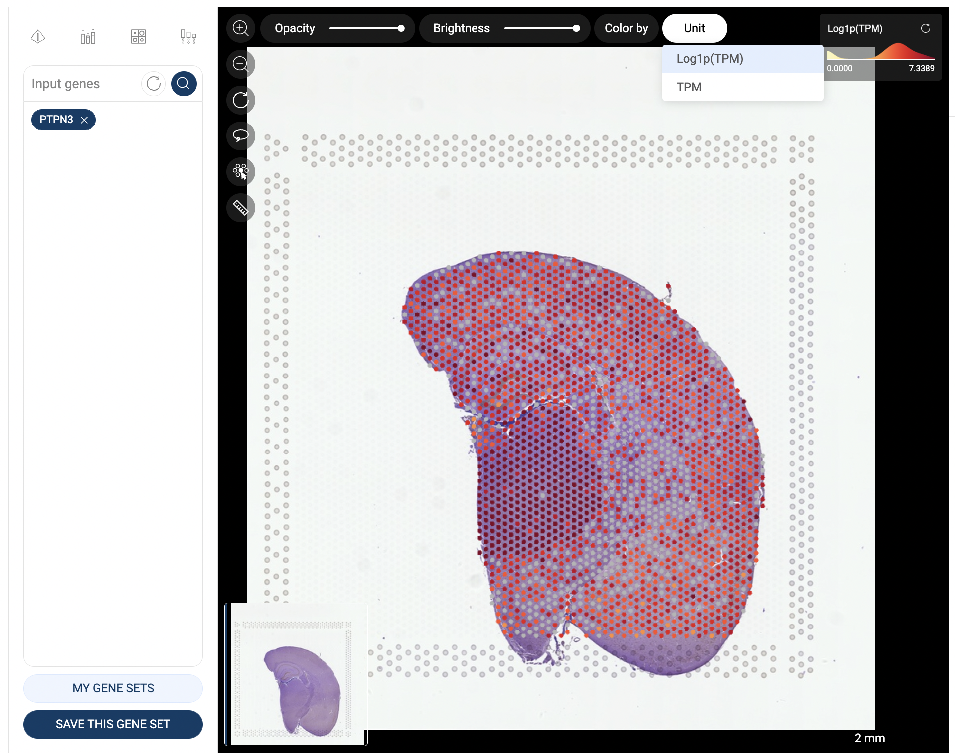
Gene expression in Log1p(TPM)
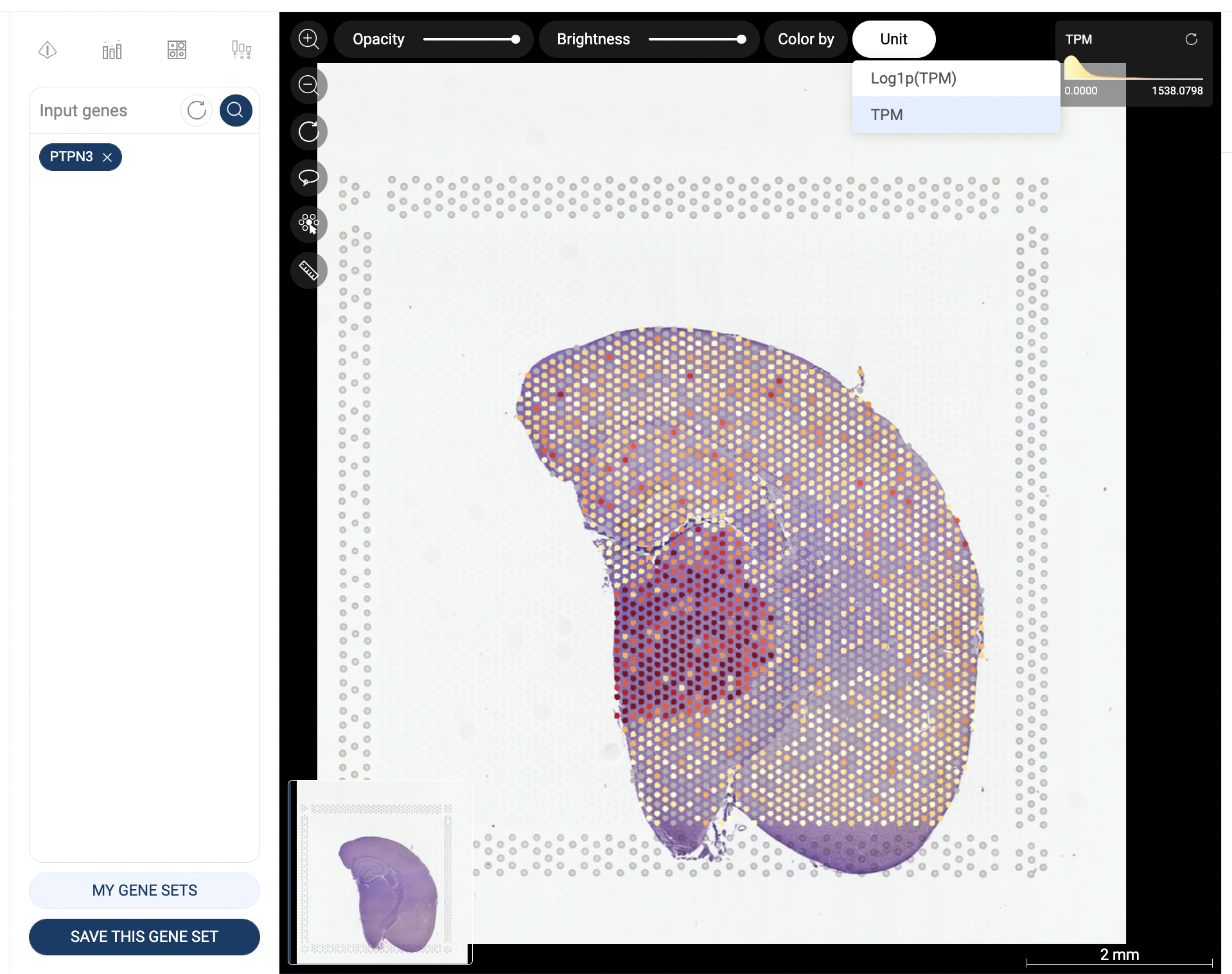
Gene expression in TPM
Users can click on the “Color by” button in the top left corner of the scatter and select “Metadata” to switch back to color the scatter plot by Metadata as follows.

3.2. Expression of two or more genes
When you query for two or more genes (a gene panel), the expression of a gene in a well/segment is based on whether at least one transcript of that gene is detected in the cell. In other words, a well/segment is identified as expressing a gene when the raw count and log-normalized expression of that gene in the well/segment are larger than zero.
To change the color mode, click on the “Color by” button. Four available color modes are:
- Gene panel (count): each well/segment is colored based on the number of genes in the panel that express in that well/segment. This is the default mode when three or more genes are queried.
- Gene panel (tricolor): This mode is only available and is the default mode for a panel of two genes. Wells/segments are colored in three colors: wells/segments expressing the first gene (in the query order) are colored red, those expressing the second gene are colored blue, and those expressing both genes are colored yellow.
- Gene panel (binary): wells/segments are colored based on whether they express all genes in the panel (“All expressed”), or not.
- Metadata: Wells/segments are colored based on the metadata.

Wells are colored based on gene count

Wells are colored in the tricolor mode
3.3. Gene expression visualization
3.3.1. Violin plot
- Click the icon on top of the gene query box. You will be directed to the Violin plot page.
- The plots for the gene(s) added to the gene query box will be created. Change the input genes on the query box and click the button to create new plots.
- The white dots represent the means. Hover the mouse over a plot to see the detailed information about Mean, Q1, Q3, Q1 - 1.5IQR, Q3 + 1.5IQR.
- Select a metadata field on the right panel to generate plots for each group of the field. Check/uncheck a box next to a group label to show/hide the respective plot.
- Select a metadata field in the “Split by” section to split the plots by the different groups of the selected metadata fields.
- Click the button to export the plots to Vinci for further editing.
- You can switch between different plots with the tools at the top of the page.

3.3.2. Bar chart
- Click the icon on top of the gene query box. You will be directed to the Bar chart page.
- The plots for the gene(s) added to the gene query box will be created. Change the input genes on the query box and click the button to create new plots.
- The error bars represent the 95% confidence intervals. Hover the mouse over a plot to see the detailed information about mean expression value, number and percentage of cells expressing the gene within the group.
- Select a metadata field on the right panel to generate plots for each group of the field. Check/uncheck a box next to a group label to show/hide the respective plot.
- Select a metadata field in the “Split by” section to split the plots by the different groups of the selected metadata fields.
- Click the button to export the plots to Vinci for further editing.
- You can switch between different plots with the tools at the top of the page.
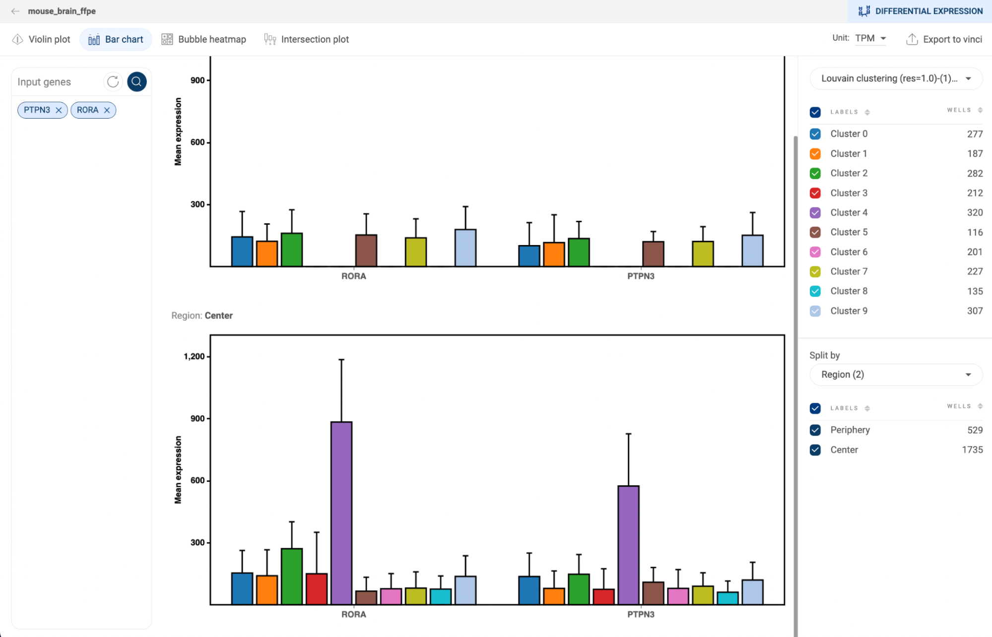
3.3.3. Bubble heatmap
- Click the icon on top of the gene query box. You will be directed to the Bubble heatmap page.
- The plots for the gene(s) added to the gene query box will be created. Change the input genes on the query box and click the button to create new plots.
- The sizes of the dots represent the percentages of cells that express the gene, or the coverage. The color represents the level of expression of a gene. The darker the color, the higher level of gene expression. Hover the mouse over a plot to see the detailed information about mean expression value, number and percentage of cells expressing the gene within the group.
- Click on the “Scale mode” toggle button to switch between “Absolute” and “Relative”:
- Absolute: The sizes of the circles are scaled from 1% to 100%.
- Relative: The sizes of the circles are scaled from the smallest value to the largest value. This mode amplifies the difference between two values.
- Select a metadata field on the right panel to generate plots for each group of the field. Check/uncheck a box next to a group label to show/hide the respective plot.
- Select a metadata field in the “Split by” section to split the plots by the different groups of the selected metadata fields.
- Click the button to export the plots to Vinci for further editing.
- You can switch between different plots with the tools at the top of the page.
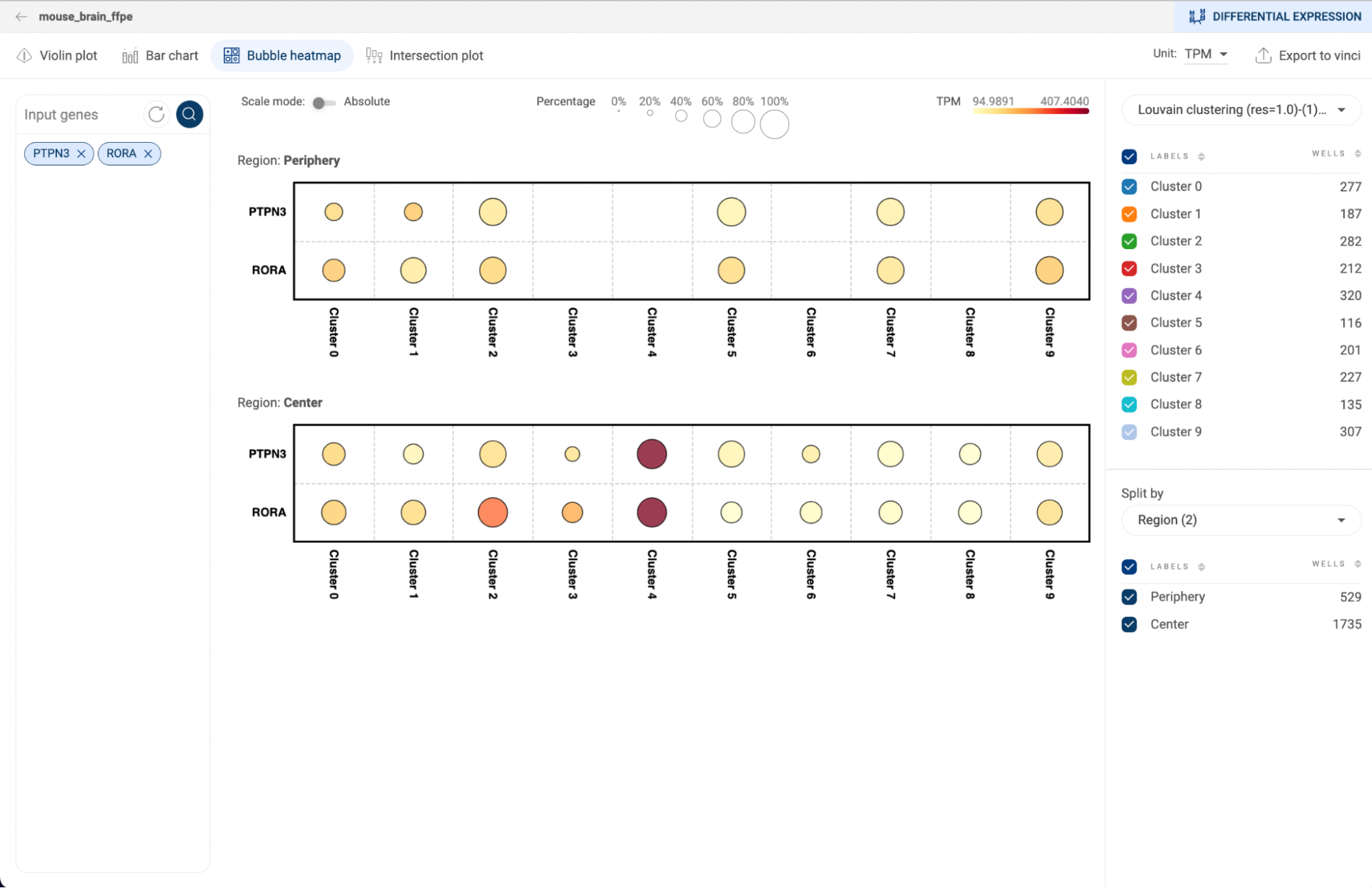
3.3.4. Intersection plot
- Click the icon on top of the gene query box. You will be directed to the Intersection plot page.
- At least two genes are required to create an intersection plot. Input genes into the query box and click the button to create new plots.
- The matrix at the bottom shows different combinations of the input genes, and the bars represent the number of cells that express the respective combinations.
- Select a metadata field on the right panel to visualize the number of cells of each group of the field on a bar. Check/uncheck a box next to a group label to show/hide the respective plot. Hover the mouse over a bar to see the number of cells of the groups made up the bar.
- Select a metadata field in the “Split by” section to split the plots by the different groups of the selected metadata fields.
- Change the expression unit
- Click the button to export the plots to Vinci for further editing.
- You can switch between different plots with the tools at the top of the page.

4. MULTIPLEXING
This features allows you to adjust three color channels of a Nanostring DSP image:
- Red channels:
- Green channel
- Blue channel
For each channel, the available wavelengths are:
- None
- GFAP FITC/525nm
- DNA, Cy3/568nm
- IBA-1. Texas Red/615nm
- NeuN, Cy5/666nm
Click “RESET” to go back to the default settings.
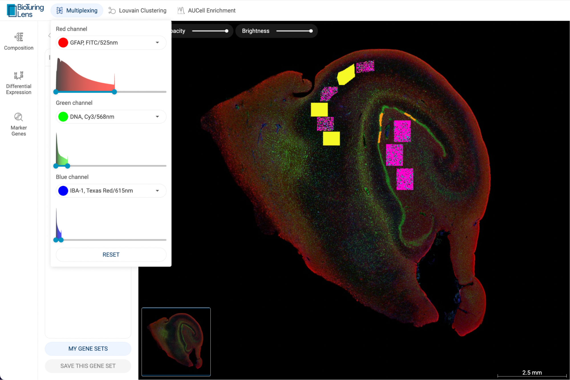
5. LOUVAIN CLUSTERING
This algorithm uses the expression level of 50 important genes that are identified by Principal Component Analysis, or PCA.
To perform Louvain Clustering on a dataset, click the “Louvain Clustering” button on the Toolbar. A popup window will appear, allowing you to adjust the Resolution. The larger the resolution, the smaller the clusters. Therefore, a larger number of clusters are recovered, and vice versa. The default resolution is 1.
After setting the parameters, click the “Run” button. The clustering result will be saved as a new metadata field under “Your Metadata” and displayed on the scatter plot.
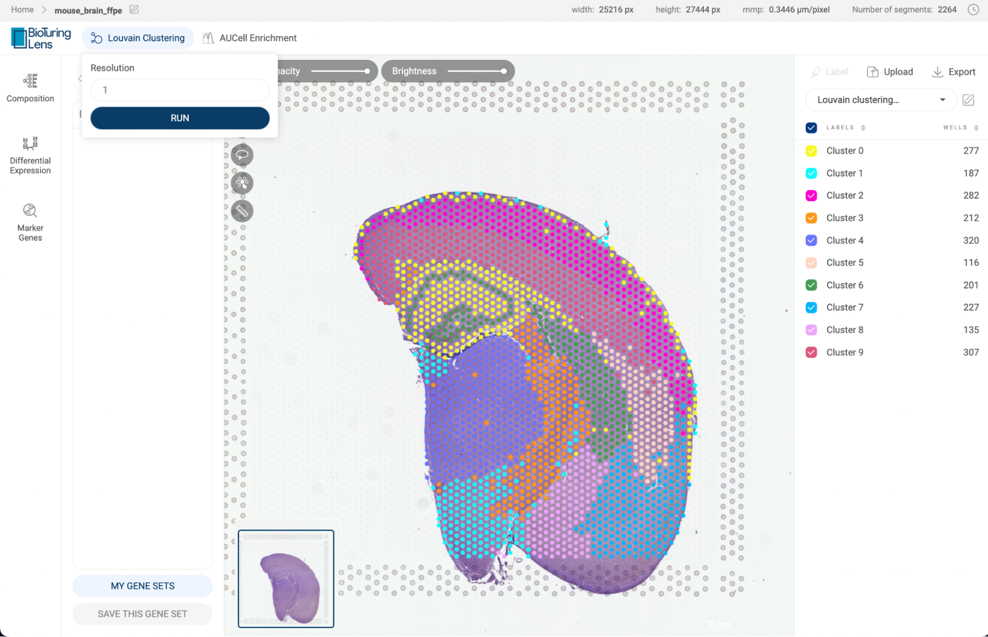
6. AUCELL ENRICHMENT ANALYSIS
AUCell (Aibar et al., 2017) is an algorithm to identify cells in a single-cell dataset with an active gene set. For an input gene set, AUCell evaluates the activity of the gene set in each cell based on the ranking of all genes and returns a score. A high AUCell score means that the gene set is highly enriched in a cell.
To perform enrichment analysis on a dataset, click the “AUCell Enrichment” button on the Toolbar. The AUCell popup window will appear as shown below:
- Save as: A name for your enrichment analysis. This will be part of the metadata name created to save your enrichment analysis.
- Gene set: Select a gene set that you saved. See how to save a gene set at “2.3. Gene expression panel”.
- Input genes: Instead of using a saved gene set, you can type or paste your genes into this box. If you have added genes to the query box on the main page, these genes will be automatically added to this box. Click on the icon in a gene tag to remove a gene. Click on the icon to remove all the added genes.
Finally, click the “RUN” button. The AUCell scores for each cell are saved as a new numerical metadata field named [Enrichment analysis name] - AUCell score] under “Your metadata”.
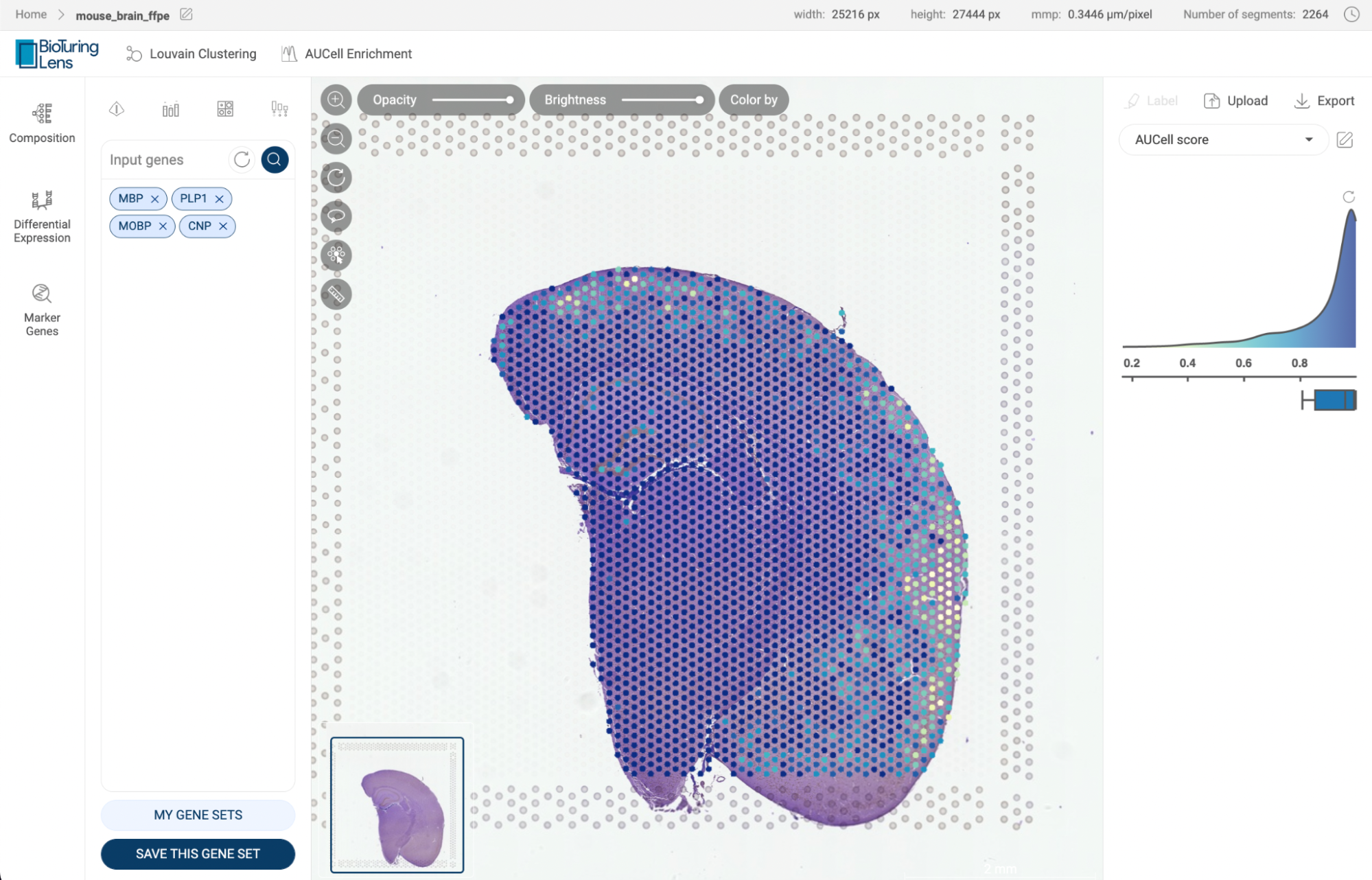
7. COMPOSITION CHART
Composition chart is an informative type of visualization when you want to have an overview of the proportions of different groups that form a dataset. For example, a composition chart can help you to visualize which geometric segments each region is composed of in a GeoMx DSP dataset. BioTuring Lens also allows you to look at the gene expression of each group directly on the chart.
7.1. Exploring the composition of a dataset
To create a composition chart for a dataset, click the “Composition” button on the Sidebar. The composition chart window will open with three dropdown menus at the top of the page. For each dropdown menu, you can click on it and select one categorical metadata field. The number in brackets next to a metadata field is the number of groups within that field.
If you are choosing a categorical metadata field on the main page, a composition chart of that field will be created when you first enter the page.
In the example below, we want to look at which geometric segments each region is composed of. Therefore, we assigned “Group” (provides information about regions) and “Geometric segments” for the first two metadata fields. The third metadata field is not assigned and has a “None” value. Then, Click “GENERATE CHART”.
- A composition chart has a tree structure with each level according to each metadata field you assigned.
- The size of a node at each level represents its percentage in its parent.
- The bar chart on the right-hand side gives you information about the number of cells in each group and its percentage in the whole dataset.
- You can hover the mouse over a node, or a bar to see some more details.
- For numerical metadata, you can look at the average value of each group by selecting a field from the drop-down menu of “Numerical metadata” in the top left corner.
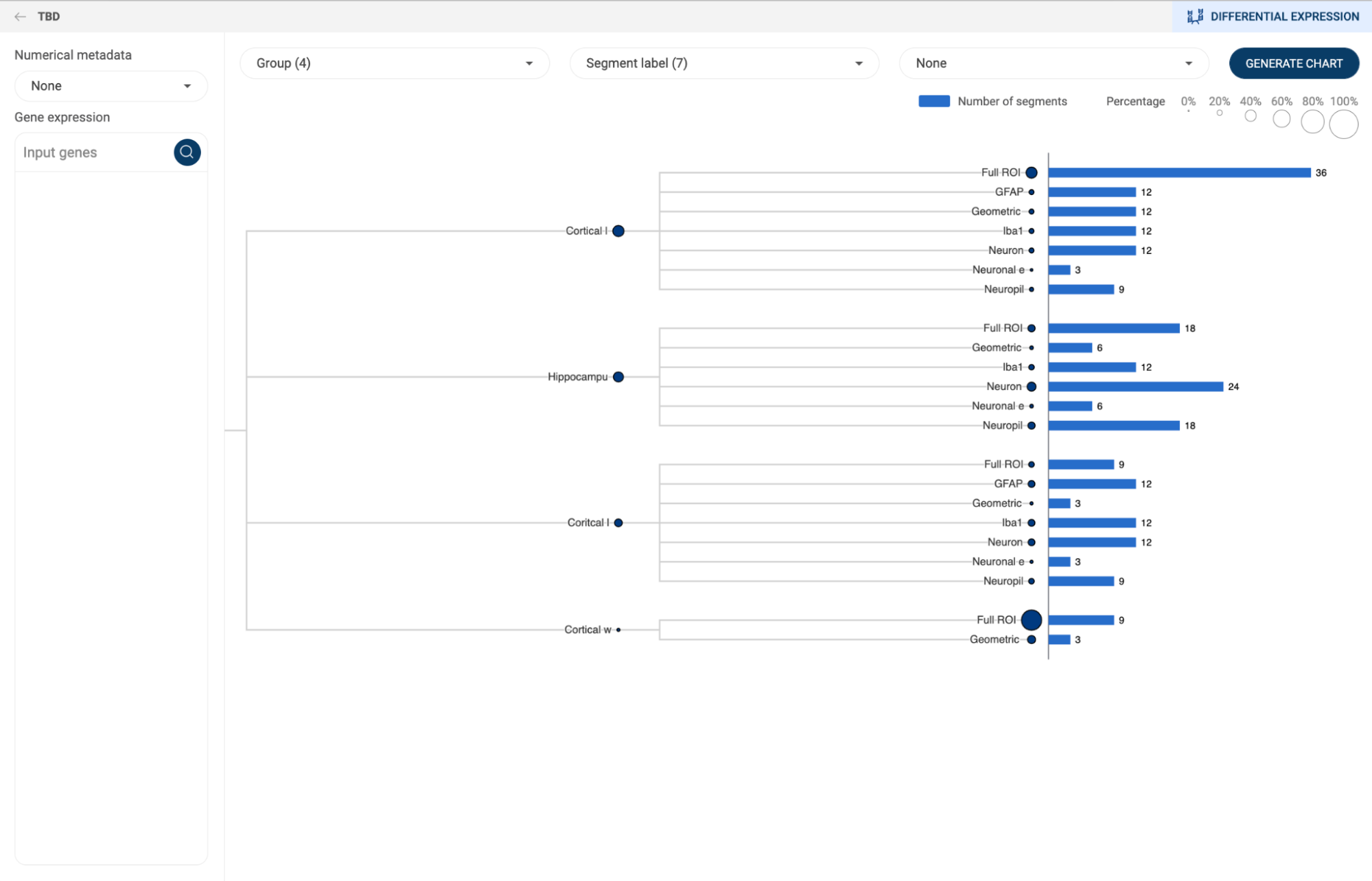
7.2. Creating a customized expression heatmap with composition chart
Once a composition chart has been created, you can look at the gene expression level within each group on the chart by type or past a gene or a list of genes into the query box on the left-hand side. An expression heatmap will replace the bar charts.
- The sizes of the circles represent the percentages of cells that express the gene, or the coverage.
- The color represents the level of expression of the gene in the datasets. The darker the color, the higher level of gene expression.
- Hover the mouse over a circle to see details about the mean expression of a gene and the number of cells expressing the gene.
You can perform differential gene expression between two groups from a composition chart by clicking on the “DIFFERENTIAL EXPRESSION” button in the top right corner. See “8. DIFFERENTIAL GENE EXPRESSION (DGE) ANALYSIS” on how to use this feature on BioTuring Lens.
8. DIFFERENTIAL GENE EXPRESSION (DGE) ANALYSIS
Differential gene expression (DGE) analysis helps you to explore the differences in the abundance of gene transcripts between any two groups of cells in a dataset using statistical tests.
8.1. Creating a new DGE analysis
To perform DGE, click on the “Differential expression” button on the Sidebar. You will be directed to the DGE settings page. The panel on the right-hand side allows you to fill in:
- Title: Set a title for your analysis. This will help you access your analysis on the history page.
- First group/Second group: This toggle button is for switching between the two groups. After selecting cells for a group, switch to the other group.
- Group name: Set a name for the current group. A name helps you to distinguish between the two groups. If you leave this field empty, the two groups will be referred to as “Group 1” and “Group 2”.
- Three methods for assigning cells to a group:
- Metadata: First, select a categorical metadata field, then select one of the groups in the field.
- Composition: Generate a composition chart and select a group by clicking on a node on the chart. You can select multiple groups. See “7. COMPOSITION CHART” on how to create a composition chart.
- Method: Student’s t test.
- After filling in, click the “RUN” button.

8.2. Navigating the DGE result page
The DGE result is shown on a summary table, a volcano plot, a heatmap, and violin plots as below.
- Summary table: The magnitude of change (Log2(FC)) and p-value of each gene are shown. The default cut-off for adjusted p-value is 0.05. The table is sorted by p-value values by default.
- Click on the icon next to a header to change the sort settings.
- Click on a gene name to select a gene. By default, the gene with the highest adjusted p-value is selected.
- Check the box next to a gene name to show its label on the volcano plot.
- Click on the button to export the result for further analysis.
- Volcano plot: Each dot represents a gene. The magnitude of change is plotted on the x-axis, and the p-value is plotted on the y-axis. The genes which are checked on the summary table will be labeled on the volcano plot. Clicking on a dot will select the gene that the dot represents.
- Violin plots: The probability density functions of the log-normalized expression values of the selected gene within each group are presented.
- Heatmap: A cluster heatmap of maximum of 300 significant genes is shown..
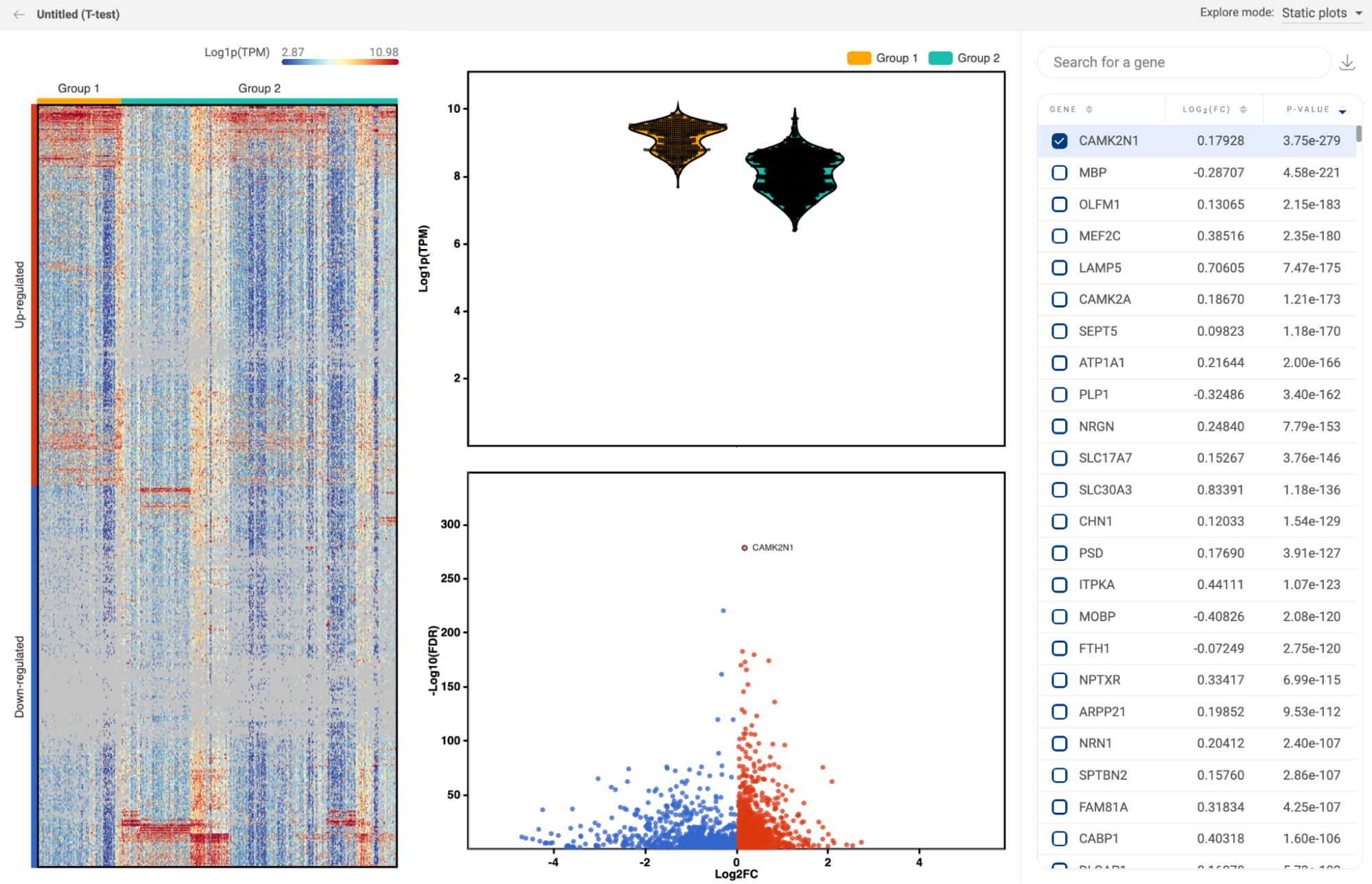
You can change the “Explore mode” in the top right corner to “Interactive image” to display the expression of each gene on the image.
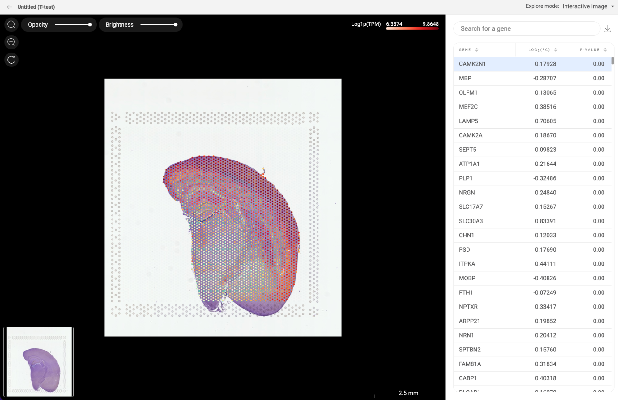
8.3. Navigating the DGE history page
When you are on the DGE page, instead of creating a new analysis, you can click on the “PREVIOUS RESULTS'' button in the top right corner to see all DGE analyses you performed on a dataset.
The information about the analysis title, the two groups, the method, and created date of each analysis are shown.
- Use the search box in the top right corner to search for analyses using keywords.
- Click the “EXPLORE” button to go to the result page of an analysis.
- Click the icon to rename or delete an analysis:
- Rename: A pop-up window will appear allowing you to change the title and name of each group.
- Delete: Delete a single analysis.
- To delete multiple items, check the boxes next to the titles. A delete button will appear at the top of the panel.
- To create a new DGE analysis, click on the “CREATE A NEW ANALYSIS” button.
9. FINDING MARKER GENES
Marker genes is a feature that allows you to find a gene panel - a set of differentially expressed genes, that help distinguish a population of cells from others. In many cases, the expression of only one gene is not enough to tell a population apart, especially at the sub type level. Therefore, a combination of multiple genes is an effective solution to tackle this problem.
To find marker genes, select your cells of interest and click the “Marker genes” button on the Sidebar. The marker genes page contains a gene panel table, a scatter plot, a metadata panel, and a decision tree as shown below.
9.1. Configuring the gene panel table
- Each gene panel is shown with its F1 score in the table
- Maximum gene panel size: type in a number that defines the maximum number of genes in a panel and click the “FIND” button. The default value is 2.
- Include negative genes: When this option is unchecked, the panel only contains expressed genes. When this option is checked, the algorithm uses both expressed genes and not-expressed genes to define a panel. In this case, negative genes are listed as red tags in the “NOT EXPRESS” column.
9.2. Exploring a gene panel
- Click on a gene panel to select. The selected panel is shown at the top of the scatter plot.
- On the scatter plot, by default, the expression of the gene panel across the dataset is presented. Click on a gene tag of the “Selected panel” to see the expression of an individual gene. See “3. EXPLORING GENE EXPRESSION” on how to use different expression units and color modes.
9.3. Decision tree
- The decision tree visualizes how the selected gene panel, can help distinguish the selected group from the rest. A flow represents a cell group.
- The default scale mode is “Absolute”, meaning that the sizes of different flows in the chart are proportional to the number of cells in each group. In case the number of cells in different groups varies considerably, you can change the scale mode to “Relative”.
- By default, only the flow representing the selected group has color, the rest is grey. You can change the color mode to “All metadata fields” to visualize all groups on the tree.